Criterion & Eclipse Cover Art & Packaging Babble-on Vol. 7
-
Finch

- Joined: Mon Jul 07, 2008 9:09 pm
- Location: United States
Re: Criterion & Eclipse Cover Art & Packaging Babble-on Vol. 7
I'm grateful they didn't see a need to change the High and Low cover.
-
cdnchris

- Site Admin
- Joined: Tue Nov 02, 2004 6:45 pm
- Location: Washington
- Contact:
Re: Criterion & Eclipse Cover Art & Packaging Babble-on Vol. 7
I would have preferred the "none more black" simple cover of the DVD, but I think they're going for a Queen II cover kinda vibe. Maybe. I don't hate it but hoping it looks better in hand.pzadvance wrote: Mon Jun 16, 2025 4:43 pm spinal tap is a hard cover to fuck up, and somehow they managed to!
-
Zot!
- Joined: Wed Jan 20, 2010 4:09 am
Re: Criterion & Eclipse Cover Art & Packaging Babble-on Vol. 7
It is indeed ugly.cdnchris wrote: Mon Jun 16, 2025 6:56 pmI would have preferred the "none more black" simple cover of the DVD, but I think they're going for a Queen II cover kinda vibe. Maybe. I don't hate it but hoping it looks better in hand.pzadvance wrote: Mon Jun 16, 2025 4:43 pm spinal tap is a hard cover to fuck up, and somehow they managed to!
Is it a reference to this (spoofing the KISS solo records)?
-
CSM126

- Joined: Thu Nov 04, 2004 12:22 pm
- Location: The Room
- Contact:
Re: Criterion & Eclipse Cover Art & Packaging Babble-on Vol. 7
The ideal Spinal Tap cover would be entirely black and glossy with a faint reflection of the band looking at it, but this is fine. Looks like a metal album cover, and given that the plot synopsis is in kayfabe, that makes sense. Spinal Tap would, of course, try to make themselves look legit.
-
pzadvance

- Joined: Mon Nov 21, 2011 11:24 pm
- Location: Vienna, Austria
Re: Criterion & Eclipse Cover Art & Packaging Babble-on Vol. 7
the concept is fine, i just think the faces look terrible
-
felipe
- Joined: Thu May 06, 2010 3:06 am
Re: Criterion & Eclipse Cover Art & Packaging Babble-on Vol. 7
Somehow they made Spinal Tap look like What We Do In The Shadows
-
tenia

- Ask Me About My Bassoon
- Joined: Wed Apr 29, 2009 3:13 pm
Re: Criterion & Eclipse Cover Art & Packaging Babble-on Vol. 7
Exactly. It's fine as a composition and concept overall, but the visual style of the faces just doesn't look good.
-
domino harvey

- Dot Com Dom
- Joined: Wed Jan 11, 2006 6:42 pm
Re: Criterion & Eclipse Cover Art & Packaging Babble-on Vol. 7
I’m so lost on this, I think it looks fine
-
The Curious Sofa
- Joined: Fri Sep 13, 2019 10:18 am
Re: Criterion & Eclipse Cover Art & Packaging Babble-on Vol. 7
The cover for Spinal Tap looks great and is so appropriate for the film, it references one of the original movie poster designs but pares it down. I don't understand the weirdly nitpicky complaints that so many of you have about covers. You may know about movies, but not much about graphic design. The same goes for the Audiard covers I've already seen complaints about. They are so much better than the original posters.
Last edited by The Curious Sofa on Tue Jun 17, 2025 1:04 pm, edited 1 time in total.
-
TechnicolorAcid

- Joined: Wed Oct 11, 2023 11:43 pm
Re: Criterion & Eclipse Cover Art & Packaging Babble-on Vol. 7
I’ll also add that even if you find that cover not as good as the original, considering it’s a poster for Spinal Tap (a movie where one of the main gags are good concept ideas turning into disappointing flops), it still fits the film even if I admittedly still prefer the idea of a black background paired with the metallic logo.
-
Zot!
- Joined: Wed Jan 20, 2010 4:09 am
Re: Criterion & Eclipse Cover Art & Packaging Babble-on Vol. 7
Thanks!The Curious Sofa wrote: Tue Jun 17, 2025 12:49 pm You may know about movies, but not much about graphic design.
Taking the existing BD cover and simply applying a weird gouache-effect does not seem like a brilliant choice, but maybe Criterion had to conform to certain rules.

-
tenia
- Ask Me About My Bassoon
- Joined: Wed Apr 29, 2009 3:13 pm
Re: Criterion & Eclipse Cover Art & Packaging Babble-on Vol. 7
It might just be a matter of stylistic preferences, I just think this render of the cover gives the faces some kinda of slightly weird waxy aspect that doesn't look good. Maybe it's just the render, maybe it'll look better in person, maybe it's a tiny thing that catches my eye for some reason.
But I do think the overall composition and inspiration is very fine.
-
The Curious Sofa
- Joined: Fri Sep 13, 2019 10:18 am
Re: Criterion & Eclipse Cover Art & Packaging Babble-on Vol. 7
While I would never rule out AI these days, this doesn't look like a 'weird gouache-effect'; it looks like a painting based on the poster. Christopher Guest looks more straight on, and the difference in the way the hair is rendered makes it obvious that this isn't just a filter.Zot! wrote: Tue Jun 17, 2025 1:21 pmTaking the existing BD cover and simply applying a weird gouache-effect does not seem like a brilliant choice, but maybe Criterion had to conform to certain rules.Spoiler
Thanks!The Curious Sofa wrote: Tue Jun 17, 2025 12:49 pm You may know about movies, but not much about graphic design.Spoiler
-
Zot!
- Joined: Wed Jan 20, 2010 4:09 am
Re: Criterion & Eclipse Cover Art & Packaging Babble-on Vol. 7
Has Criterion copped to doing anything with AI? That Querelle "Tekken" abomination is a prime candidate, but it's probably just human error. I said "effect", to allow for it to be rendered in whatever manner, whether it be physical medium, software, whatever. The end result, for me, is neither funny nor handsome, just clunky looking. But then I'm not qualified to speak on this topic, so I'll tap out.The Curious Sofa wrote: Tue Jun 17, 2025 2:03 pm While I would never rule out AI these days, this doesn't look like a 'weird gouache-effect'; it looks like a painting based on the poster. Christopher Guest looks more straight on, and the difference in the way the hair is rendered makes it obvious that this isn't just a filter.
-
DimitriL
- Joined: Thu Jul 24, 2014 10:07 pm
Re: Criterion & Eclipse Cover Art & Packaging Babble-on Vol. 7
Querelle was not AI, says the artist. He says he has worked with AI textures on some things, but his entire body of work is exploring the uncanny. In Querelle’s case, it was a 3D computer sculpt that he used as a basis for a traditional painting.)Zot! wrote: Tue Jun 17, 2025 2:27 pmHas Criterion copped to doing anything with AI? That Querelle "Tekken" abomination is a prime candidate, but it's probably just human error. I said "effect", to allow for it to be rendered in whatever manner, whether it be physical medium, software, whatever. The end result, for me, is neither funny nor handsome, just clunky looking. But then I'm not qualified to speak on this topic, so I'll tap out.The Curious Sofa wrote: Tue Jun 17, 2025 2:03 pm While I would never rule out AI these days, this doesn't look like a 'weird gouache-effect'; it looks like a painting based on the poster. Christopher Guest looks more straight on, and the difference in the way the hair is rendered makes it obvious that this isn't just a filter.
The Spinal Tap cover makes me think MAD Magazine vibe, slightly exaggerated. (In a good way, to me.)
-
The Curious Sofa
- Joined: Fri Sep 13, 2019 10:18 am
Re: Criterion & Eclipse Cover Art & Packaging Babble-on Vol. 7
The Querelle cover was great!
Not that I've loved every single cover but on the whole Criterion know what they are doing when it comes to design. They keep up with what's happening in current graphic design and they hire talented people.
Not that I've loved every single cover but on the whole Criterion know what they are doing when it comes to design. They keep up with what's happening in current graphic design and they hire talented people.
-
cdnchris
- Site Admin
- Joined: Tue Nov 02, 2004 6:45 pm
- Location: Washington
- Contact:
Re: Criterion & Eclipse Cover Art & Packaging Babble-on Vol. 7
It's a drawing, isn't it? That's probably why (unless I'm mistaken).tenia wrote:I just think this render of the cover gives the faces some kinda of slightly weird waxy aspect that doesn't look good. Maybe it's just the render, maybe it'll look better in person, maybe it's a tiny thing that catches my eye for some reason.
-
DRW.mov

- Joined: Thu Sep 15, 2016 6:43 pm
- Location: Los Angeles, CA
Re: Criterion & Eclipse Cover Art & Packaging Babble-on Vol. 7
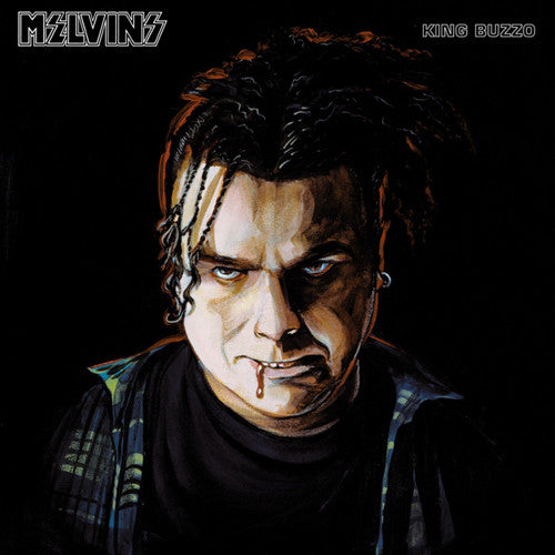
The Spinal Tap cover is fully illustrated. All you have to do is go look at the other heavy metal illustration work of artist Dan Goldsworthy.
-
Zot!
- Joined: Wed Jan 20, 2010 4:09 am
Re: Criterion & Eclipse Cover Art & Packaging Babble-on Vol. 7
No judgement implied, but for clarity, the artist fully admits his workflow is 100% digital. So in this case, he no doubt digitally "painted" over and tweaked the existing portraits seen on the previous cover.DRW.mov wrote: Tue Jun 17, 2025 3:25 pm The Spinal Tap cover is fully illustrated. All you have to do is go look at the other heavy metal illustration work of artist Dan Goldsworthy.
-
Guido
- Joined: Sun Jun 01, 2008 3:31 am
Re: Criterion & Eclipse Cover Art & Packaging Babble-on Vol. 7
Why would a digital workflow necessarily imply that tracing or “painting over” was used as a method?
-
Zot!
- Joined: Wed Jan 20, 2010 4:09 am
Re: Criterion & Eclipse Cover Art & Packaging Babble-on Vol. 7
See the existing BD cover I posted above. Quite clearly the same images with some minor adjustments. Again, no judgement applied, I wouldn't even rule out that the studio had some stipulations for the design, for what is a perennial cash-cow.Guido wrote: Tue Jun 17, 2025 3:54 pm Why would a digital workflow necessarily imply that tracing or “painting over” was used as a method?
-
tenia
- Ask Me About My Bassoon
- Joined: Wed Apr 29, 2009 3:13 pm
Re: Criterion & Eclipse Cover Art & Packaging Babble-on Vol. 7
Yes, and I'm fine with this in general, I suppose it's this style of drawing that gives a look to the faces I don't find very appealing to me (which isn't dis-similar to the faces' look on the older BD cover linked by Zot, which I'm not fond of either).cdnchris wrote: Tue Jun 17, 2025 3:00 pmIt's a drawing, isn't it? That's probably why (unless I'm mistaken).tenia wrote:I just think this render of the cover gives the faces some kinda of slightly weird waxy aspect that doesn't look good. Maybe it's just the render, maybe it'll look better in person, maybe it's a tiny thing that catches my eye for some reason.
-
The Curious Sofa
- Joined: Fri Sep 13, 2019 10:18 am
Re: Criterion & Eclipse Cover Art & Packaging Babble-on Vol. 7
They commissioned an artist who has specialised in metal album covers for decades to design the cover of a parody about a metal band. When you look at these type of album covers, 'appealing' is not the first word that springs to mind. Yes, they look slightly distorted and weird — that's the point.
-
DRW.mov
- Joined: Thu Sep 15, 2016 6:43 pm
- Location: Los Angeles, CA
Re: Criterion & Eclipse Cover Art & Packaging Babble-on Vol. 7
Using a photo for reference and "painting over"/tracing are two wildly different things.Zot! wrote: Tue Jun 17, 2025 4:10 pmSee the existing BD cover I posted above. Quite clearly the same images with some minor adjustments. Again, no judgement applied, I wouldn't even rule out that the studio had some stipulations for the design, for what is a perennial cash-cow.Guido wrote: Tue Jun 17, 2025 3:54 pm Why would a digital workflow necessarily imply that tracing or “painting over” was used as a method?
-
Zot!
- Joined: Wed Jan 20, 2010 4:09 am
Re: Criterion & Eclipse Cover Art & Packaging Babble-on Vol. 7
I might be missing your point, but if I was a purely digital artist, I would never try to reproduce an image freehand...what would be the point in that? Why eyeball your already digital source image on a separate monitor so you can then try to approximate that freehand with a digital brush?DRW.mov wrote: Tue Jun 17, 2025 6:57 pmUsing a photo for reference and "painting over"/tracing are two wildly different things.Zot! wrote: Tue Jun 17, 2025 4:10 pmSee the existing BD cover I posted above. Quite clearly the same images with some minor adjustments. Again, no judgement applied, I wouldn't even rule out that the studio had some stipulations for the design, for what is a perennial cash-cow.Guido wrote: Tue Jun 17, 2025 3:54 pm Why would a digital workflow necessarily imply that tracing or “painting over” was used as a method?