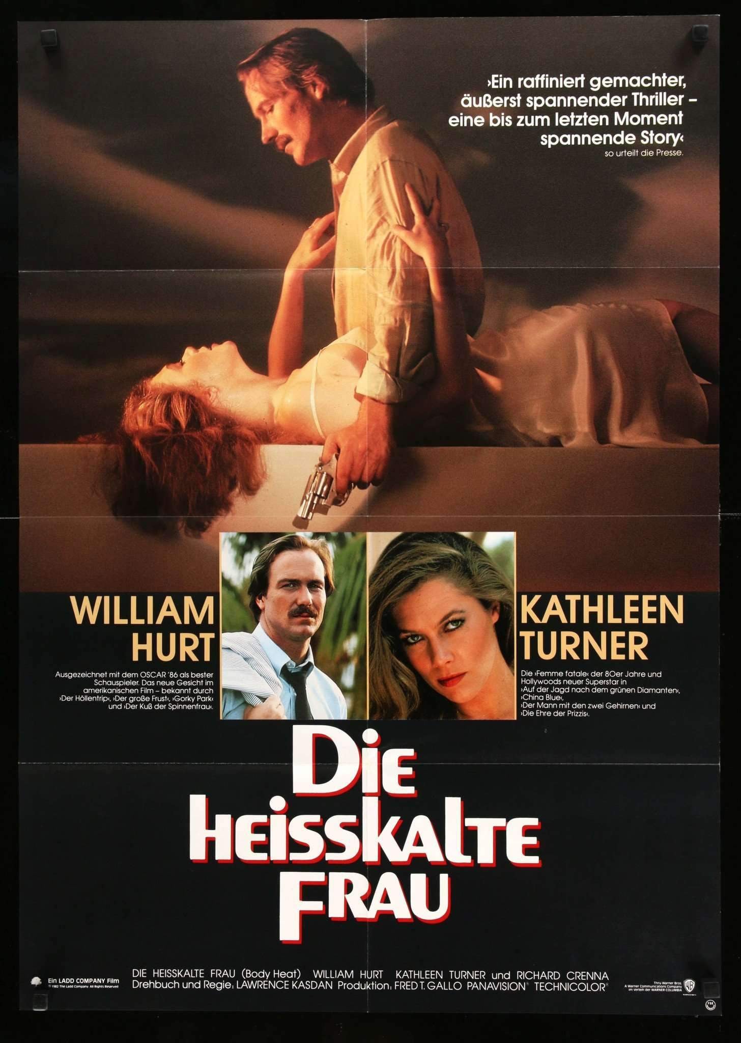
I agree. I'm not a fan of this movie, but nothing sums up the idea of "'80s neo-noir" more than this: neon colors and slatted window blinds, a girl and a gun. I wish they had done Against All Odds instead.aox wrote: Fri Feb 13, 2026 4:58 pmNot being a fan of the movie myself, I think the awful artwork is perfect and captures the film superbly.
Criterion & Eclipse Cover Art & Packaging Babble-on Vol. 7
-
Matt

- Joined: Tue Nov 02, 2004 4:58 pm
Re: Criterion & Eclipse Cover Art & Packaging Babble-on Vol. 7
-
ryannichols7

- Joined: Mon Jul 16, 2012 6:26 pm
Re: Criterion & Eclipse Cover Art & Packaging Babble-on Vol. 7
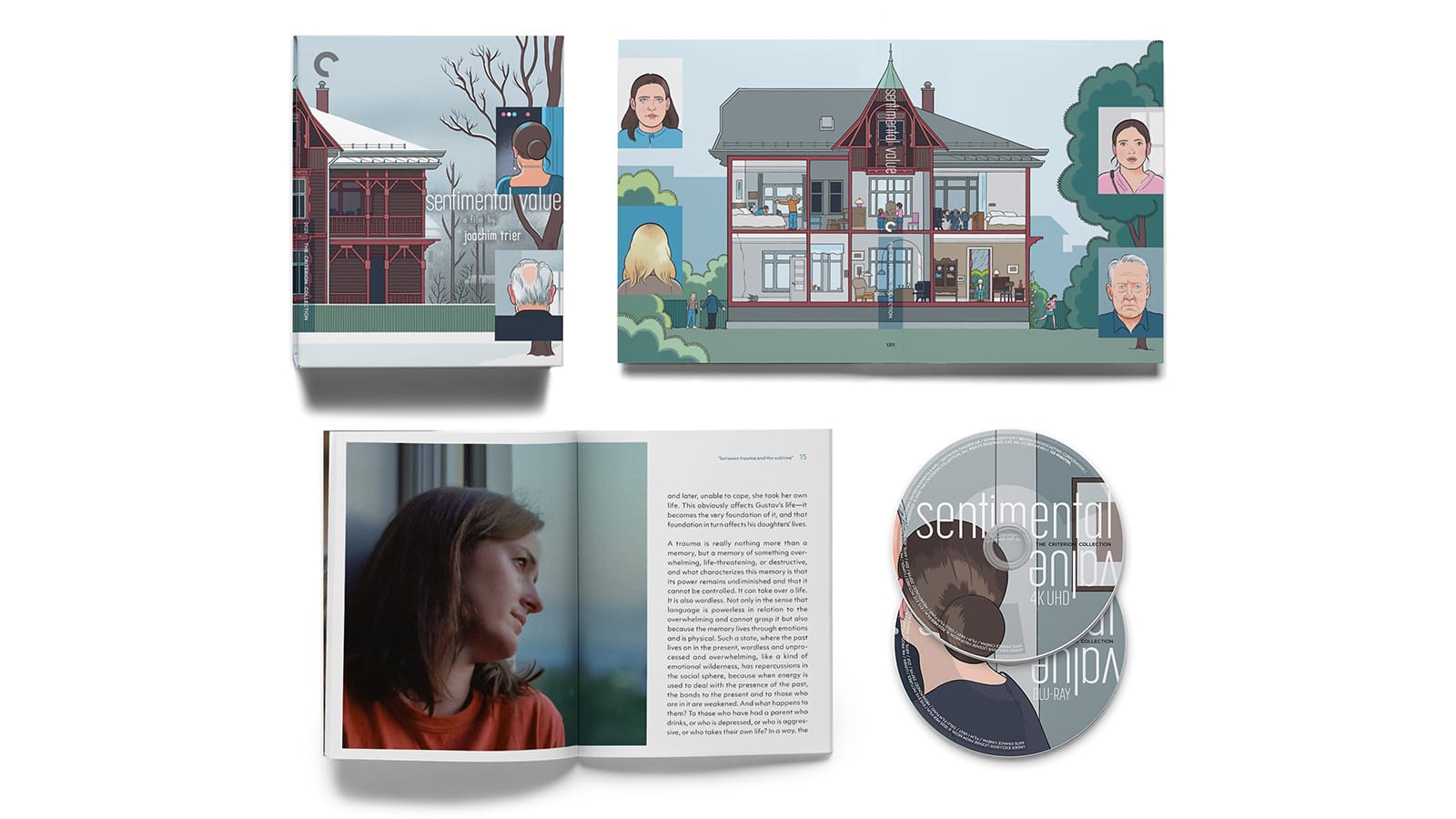
I had no idea Chris Ware had so many ardent defenders online, every single negative comment towards the Sentimental Value cover (and I'm in the camp that doesn't like it) is met immediately with a "but don't you know who Chris Ware is?" nasty run of vitriol. I don't care who designed it, it's pretty poor, but at least it's not something I'll be owning..
Lenny is the best cover but nothing inventive. and I still love the Stray Dog cover a lot. simplicity at it's best
Lenny is the best cover but nothing inventive. and I still love the Stray Dog cover a lot. simplicity at it's best
-
domino harvey

- Dot Com Dom
- Joined: Wed Jan 11, 2006 6:42 pm
Re: Criterion & Eclipse Cover Art & Packaging Babble-on Vol. 7
For the record, Ware did the original poster for the Savages, which I love (I used to have one until some cultured thief stole my posters from storage). This cover though is just awkwardly composed and frankly ugly. Even talented artists are not immune to bad ideas (or perhaps interference from Criterion or Trier?)
-
soundchaser

- Leave Her to Beaver
- Joined: Sun Aug 28, 2016 4:32 am
Re: Criterion & Eclipse Cover Art & Packaging Babble-on Vol. 7
I'm withholding judgment until I see the full piece, because I do think Chris Ware's designs (at least in the comics world) are generally pretty stunning (the older paperback Krazy & Ignatz covers are uniformly interesting and eye-catching), and I'm sure there's more going on here than we're privy to just yet. Does that mean it fails as a piece of composition without the full context? Possibly, but I'm not so bothered by it.
-
Matt
- Joined: Tue Nov 02, 2004 4:58 pm
Re: Criterion & Eclipse Cover Art & Packaging Babble-on Vol. 7
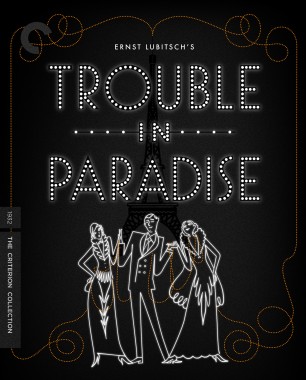
It didn't hit me until I half-watched Trouble in Paradise on TCM the other night, but the typography on the cover reflects that of the signs on Madame Colet's factory and shop. Bad images, but you get the idea:


-
Zot!
- Joined: Wed Jan 20, 2010 4:09 am
Re: Criterion & Eclipse Cover Art & Packaging Babble-on Vol. 7
While it is from the (early) 80's, I don't don't remember any Miami Vice inspired kitsch in this movie. I will be happy to rewatch it, as my previous impression was positive, but Hurt and Turner might have a lot to do with that. FYI, Against All Odds has a good BD available, but no 4K transfer presumably, as IMPRINT is releasing a Aussie BD just this month.Matt wrote: Sat Feb 14, 2026 3:16 amI agree. I'm not a fan of this movie, but nothing sums up the idea of "'80s neo-noir" more than this: neon colors and slatted window blinds, a girl and a gun. I wish they had done Against All Odds instead.aox wrote: Fri Feb 13, 2026 4:58 pmNot being a fan of the movie myself, I think the awful artwork is perfect and captures the film superbly.
-
cdnchris

- Site Admin
- Joined: Tue Nov 02, 2004 6:45 pm
- Location: Washington
- Contact:
Re: Criterion & Eclipse Cover Art & Packaging Babble-on Vol. 7
Oddly, it doesn't bother me. It's the same image from the RCA CED my dad had (and how I first saw the film), minus the color scheme, so that might be why. Though I agree, from what I recall, there's nothing Miami Vice about the film.
-
Zot!
- Joined: Wed Jan 20, 2010 4:09 am
Re: Criterion & Eclipse Cover Art & Packaging Babble-on Vol. 7
For me the weird part beyond the color-scheme is the addition of noiresque "blinds" to the original very earthy sepia image that make it look more like disco lights than blinds. Either way it feels tacky to me.
-
jt938
- Joined: Sun Dec 29, 2024 4:06 pm
Re: Criterion & Eclipse Cover Art & Packaging Babble-on Vol. 7
I watched it recently, there is no neon lighting that is prevalent in the movie. The lighting is usually brown and yellowish which most of the older covers/posters represent better. The new cover is more Body Double than Body Heat.
-
dwk

- Joined: Sat Jun 12, 2010 10:10 pm
Re: Criterion & Eclipse Cover Art & Packaging Babble-on Vol. 7
Packaging shot of Sentimental Value added to its page
-
Zot!
- Joined: Wed Jan 20, 2010 4:09 am
Re: Criterion & Eclipse Cover Art & Packaging Babble-on Vol. 7
Ah...all is revealed! The "mirrored/reverse angle" gatefold looks great, and now it's clear that Chris Ware didn't completely lose it. The front cover on its own still looks crap tho  .
.
-
pzadvance

- Joined: Mon Nov 21, 2011 11:24 pm
- Location: Vienna, Austria
Re: Criterion & Eclipse Cover Art & Packaging Babble-on Vol. 7
feeling vindicatedpzadvance wrote: Fri Feb 13, 2026 9:31 pm Being a digipack and being Chris ware you can almost guarantee the art will wrap around to the back to feature the second half of the house and two more heads
-
domino harvey
- Dot Com Dom
- Joined: Wed Jan 11, 2006 6:42 pm
Re: Criterion & Eclipse Cover Art & Packaging Babble-on Vol. 7
I mean, that still looks like awful? And none of those illustrations look like the actors... I like the overlapping disc design though, I'll give him that
-
jazzo

- Joined: Sun Nov 17, 2013 4:02 am
Re: Criterion & Eclipse Cover Art & Packaging Babble-on Vol. 7
That's some beautiful Chris Ware.
It would be great if Criterion decides to release a set of Tamara Jenkins' pictures, The Savages and Private Life. Ware has already designed beautiful posters for those two films, and if they add in Slums of Beverly Hills, they could commission design for that and complete the set nicely.
It would be great if Criterion decides to release a set of Tamara Jenkins' pictures, The Savages and Private Life. Ware has already designed beautiful posters for those two films, and if they add in Slums of Beverly Hills, they could commission design for that and complete the set nicely.
-
Zot!
- Joined: Wed Jan 20, 2010 4:09 am
Re: Criterion & Eclipse Cover Art & Packaging Babble-on Vol. 7
I don't disagree, but the Ware house style is pretty cartoonish if intended for portraiture. Still, those Ian Dingman illustrations on the Wes Anderson films were much cruder than this, identifiable only by their costumes.
-
pzadvance
- Joined: Mon Nov 21, 2011 11:24 pm
- Location: Vienna, Austria
Re: Criterion & Eclipse Cover Art & Packaging Babble-on Vol. 7
i guess his style isn't for everyone 
personally would love to see him do an Ozu cover, I have this hanging in my office (commissioned by Cinefamily in LA back in the day if I recall?)

personally would love to see him do an Ozu cover, I have this hanging in my office (commissioned by Cinefamily in LA back in the day if I recall?)
-
Matt
- Joined: Tue Nov 02, 2004 4:58 pm
Criterion & Eclipse Cover Art & Packaging Babble-on Vol. 7
That’s not too different from Adrian Tomine”s covers for Ozu’s There Was a Father and The Only Son for Criterion. I’d hoped he’d give a unified look to all of Criterion’s Ozus after that, but it didn’t happen.
-
Zot!
- Joined: Wed Jan 20, 2010 4:09 am
Re: Criterion & Eclipse Cover Art & Packaging Babble-on Vol. 7
Yeah for a second after seeing that, I misremembered it was Ware that did the Ozu covers and not Tomine, even though the two typically bear no resemblance...apparently Ozu is a "vibe". Tomine is a great choice for those, as he is Japanese-American creating American covers for Japanese films, and had an amusing story in one of his comics about an "Asian-American film festival", so he obviously understands what Criterion is all about.Matt wrote: Mon Mar 09, 2026 7:50 pm That’s not too different from Adrian Tomine”s covers for Ozu’s There Was a Father and The Only Son for Criterion. I’d hoped he’d give a unified look to all of Criterion’s Ozus after that, but it didn’t happen.
-
Saturnome

- Joined: Sun Aug 12, 2007 9:22 pm
Re: Criterion & Eclipse Cover Art & Packaging Babble-on Vol. 7
Ware's plane safety instruction booklet style is way too sterile for Ozu. Tomine is a better (but not ideal) choice.
-
mfunk9786

- Under Chris' Protection
- Joined: Fri May 16, 2008 8:43 pm
- Location: Miami, FL
Re: Criterion & Eclipse Cover Art & Packaging Babble-on Vol. 7
Fabulous. This is not the first time people have freaked out too soon on a Criterion packaging concept, won't be the last... but it's excellent. Unfortunate that I probably never need to see this film again after two lukewarm viewings, otherwise it'd be a must buy.
-
cdnchris
- Site Admin
- Joined: Tue Nov 02, 2004 6:45 pm
- Location: Washington
- Contact:
Re: Criterion & Eclipse Cover Art & Packaging Babble-on Vol. 7
Viridiana [4K] (Booklet)
Classe tous risques [4K] (Booklet)
Killers of the Flower Moon [4K] (Booklet)
Testament
A Man and a Woman
The Blade [4K]
Killers of the Flower Moon is licensed from Paramount.
Classe tous risques [4K] (Booklet)
Killers of the Flower Moon [4K] (Booklet)
Testament
A Man and a Woman
The Blade [4K]
Killers of the Flower Moon is licensed from Paramount.
-
Finch

- Joined: Mon Jul 07, 2008 9:09 pm
- Location: United States
-
Finch
- Joined: Mon Jul 07, 2008 9:09 pm
- Location: United States
Re: Criterion & Eclipse Cover Art & Packaging Babble-on Vol. 7
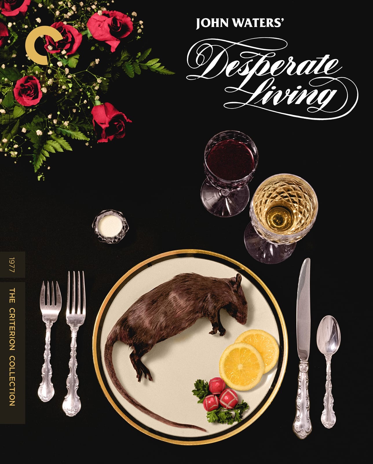
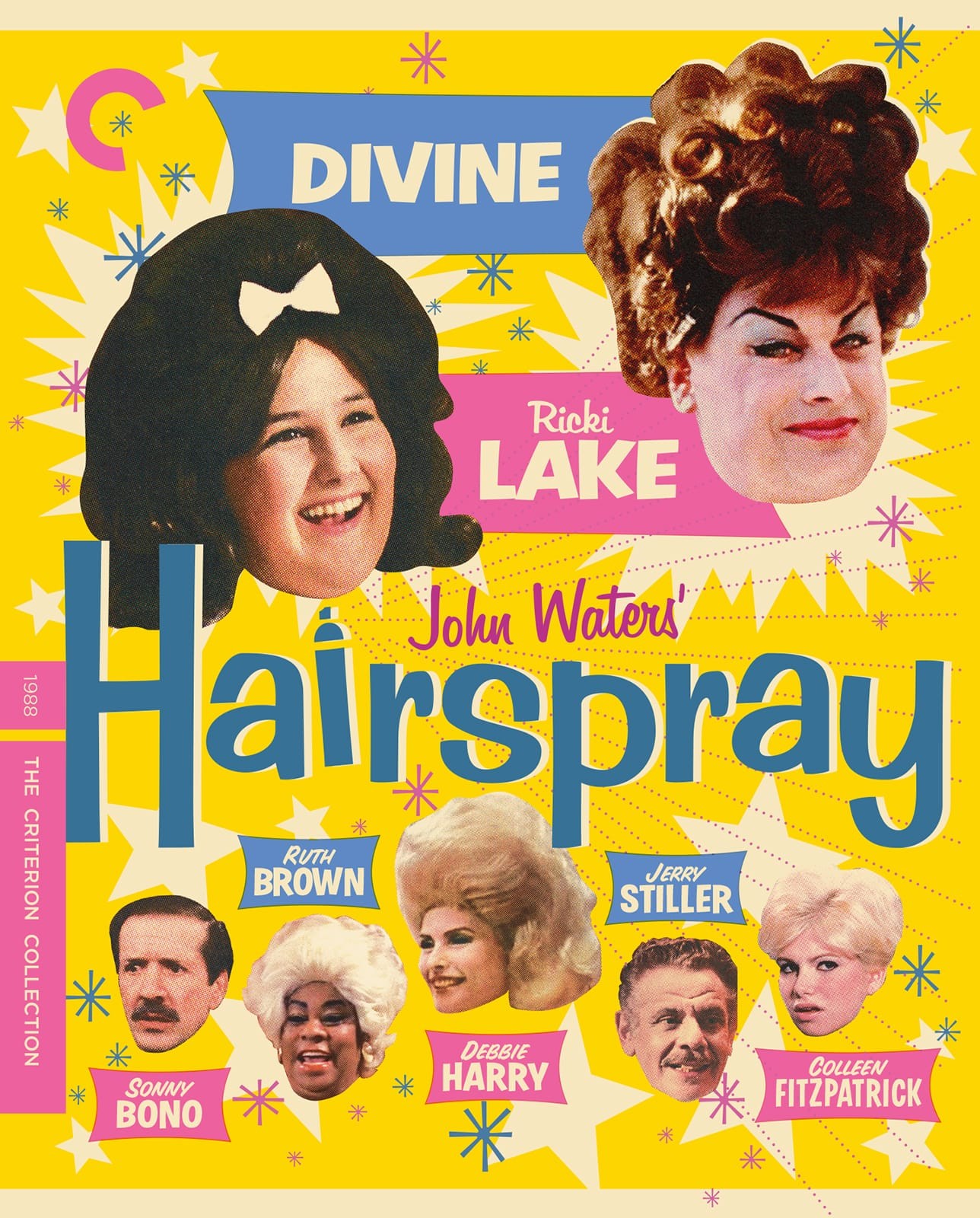
IMO they nailed the Waters covers.
-
Never Cursed

- Such is life on board the Redoutable
- Joined: Sun Aug 14, 2016 4:22 am
Re: Criterion & Eclipse Cover Art & Packaging Babble-on Vol. 7
The Desperate Living cover is just a crop of the film's theatrical release poster - which is exactly what they should have gone with
-
Beloved Aunt

- Joined: Tue Dec 14, 2021 7:28 pm
Re: Criterion & Eclipse Cover Art & Packaging Babble-on Vol. 7
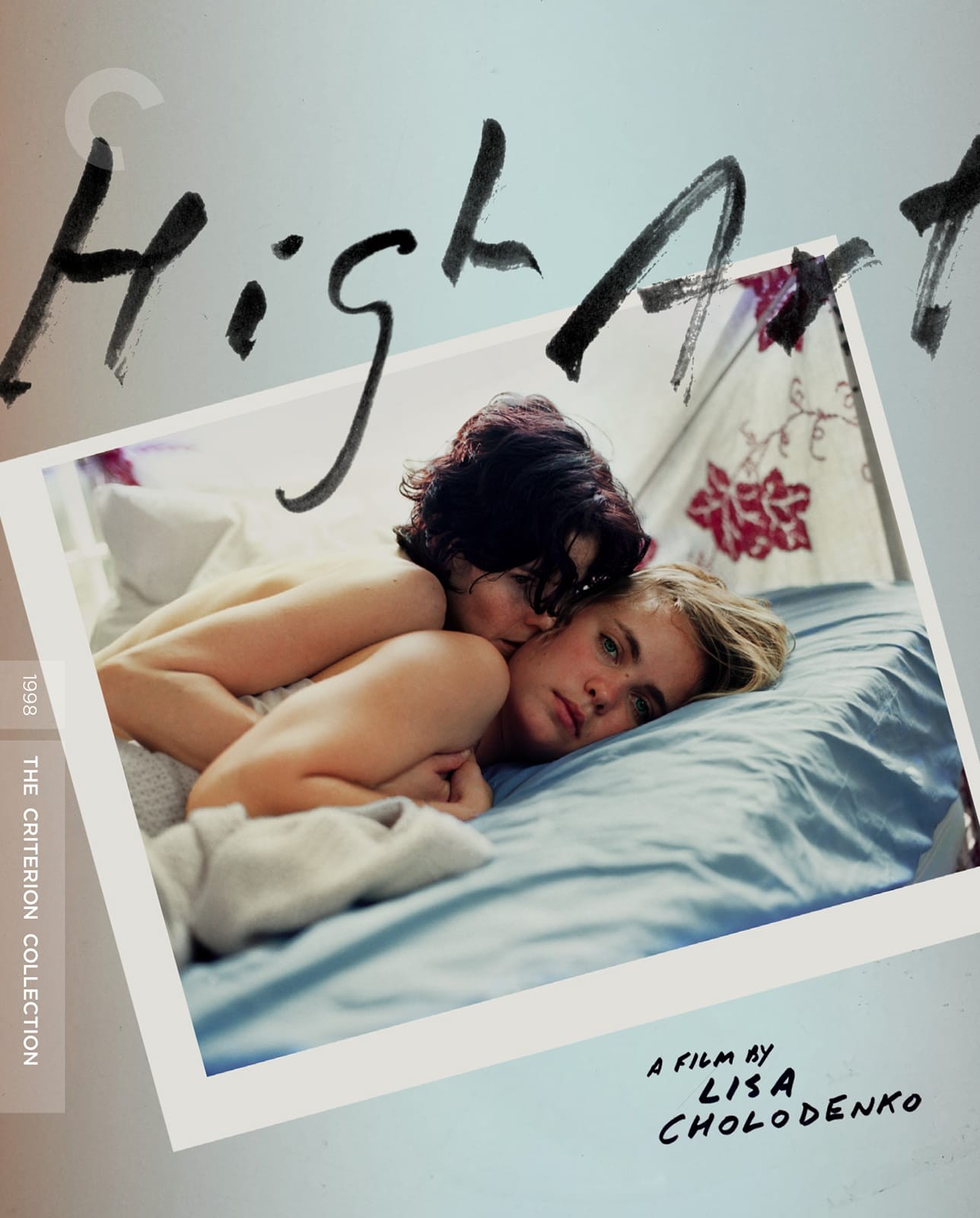
Love the Waters covers, they're great. High Art cover is the most instantly forgettable thing I've ever seen. Radha Mitchell doesn't look very happy about Ally Sheedy being on top of her, and the cover makes it look likes she's the star. Is this actually the case?