Criterion & Eclipse Cover Art & Packaging Babble-on Vol. 7
-
ryannichols7

- Joined: Mon Jul 16, 2012 6:26 pm
Re: Criterion & Eclipse Cover Art & Packaging Babble-on Vol. 7
not to steal your inevitable thunder Chris, but a Reddit user somehow got Spinal Tap a month early and shared packaging photos. I think this is another case like Paper Moon where there was an uneven/mixed reaction to the cover, but after seeing the entire package....it's hard to complain. looks awesome!
-
Walter Kurtz

- Joined: Sat Jul 25, 2020 7:03 pm
Re: Criterion & Eclipse Cover Art & Packaging Babble-on Vol. 7
Looking for the monthly release announcement on their website and confronted with the lead splash page for Jia's Caught by the Tides that has perhaps the worst graphic design of all time-----
a mixture of barf, snots and cum.
a mixture of barf, snots and cum.
-
mfunk9786

- Under Chris' Protection
- Joined: Fri May 16, 2008 8:43 pm
- Location: Miami, FL
-
domino harvey

- Dot Com Dom
- Joined: Wed Jan 11, 2006 6:42 pm
Re: Criterion & Eclipse Cover Art & Packaging Babble-on Vol. 7
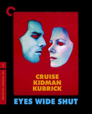
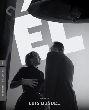
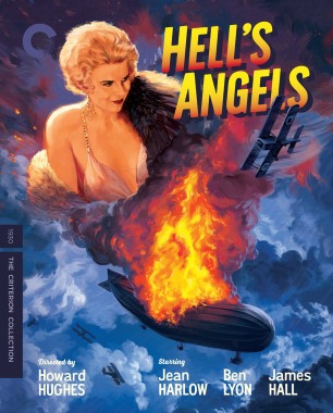
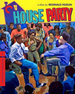
Great covers for El and House Party. Hell’s Angels artist does not know what Harlow looks like?
-
ryannichols7
- Joined: Mon Jul 16, 2012 6:26 pm
Re: Criterion & Eclipse Cover Art & Packaging Babble-on Vol. 7
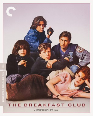
thrilled that El got an incredible cover. I feel like there's some foil stuff going on with Eyes Wide Shut
also important, before people bitch:
also important, before people bitch:
New cover based on an original poster by Katharina Kubrick and Christiane Kubrick
-
domino harvey
- Dot Com Dom
- Joined: Wed Jan 11, 2006 6:42 pm
Re: Criterion & Eclipse Cover Art & Packaging Babble-on Vol. 7
Guess his talent wasn’t hereditary
-
Tony le Stephanois
- Joined: Fri Nov 12, 2004 5:24 pm
- Location: Brooklyn, NY
Re: Criterion & Eclipse Cover Art & Packaging Babble-on Vol. 7
Major swimminghorses vibes on EWS
-
ryannichols7
- Joined: Mon Jul 16, 2012 6:26 pm
Re: Criterion & Eclipse Cover Art & Packaging Babble-on Vol. 7
this thing is getting cooked on BR and reddit, but it was never gonna have any other cover. the Kubrick family are clearly very close with Criterion, and on top of that, this was the poster Kubrick originally submitted to WB for reelsse
admittedly not the easiest movie to make a cover for, unless it was just a pic of Jeffrey Epstein
admittedly not the easiest movie to make a cover for, unless it was just a pic of Jeffrey Epstein
-
CSM126

- Joined: Thu Nov 04, 2004 12:22 pm
- Location: The Room
- Contact:
Re: Criterion & Eclipse Cover Art & Packaging Babble-on Vol. 7
I like the EWS cover but I do think just using the orgy mask would have made more people happy.
-
Finch

- Joined: Mon Jul 07, 2008 9:09 pm
- Location: United States
Re: Criterion & Eclipse Cover Art & Packaging Babble-on Vol. 7
No plans of buying it (love Kubrick but not this film) but I like the cover for EWS. Everyone's mileage obviously varies, but for me, there is nothing in this November's announcements. Been a solid year for Criterion on the whole, though.
-
mfunk9786
- Under Chris' Protection
- Joined: Fri May 16, 2008 8:43 pm
- Location: Miami, FL
Re: Criterion & Eclipse Cover Art & Packaging Babble-on Vol. 7
Bizarre to declare this about a cover made from original poster elements from direct family members of Kubrick, but OK!
-
guyetgenevieve
- Joined: Thu Sep 19, 2019 2:56 am
Re: Criterion & Eclipse Cover Art & Packaging Babble-on Vol. 7
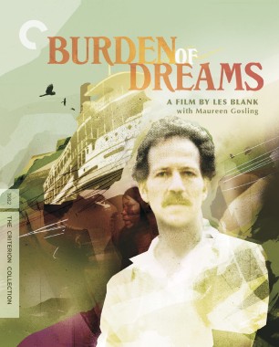
Burden of Dreams is a digipak. Everything else is a standard case
-
domino harvey
- Dot Com Dom
- Joined: Wed Jan 11, 2006 6:42 pm
Re: Criterion & Eclipse Cover Art & Packaging Babble-on Vol. 7
How many of Beatrice Welles’ handbags have you picked up?mfunk9786 wrote: Mon Aug 18, 2025 5:22 pmBizarre to declare this about a cover made from original poster elements from direct family members of Kubrick, but OK!
-
ryannichols7
- Joined: Mon Jul 16, 2012 6:26 pm
Re: Criterion & Eclipse Cover Art & Packaging Babble-on Vol. 7
yeah I'm trying to imagine what people wanted the cover to be, because I personally don't think any of the existing art for it is all that great. I guess just a simple mask but that seems a little ehCSM126 wrote: Mon Aug 18, 2025 5:19 pm I like the EWS cover but I do think just using the orgy mask would have made more people happy.
I like the Kubrick family cover. just hope that's foil so the colors look cool
-
aox

- Joined: Fri Jun 20, 2008 4:02 pm
- Location: nYc
Re: Criterion & Eclipse Cover Art & Packaging Babble-on Vol. 7
I don't normally comment on covers, but that Eyes Wide Shut cover is one of the most putrid pieces of shit I have ever countenessed in my life.
-
therewillbeblus

- Joined: Tue Dec 22, 2015 7:40 pm
Re: Criterion & Eclipse Cover Art & Packaging Babble-on Vol. 7
There's some great cover art/posters for Eyes Wide Shut on LB, any of those would be better than this
-
sabbath
- Joined: Fri Apr 25, 2014 10:29 am
Re: Criterion & Eclipse Cover Art & Packaging Babble-on Vol. 7
Katharina Kubrick talks to Isabel Stevens about her early poster designs for the film (Sight and Sound interview, November 2019)
How did you end up designing these posters?
After Stanley died my mother and I received artwork for the Eyes Wide Shut posters from the studio, but we really wanted to design them ourselves as a last gift to him. My mother in particular felt we could design a poster that he would have loved.
As you may know, Stanley was always very involved in his poster campaigns. It was important to him that his posters were elegant and stylish and immediately visible across the tube station or when you opened the newspaper. They had to be iconic. If you think of the ‘A’ that Philip Castle designed for A Clockwork Orange [1971], or the helmet that he did for Full Metal Jacket [1987], or the foot on the rose for Barry Lyndon… They were very strong images and they told you something, but not everything, about the film.
It was a very intense period. He died in March and the film came out in July, so we had very little time to do it. We were grieving, but it was important for us to come up with a design that we felt Stanley would have loved.
My mother and I are both artists, and because masks are very heavily featured in the film – we started with the premise of turning Tom and Nicole’s faces into masks. We got a photographer who shot them for us full-face. Then using Photoshop we made Nicole and Tom look as mask-like as possible.
Why did you select red as the background?
Red was one of dad’s favourite colours, and it’s also a very emotional colour. People respond to it in very different ways. Some people find it a scary colour. Red is the colour of prostitutes, isn’t it? And whenever you see somebody in sleazy underwear, it’s always got to be red.
Why weren’t they used?
The feedback from the studio was: “You’ve got two of the most beautiful movie stars in the film industry – why are you using masks?” So we thought, OK, let’s start again.
The mirror that was in the Harfords’ apartment was ours. So we had it photographed, and then we took that photograph of them in front of the mirror and made, again, what we thought was an elegant poster. It’s a shame the originals weren’t used because if you look at them now, 20 years later, I think they really hold up and they are definitely Tom and Nicole.
Last edited by sabbath on Mon Aug 18, 2025 5:45 pm, edited 2 times in total.
-
mfunk9786
- Under Chris' Protection
- Joined: Fri May 16, 2008 8:43 pm
- Location: Miami, FL
Re: Criterion & Eclipse Cover Art & Packaging Babble-on Vol. 7
In this case they were the original posters, the studio rejected them because they wanted photos of the leads. This and the straight-on mask shot of Cruise that they used elements of for the DVD box set a few years back.domino harvey wrote: Mon Aug 18, 2025 5:25 pmHow many of Beatrice Welles’ handbags have you picked up?mfunk9786 wrote: Mon Aug 18, 2025 5:22 pmBizarre to declare this about a cover made from original poster elements from direct family members of Kubrick, but OK!
At any rate, it’s certainly not something that’s been slapped together for this release.
EDIT: ah, much of this is now detailed above!
-
DeprongMori

- Joined: Fri Apr 04, 2014 5:59 am
- Location: San Francisco
Re: Criterion & Eclipse Cover Art & Packaging Babble-on Vol. 7
So, it looks like Criterion are officially dropping the “wacky E” for the Eclipse sets and are using the “wacky C” instead. Unless of course they just didn’t catch the error before doing the announcements. Perhaps they are trying to create a common branding element for The Criterion Collection, Criterion Premieres (formerly Janus Contemporaries), and Eclipse from Criterion. Sorry to see the old Eclipse from Criterion logo go — it was an innovative branding variant that still mapped clearly to Criterion.
-
ryannichols7
- Joined: Mon Jul 16, 2012 6:26 pm
Re: Criterion & Eclipse Cover Art & Packaging Babble-on Vol. 7
genuinely great read, thank you for this. some much needed insightsabbath wrote: Mon Aug 18, 2025 5:29 pm Katharina Kubrick talks to Isabel Stevens about her early poster designs for the film (Sight and Sound interview, November 2019)
-
Kracker

- Joined: Sat Sep 28, 2013 6:06 pm
Re: Criterion & Eclipse Cover Art & Packaging Babble-on Vol. 7
Didn't like the Kurbrick at all on first glance. But now I think its perfect, the simplicity, the font, it works. Good month for covers.
-
mteller
- Joined: Tue Nov 02, 2004 7:23 pm
Re: Criterion & Eclipse Cover Art & Packaging Babble-on Vol. 7
I love House Party, but man I hate that cover.
-
Matt

- Joined: Tue Nov 02, 2004 4:58 pm
Re: Criterion & Eclipse Cover Art & Packaging Babble-on Vol. 7
CSM126 wrote: Mon Aug 18, 2025 5:19 pm I like the EWS cover but I do think just using the orgy mask would have made more people happy.


-
swo17

- Bloodthirsty Butcher
- Joined: Tue Apr 15, 2008 2:25 pm
- Location: SLC, UT
Re: Criterion & Eclipse Cover Art & Packaging Babble-on Vol. 7
Can they fit a cardboard orgy mask inside the case?
-
Matt
- Joined: Tue Nov 02, 2004 4:58 pm
Re: Criterion & Eclipse Cover Art & Packaging Babble-on Vol. 7
If Severin was releasing it, we'd get a real mask, a Band-Aid tin with a roll-up in it, a camisole, and a string of Christmas lights.