I was so thrilled to be asked by Criterion's Eric Skillman (aka the best art director in the world) to contribute a new cover to their upcoming release of Fritz Lang's iconic noir flick, wildly considered one of it not his best American film. I'm a massive fan of Lang and a big noir devotee, and on top of that this would be my first proper "old hollywood" title with the Collection, I really wanted to flex my muscles on this one. The direction was very specific, highlighting the leads Gloria Grahame and Glenn Ford in an artful montage, with only a hint of Gloria's "reveal" near the end, and leaning hard into the aesthetics of the genre. I knew I wanted to nail this as much as possible and give it the time and care it deserved, but as always, I wanted to play around in the sandbox of a classic film that I love so I created some left field concepts too that offered a different perspective on this brutal film. Obviously, the elegant montage was the way to go so we focused on refining that to the elegant final piece.
I knew early on I wanted to illustrate this cover to bring out the silver screen glow of nitrate film stock. I'm admittedly not much of an illustrator and haven't done a proper illustrated piece for Criterion since the Elephant Man, so I had to develop a method that worked for my skill level. I started by collaging together images from the film to find the composition that worked and captured tropes of the genre (he can't not be holding a smoking gun and wearing a fedora, c'mon). From there, (since I didn't have any black paper or white pencils), I created a negative version of the image, and used that as reference for a pencil sketch (you can see a rough draft in a later slide). That was scanned in and then finished and brought to life using digital pencils and smudge techniques, even incorporating the film's original title card into the illustration and giving it some good smears. Ultimately I couldn't be happier or more proud of how it came out.
Criterion & Eclipse Cover Art & Packaging Babble-on Vol. 7
-
FrauBlucher

- Joined: Tue Jul 16, 2013 12:28 am
- Location: Greenwich Village
Re: Criterion & Eclipse Cover Art & Packaging Babble-on Vol. 7
This from Sister Hyde's Instagram
-
Matt

- Joined: Tue Nov 02, 2004 4:58 pm
Re: Criterion & Eclipse Cover Art & Packaging Babble-on Vol. 7
Always happy to see more work by Sister Hyde, but I greatly prefer the earlier, simpler draft that emphasizes the "blinds" effect and doesn't have the coffee pot. Once you put the pot, the steam, the actors' names, the slanted title treatment, and the branding on it, it's way too much.
-
FrauBlucher
- Joined: Tue Jul 16, 2013 12:28 am
- Location: Greenwich Village
Re: Criterion & Eclipse Cover Art & Packaging Babble-on Vol. 7
I don’t mind the cover but I’d like it a whole lot more minus the coffee pot. I don’t believe it’s necessary
-
ryannichols7

- Joined: Mon Jul 16, 2012 6:26 pm
Re: Criterion & Eclipse Cover Art & Packaging Babble-on Vol. 7
I like Sister Hyde's work but count me in as one who would support that cover more with more simplicity. that said, my much bigger issue is probably not their fault at all, but a Criterion issue at large. why must black and white movie = black and white cover? this is getting boring and is happening far too often, obviously especially on the noir side of things. one of the reasons I was so grateful for Indicator's Columbia Noir boxes was the fact that they truly paid tribute to the marketing of that genre with bold ass colors, as the posters often were. I love the original poster for The Big Heat like I do Double Indemnity or Midnight. I know we're never gonna win the original poster battle with Criterion, but can we at least have more fun covers like The Palm Beach Story or the 2011 cover for The Rules of the Game? just some ideas.
also that Carnal Knowledge designer has done some genuinely cool work. I have no idea how they made a cover that boring - reminds me of how the Scarface designer usually had pretty good stuff but ended up making that. anyway, yeah, weird month artwork wise.
also that Carnal Knowledge designer has done some genuinely cool work. I have no idea how they made a cover that boring - reminds me of how the Scarface designer usually had pretty good stuff but ended up making that. anyway, yeah, weird month artwork wise.
it's maddening that a movie that already didn't get enough love (it should've won the Palme d'Or but lost to...I don't wanna talk about it, and then didn't get Oscar nominated), but Criterion unceremoniously dumping it is just as disappointing. I'm very grateful for the BFI's edition, which does the movie and Payal Kapadia justice!DimitriL wrote: Wed Apr 16, 2025 6:07 pmThe way Peter Becker was raving about it at NYFF, pretty much making it clear he thought it was the best film of the year, I thought it was a sure thing. But Flow was going to go Contemporaries until it won Best Animated, so I can only imagine the failure of either France or India to even nominate it for Best Foreign Film at the Oscars had a lot to do with it.zedz wrote: Tue Apr 15, 2025 10:31 pmRegardless of what anybody thinks about All We Imagine As Light, it just makes sense on paper: it's one of the most highly praised and highly awarded films in years, is directed by an emerging woman filmmaker, and comes from a major filmmaking nation drastically underrepresented in the collection. I would have thought they'd be falling over themselves to add it to the main line.
-
tenia

- Ask Me About My Bassoon
- Joined: Wed Apr 29, 2009 3:13 pm
Re: Criterion & Eclipse Cover Art & Packaging Babble-on Vol. 7
Maybe it's just a way to ensure they don't release All We Imagine in 6 years in the mainline, but right now though through the Contemporary line.
-
Walter Kurtz

- Joined: Sat Jul 25, 2020 7:03 pm
Re: Criterion & Eclipse Cover Art & Packaging Babble-on Vol. 7
The simple design will look much better on a slipcase than the flimsy worse-than-copy-paper inserts they put in the plastic cases. They could also do a 2-page spread of one of those panoramic shots for the disc holder jacket.guyetgenevieve wrote: Tue Apr 15, 2025 6:57 pm Worth noting that it looks like the Barry Lyndon 4K will be housed in a digipak instead of a standard case like its original release
Having said that it certainly depends on whether the digipak is constructed more like Ambersons with a bit of sturdiness to it... or the flimsy piece-of-shit slipcase-er-slip-paper for the Europe Trilogy.
-
CSM126

- Joined: Thu Nov 04, 2004 12:22 pm
- Location: The Room
- Contact:
Re: Criterion & Eclipse Cover Art & Packaging Babble-on Vol. 7
Ya know, with Criterion being owned by a legit billionaire now you’d think they could invest in sturdier digipaks. I mean, Indicator does it on a small label budget so realistically Criterion shouldn’t need the extra cash… but now they really have no excuse for flimsy digipaks. I’m sure there’s an added cost for thicker material but it can’t be that much worse when you’re doing it in bulk numbers.
-
jwo17

- Joined: Fri Feb 27, 2015 1:02 pm
Re: Criterion & Eclipse Cover Art & Packaging Babble-on Vol. 7
Just keep it in the shrink and nobody gets hurt..Walter Kurtz wrote: Thu Apr 17, 2025 4:33 pmThe simple design will look much better on a slipcase than the flimsy worse-than-copy-paper inserts they put in the plastic cases. They could also do a 2-page spread of one of those panoramic shots for the disc holder jacket.guyetgenevieve wrote: Tue Apr 15, 2025 6:57 pm Worth noting that it looks like the Barry Lyndon 4K will be housed in a digipak instead of a standard case like its original release
Having said that it certainly depends on whether the digipak is constructed more like Ambersons with a bit of sturdiness to it... or the flimsy piece-of-shit slipcase-er-slip-paper for the Europe Trilogy.
-
Matt
- Joined: Tue Nov 02, 2004 4:58 pm
Re: Criterion & Eclipse Cover Art & Packaging Babble-on Vol. 7
Many consumers are genuinely stupid and many of them also have an unreasonable hatred for black-and-white films. I wouldn't be surprised if companies get a lot of returned discs because people thought they were buying a color film based on full-color cover art. But Criterion has done some mostly black-and-white illustrated covers with spot color, like The Gunfighter and Destry Rides Again that I think are really successful and wouldn't mislead anyone.ryannichols7 wrote: Thu Apr 17, 2025 2:23 pmwhy must black and white movie = black and white cover? this is getting boring and is happening far too often, obviously especially on the noir side of things.
-
DimitriL
- Joined: Thu Jul 24, 2014 10:07 pm
Re: Criterion & Eclipse Cover Art & Packaging Babble-on Vol. 7
Also, there's so many intensely colorful covers in the collection that a black and white stands out. But even so, there's still a decent number of colorful covers for BW films lately. Miracle in Milan. The Tod Browning collection. A Woman in Paris. Combine those with he ones with spot color - Arsenic and Old Lace also springs to mind - and I think you have a rather decently varied amount of color approaches.
(It's interesting that the Chaplin sets have by and large gone for a VERY colorful cover treatment, with only a couple of exceptions.)
(It's interesting that the Chaplin sets have by and large gone for a VERY colorful cover treatment, with only a couple of exceptions.)
-
olmo

- Joined: Wed Jul 16, 2014 5:10 pm
Re: Criterion & Eclipse Cover Art & Packaging Babble-on Vol. 7
The aesthetic quality of an item is not a billionaire's concern the profit margin is.CSM126 wrote: Thu Apr 17, 2025 5:13 pm Ya know, with Criterion being owned by a legit billionaire now you’d think they could invest in sturdier digipaks. I mean, Indicator does it on a small label budget so realistically Criterion shouldn’t need the extra cash… but now they really have no excuse for flimsy digipaks. I’m sure there’s an added cost for thicker material but it can’t be that much worse when you’re doing it in bulk numbers.
-
CSM126
- Joined: Thu Nov 04, 2004 12:22 pm
- Location: The Room
- Contact:
Re: Criterion & Eclipse Cover Art & Packaging Babble-on Vol. 7
Well, to be fair, his whole pitch when he offered to buy them was “what could you do if you spent my money”. I guess the answer was “license The Wiz”.olmo wrote: Fri Apr 18, 2025 5:50 pmThe aesthetic quality of an item is not a billionaire's concern the profit margin is.CSM126 wrote: Thu Apr 17, 2025 5:13 pm Ya know, with Criterion being owned by a legit billionaire now you’d think they could invest in sturdier digipaks. I mean, Indicator does it on a small label budget so realistically Criterion shouldn’t need the extra cash… but now they really have no excuse for flimsy digipaks. I’m sure there’s an added cost for thicker material but it can’t be that much worse when you’re doing it in bulk numbers.
-
tenia
- Ask Me About My Bassoon
- Joined: Wed Apr 29, 2009 3:13 pm
Re: Criterion & Eclipse Cover Art & Packaging Babble-on Vol. 7
It's not just an aesthetic thing : actually, thicker cardboard really isn't. It's a matter of sturdiness, in a world where most of these products are bought online and shipped, so it's ensuring customers will be happy with a product able to absorb transportation issues and not ask for a replacement (which cost money). Sturdiness also kinda sends a message of a more lavish product, and people don't like buying a supposedly high-end premium priced product and feel like it's made of cheapo material. It's a brand image, and this brings money when it's good.olmo wrote:The aesthetic quality of an item is not a billionaire's concern the profit margin is.CSM126 wrote: Thu Apr 17, 2025 5:13 pm Ya know, with Criterion being owned by a legit billionaire now you’d think they could invest in sturdier digipaks. I mean, Indicator does it on a small label budget so realistically Criterion shouldn’t need the extra cash… but now they really have no excuse for flimsy digipaks. I’m sure there’s an added cost for thicker material but it can’t be that much worse when you’re doing it in bulk numbers.
-
olmo
- Joined: Wed Jul 16, 2014 5:10 pm
Re: Criterion & Eclipse Cover Art & Packaging Babble-on Vol. 7
Which is what I said. Billionaires become billionaires because they don't spend money when they don't have to.tenia wrote: Fri Apr 18, 2025 6:25 pmIt's not just an aesthetic thing : actually, thicker cardboard really isn't. It's a matter of sturdiness, in a world where most of these products are bought online and shipped, so it's ensuring customers will be happy with a product able to absorb transportation issues and not ask for a replacement (which cost money). Sturdiness also kinda sends a message of a more lavish product, and people don't like buying a supposedly high-end premium priced product and feel like it's made of cheapo material. It's a brand image, and this brings money when it's good.olmo wrote:The aesthetic quality of an item is not a billionaire's concern the profit margin is.CSM126 wrote: Thu Apr 17, 2025 5:13 pm Ya know, with Criterion being owned by a legit billionaire now you’d think they could invest in sturdier digipaks. I mean, Indicator does it on a small label budget so realistically Criterion shouldn’t need the extra cash… but now they really have no excuse for flimsy digipaks. I’m sure there’s an added cost for thicker material but it can’t be that much worse when you’re doing it in bulk numbers.
Billionaires attain their status by being terrible people, philanthropists & artisans they are not so don't go hoping for any more lavish product soon unless there's a price hike.
-
tenia
- Ask Me About My Bassoon
- Joined: Wed Apr 29, 2009 3:13 pm
Re: Criterion & Eclipse Cover Art & Packaging Babble-on Vol. 7
Except that ensuring more customers' are happy to come back because they feel they have value-for-money and don't have to return half their purchases because of flimsy packaging does help the profits.
-
dwk

- Joined: Sat Jun 12, 2010 10:10 pm
-
Walter Kurtz
- Joined: Sat Jul 25, 2020 7:03 pm
Re: Criterion & Eclipse Cover Art & Packaging Babble-on Vol. 7
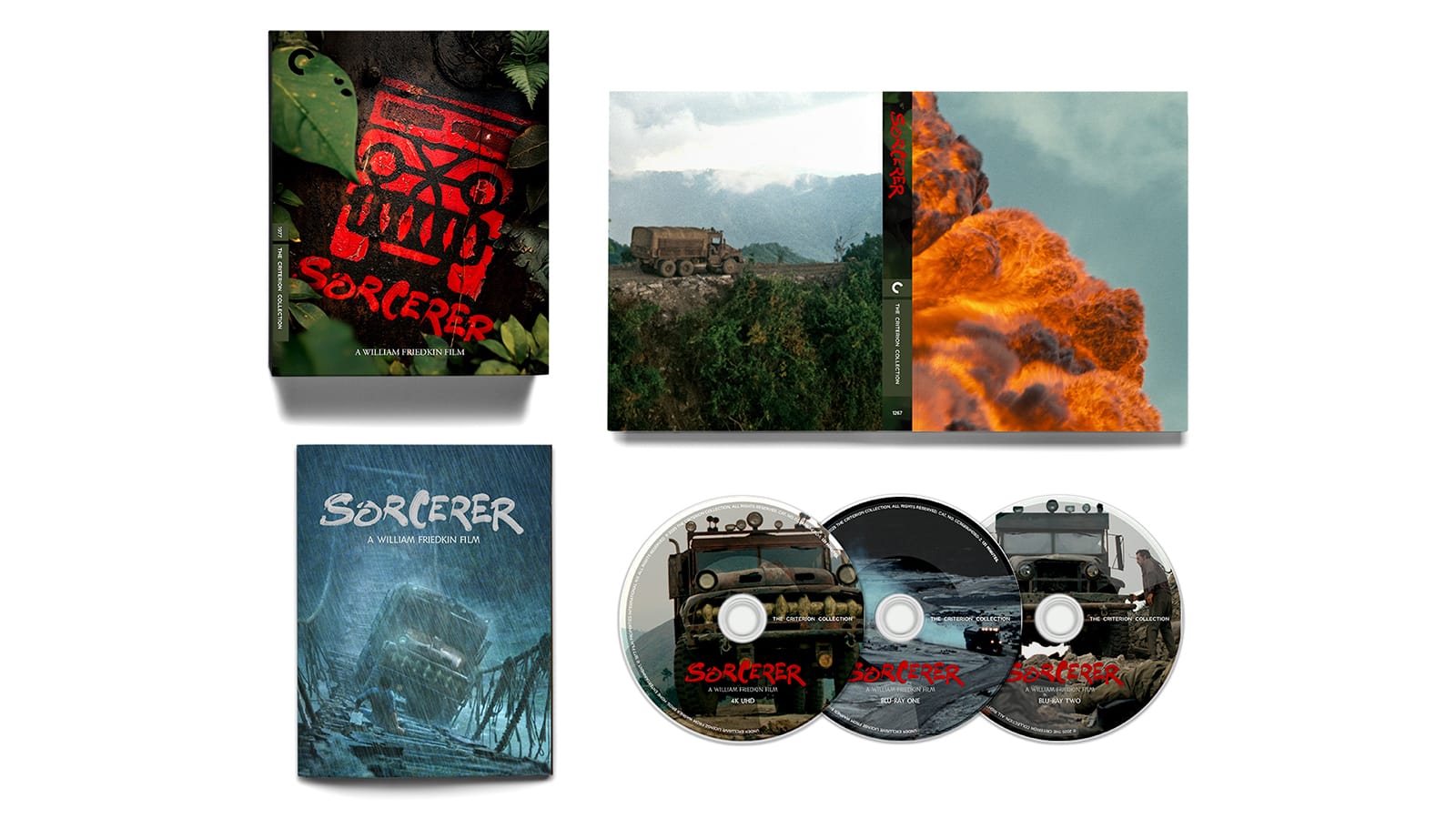
Just curious. Is that a spoiler on the disc holder? (But one of the most striking covers in the entire collection.)
-
sabbath
- Joined: Fri Apr 25, 2014 10:29 am
Re: Criterion & Eclipse Cover Art & Packaging Babble-on Vol. 7
Which one? If you mean the flame, no, that's a premise.Walter Kurtz wrote: Thu Apr 24, 2025 9:33 pm Just curious. Is that a spoiler on the disc holder? (But one of the most striking covers in the entire collection.)
-
Walter Kurtz
- Joined: Sat Jul 25, 2020 7:03 pm
Re: Criterion & Eclipse Cover Art & Packaging Babble-on Vol. 7
Great, thanks. I was going left to right and doing psych test evaluation/Pudovkin montage theory and saw 1) truck with nitro or dynamite 2) explosion... therefore 3) roll credits. After reading that someone wanted to put out Seven in a what's in the box package... I'm only sure of one thing. We all live in an idiocracy.
-
DimitriL
- Joined: Thu Jul 24, 2014 10:07 pm
Re: Criterion & Eclipse Cover Art & Packaging Babble-on Vol. 7
Yeah, it makes more sense as a premise image when you realize that the fire is actually the FRONT of the disc holder.Walter Kurtz wrote: Fri Apr 25, 2025 2:57 pm Great, thanks. I was going left to right and doing psych test evaluation/Pudovkin montage theory and saw 1) truck with nitro or dynamite 2) explosion... therefore 3) roll credits. After reading that someone wanted to put out Seven in a what's in the box package... I'm only sure of one thing. We all live in an idiocracy.
-
cdnchris

- Site Admin
- Joined: Tue Nov 02, 2004 6:45 pm
- Location: Washington
- Contact:
Re: Criterion & Eclipse Cover Art & Packaging Babble-on Vol. 7
Withnail and I [4K]
How to Get Ahead in Advertising
The Umbrellas of Cherbourg [4K]
In the Heat of the Night [4K]
The Wind Will Carry Us
Killer of Sheep [4K]
The Three Musketeers/The Four Musketeers [4K]
Restoration Details:
Withnail and I
How to Get Ahead in Advertising
The Umbrellas of Cherbourg
In the Heat of the Night
The Wind Will Carry Us
Killer of Sheep
The Three Musketeers/The Four Musketeers
How to Get Ahead in Advertising
The Umbrellas of Cherbourg [4K]
In the Heat of the Night [4K]
The Wind Will Carry Us
Killer of Sheep [4K]
The Three Musketeers/The Four Musketeers [4K]
Restoration Details:
Withnail and I
How to Get Ahead in Advertising
The Umbrellas of Cherbourg
In the Heat of the Night
The Wind Will Carry Us
Killer of Sheep
The Three Musketeers/The Four Musketeers
-
CSM126
- Joined: Thu Nov 04, 2004 12:22 pm
- Location: The Room
- Contact:
Re: Criterion & Eclipse Cover Art & Packaging Babble-on Vol. 7
As regards the interior of the Musketeers…
I think I found Waldo
I think I found Waldo
-
olmo
- Joined: Wed Jul 16, 2014 5:10 pm
Re: Criterion & Eclipse Cover Art & Packaging Babble-on Vol. 7
The inner design of The Three Musketeers brings to mind the illustrations of the much-missed Jason Polan.
-
mteller

- Joined: Tue Nov 02, 2004 7:23 pm
Re: Criterion & Eclipse Cover Art & Packaging Babble-on Vol. 7
My thoughts exactly.olmo wrote: Thu May 08, 2025 4:51 pm The inner design of The Three Musketeers brings to mind the illustrations of the much-missed Jason Polan.
-
low
- Joined: Mon Mar 24, 2014 3:43 am
Re: Criterion & Eclipse Cover Art & Packaging Babble-on Vol. 7
I'm pleased to see the return of what at least resembles the classic double-Alpha width spine for the Musketeers release.