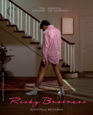
Didn't notice at first, but Risky Business is an illustration, not a cap, from the artist that did Criterion's Police Story and Throw Down covers.
Criterion & Eclipse Cover Art & Packaging Babble-on Vol. 7
-
dwk

- Joined: Sat Jun 12, 2010 10:10 pm
Re: Criterion & Eclipse Cover Art & Packaging Babble-on Vol. 7


Last edited by dwk on Mon Apr 15, 2024 4:41 pm, edited 1 time in total.
-
Matt

- Joined: Tue Nov 02, 2004 4:58 pm
Re: Criterion & Eclipse Cover Art & Packaging Babble-on Vol. 7
Le Samouraï seems to be a rare example of giving a completely new cover to what is a simple format upgrade and not a new addition with more supplements.
The old cover was perfect, one of their best.
The old cover was perfect, one of their best.
-
therewillbeblus

- Joined: Tue Dec 22, 2015 7:40 pm
Re: Criterion & Eclipse Cover Art & Packaging Babble-on Vol. 7
None are great, none are horrible - a curious choice for Perfect Days, but it's both in step with the spirit of the film and made me laugh in its bald irony
-
Kracker

- Joined: Sat Sep 28, 2013 6:06 pm
Re: Criterion & Eclipse Cover Art & Packaging Babble-on Vol. 7
and of course the Concubine cover gets to be the one that looks like garbage, dont recall that being original poster art or anything.
-
Walter Kurtz

- Joined: Sat Jul 25, 2020 7:03 pm
Re: Criterion & Eclipse Cover Art & Packaging Babble-on Vol. 7
Maybe the bifurcation between the colorful left-top and pure-red bottom-right is meant to visually highlight the political bifurcation/end of the happy/good times contrasted with the new austerity under the little RED book waving commies of Chairman Mao?
-
Walter Kurtz
- Joined: Sat Jul 25, 2020 7:03 pm
Re: Criterion & Eclipse Cover Art & Packaging Babble-on Vol. 7
Or is it simply that everyone who is in love (red) with Gong's acting is shocked (thus a shocking bifurcation) that she's finally in the collection?
-
Beloved Aunt

- Joined: Tue Dec 14, 2021 7:28 pm
Re: Criterion & Eclipse Cover Art & Packaging Babble-on Vol. 7
Farewell, My Concubine is a thoroughly decent effort and the Rocha cover is actually pretty terrific!
-
dwk
- Joined: Sat Jun 12, 2010 10:10 pm
Re: Criterion & Eclipse Cover Art & Packaging Babble-on Vol. 7
Yeah, the title treatment is the real issue with Farewell's cover. Farewell crossing out of the red into the picture just looks sloppy.Finch wrote: Mon Apr 15, 2024 4:37 pm I find the empty space on the Farewell cover baffling, too, and the placement of the word Farewell is really awkward. Skillman could have applied some shadow to the title fonts if he was concerned about the title not standing out enough against the busy background.
-
zedz

- Joined: Sun Nov 07, 2004 11:24 pm
Re: Criterion & Eclipse Cover Art & Packaging Babble-on Vol. 7
If memory serves, this was the first such instance:Matt wrote: Mon Apr 15, 2024 4:40 pm Le Samouraï seems to be a rare example of giving a completely new cover to what is a simple format upgrade and not a new addition with more supplements.

-
zedz
- Joined: Sun Nov 07, 2004 11:24 pm
Re: Criterion & Eclipse Cover Art & Packaging Babble-on Vol. 7
That's the original poster, so Criterion only deserves credit for not screwing it up.Randall Maysin Again wrote: Mon Apr 15, 2024 7:24 pm Farewell, My Concubine is a thoroughly decent effort and the Rocha cover is actually pretty terrific!

-
Walter Kurtz
- Joined: Sat Jul 25, 2020 7:03 pm
Re: Criterion & Eclipse Cover Art & Packaging Babble-on Vol. 7
But that may be shortchanging the genius of the person at Criterion who changed the red color from Pantone #485a to Pantone #485b!
-
afilmcionado
- Joined: Mon Sep 28, 2020 1:14 pm
Re: Criterion & Eclipse Cover Art & Packaging Babble-on Vol. 7
I don’t aesthetically love the Farewell My Concubine cover but the idea is strong: the yellow and red combo is symbolic of the CCP, and it cuts through the image like a knife, with all the red almost like blood spilled.
-
Murdoch

- Joined: Mon Apr 21, 2008 3:59 am
- Location: Upstate NY
Re: Criterion & Eclipse Cover Art & Packaging Babble-on Vol. 7
The Le Samouraï cover is terrible. The old cover was one of my earliest memories of seeing a Criterion cover, it's a shame they changed it.
-
cdnchris

- Site Admin
- Joined: Tue Nov 02, 2004 6:45 pm
- Location: Washington
- Contact:
Re: Criterion & Eclipse Cover Art & Packaging Babble-on Vol. 7
La haine [4K]
Picnic at Hanging Rock [4K] (Booklet)
I Am Cuba [4K]
Werckmeister Harmonies [4K]
Dogfight
Picnic at Hanging Rock [4K] (Booklet)
I Am Cuba [4K]
Werckmeister Harmonies [4K]
Dogfight
-
dwk
- Joined: Sat Jun 12, 2010 10:10 pm
Re: Criterion & Eclipse Cover Art & Packaging Babble-on Vol. 7
Odd, it appears that the Three Colors boxset is getting broken up into individual releases in standard Scanavo cases. (and Blue and White have different cover art.) There is no listing for these on Criterion's site, but the op at reddit works at B&N,
-
domino harvey

- Dot Com Dom
- Joined: Wed Jan 11, 2006 6:42 pm
Re: Criterion & Eclipse Cover Art & Packaging Babble-on Vol. 7
Those comments are bizarre-- why are all of those commentators acting like this is the norm when it's never happened beforedwk wrote: Fri May 03, 2024 3:46 pm Odd, it appears that the Three Colors boxset is getting broken up into individual releases in standard Scanavo cases. (and Blue and White have different cover art.) There is no listing for these on Criterion's site, but the op at reddit works at B&N,
-
dwk
- Joined: Sat Jun 12, 2010 10:10 pm
Re: Criterion & Eclipse Cover Art & Packaging Babble-on Vol. 7
They have changed packaging and broken up boxsets before, but this is the first time I can think of them doing it to a Blu-ray set.
-
fiendishthingy
- Joined: Wed Feb 12, 2020 5:55 pm
Re: Criterion & Eclipse Cover Art & Packaging Babble-on Vol. 7
The Three Colors trilogy seems like a very odd set to break up. Is there significant demand for, say, a standalone edition of Blue the way there was enough demand for standalone releases of The Umbrellas of Cherbourg or The Young Girls of Rochefort from the Demy set?
-
tenia

- Ask Me About My Bassoon
- Joined: Wed Apr 29, 2009 3:13 pm
Re: Criterion & Eclipse Cover Art & Packaging Babble-on Vol. 7
Yeah, outside of any individual title previously on digi and re-released in Scanavo, this seems like a weird first time to split a digi boxset to individual plastic case releases. I'd understand stuff like Pasolini's Trilogy of Life, World Cinema Project movies or Demys, but the 3 colors trilogy ?
-
Matt
- Joined: Tue Nov 02, 2004 4:58 pm
Re: Criterion & Eclipse Cover Art & Packaging Babble-on Vol. 7
Don’t shoot me, but it’s the only one I really like. I would buy a standalone. But this is probably just easier for them to manufacture and package. I doubt they’d split up something made specifically as a trilogy.fiendishthingy wrote:Is there significant demand for, say, a standalone edition of Blue
-
denti alligator

- Joined: Thu Nov 04, 2004 1:36 am
- Location: "born in heaven, raised in hell"
Re: Criterion & Eclipse Cover Art & Packaging Babble-on Vol. 7
These films weren‘t specifically made as a trilogy?
-
Walter Kurtz
- Joined: Sat Jul 25, 2020 7:03 pm
Re: Criterion & Eclipse Cover Art & Packaging Babble-on Vol. 7
Of course this is a trilogy. The titles of the films are the three colors of the French tri-color flag. Each film keys in on the colors of the titles. And the last five minutes of the last film make it obvious this is a trilogy...
-
Walter Kurtz
- Joined: Sat Jul 25, 2020 7:03 pm
Re: Criterion & Eclipse Cover Art & Packaging Babble-on Vol. 7
As far a packaging goes, I always thought this was one of Criterion's best efforts. All three images are mediated reality... from a TV screen, from a dream (or fantasy), and from a photograph. It's weird that they bust this concept up.
-
domino harvey
- Dot Com Dom
- Joined: Wed Jan 11, 2006 6:42 pm
Re: Criterion & Eclipse Cover Art & Packaging Babble-on Vol. 7
I still have my Miramax DVD of Bleu and never bothered to upgrade to the box set, so I'm not opposed to just picking that one up either... but this is one of the more interconnected of trilogy/three-film boxes they've released, so I'm still a little bumfuzzledMatt wrote: Fri May 03, 2024 9:03 pmDon’t shoot me, but it’s the only one I really like. I would buy a standalone. But this is probably just easier for them to manufacture and package. I doubt they’d split up something made specifically as a trilogy.fiendishthingy wrote:Is there significant demand for, say, a standalone edition of Blue
-
FrauBlucher

- Joined: Tue Jul 16, 2013 12:28 am
- Location: Greenwich Village
Re: Criterion & Eclipse Cover Art & Packaging Babble-on Vol. 7
Does anyone know who did the cover for Pat Garrett and Billy the Kid? It's not listed on the page