A Japanese poster for "Repast" -- from a Setsuko Hara retrospective, I suspect.
The artwork for the Japanese DVD release.
MoC Cover Art & Packaging Babble-on
-
Michael Kerpan

- Spelling Bee Champeen
- Joined: Wed Nov 03, 2004 5:20 pm
- Location: New England
- Contact:
-
Monsieur Verdoux

- Joined: Tue May 16, 2006 8:56 pm
- Location: Bristol, UK
- Contact:
-
Michael Kerpan
- Spelling Bee Champeen
- Joined: Wed Nov 03, 2004 5:20 pm
- Location: New England
- Contact:
-
Michael Kerpan
- Spelling Bee Champeen
- Joined: Wed Nov 03, 2004 5:20 pm
- Location: New England
- Contact:
-
Michael Kerpan
- Spelling Bee Champeen
- Joined: Wed Nov 03, 2004 5:20 pm
- Location: New England
- Contact:
I agree. Although the Japanese DVD cover uses the same shot as the poster, it mucks up the composition.fred wrote:I think the poster is stunning (I want one!). Not crazy about the cropping on the Japanese DVD, but that shouldn't be a problem for Masters of Cinema.
I'm not entirely certain whether this exact shot occurs in the film or not -- but there certainly are similar ones.
MEK
-
Jun-Dai

- 監督
- Joined: Thu Nov 04, 2004 8:34 am
- Location: London, UK
- Contact:
I'd have to agree with Kerpan's points about the cover, and I prefer the poster/cover he posted.
I threw up a stub on the film at wikipedia
I threw up a stub on the film at wikipedia
-
der_Artur

- Joined: Mon Nov 08, 2004 10:22 pm
- Location: stuttgart
peerpee wrote:Having said that. We're constantly re-evaluating everything, and it may change.
If my vote counts: I love the artwork. Original poster artwork on the DVD for me can somehow influence the mood of the experience. MOC's selection of filmstills as covers is always great, but if you ave original artwork, even if it might disappoint modern tastes, you should use it.
-
Michael Kerpan
- Spelling Bee Champeen
- Joined: Wed Nov 03, 2004 5:20 pm
- Location: New England
- Contact:
Did you ever post a link to the full-size (presumably oddly double length) poster? I'd be curious to see what they did on the top half. ;~}
Sounds like the upcoming DVD covers should be nice.
(Hoping to see a few more Naruse rarities soon).
I hope the first set sells well -- and you can release some of the less well-known (but also remarkable) films like "Traveling Actors" and "Song Lantern" (and some silents).
MEK
Sounds like the upcoming DVD covers should be nice.
(Hoping to see a few more Naruse rarities soon).
I hope the first set sells well -- and you can release some of the less well-known (but also remarkable) films like "Traveling Actors" and "Song Lantern" (and some silents).
MEK
-
jamie_summers
- Joined: Sun May 21, 2006 10:02 am
- Contact:
To consider: Beaver, Village Voice, Stylus Magazine. I appreciate they're in low quality but they're interesting ideas to look at.

-
a.khan

- Joined: Sat May 20, 2006 7:28 am
- Location: Los Angeles
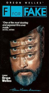
No, don't change it, it's brilliant!CSM126 wrote:F for Fake!
-
Cinesimilitude
- Joined: Tue Jul 09, 2013 4:43 am
-
Jem

- Joined: Mon May 02, 2005 3:03 am
- Location: Potts Point
Looking at the black and white MOC banner, I assumed it was only a 'mock-up' of the final concept anyway. Though I could se the final 'SncDthMnky' cover with bit of restrained color, just to bring it home.Narshty wrote:SncDthMnky's cover is a nice idea in concept, but I suspect on shop shelves it would just look ineptly printed.
-
Cinesimilitude
- Joined: Tue Jul 09, 2013 4:43 am
-
Michael Kerpan
- Spelling Bee Champeen
- Joined: Wed Nov 03, 2004 5:20 pm
- Location: New England
- Contact:
-
Cinesimilitude
- Joined: Tue Jul 09, 2013 4:43 am
-
indiannamednobody

- Joined: Fri Apr 14, 2006 4:47 pm
- Location: Dub I
