Criterion & Eclipse Cover Art & Packaging Babble-on Vol. 7
-
FrauBlucher

- Joined: Tue Jul 16, 2013 12:28 am
- Location: Greenwich Village
Re: Criterion & Eclipse Cover Art & Packaging Babble-on Vol. 7
I never understood why Criterion never listed what kind of packaging on films’ pages
-
swo17

- Bloodthirsty Butcher
- Joined: Tue Apr 15, 2008 2:25 pm
- Location: SLC, UT


-
acroyear

- Joined: Mon Sep 24, 2012 2:22 am
Re: Criterion & Eclipse Cover Art & Packaging Babble-on Vol. 7
Pinocchio, simply... wow!
-
Rupert Pupkin
- Joined: Thu Oct 20, 2005 1:34 pm
Re: Criterion & Eclipse Cover Art & Packaging Babble-on Vol. 7
Contrary to what I could expect from what I can see at criterion.com (which shows a different artwork for each movie), the Bo Widerbergs box et turned out to be a big Scanavo box not a digipack.
https://www.criterion.com/boxsets/6737- ... ish-cinema
https://www.criterion.com/boxsets/6737- ... ish-cinema
-
CSM126

- Joined: Thu Nov 04, 2004 12:22 pm
- Location: The Room
- Contact:
Re: Criterion & Eclipse Cover Art & Packaging Babble-on Vol. 7
They’ve made a habit in recent years of creating individual art for titles that are packaged that way. It’s usually just for the website but I think a few have had the individual artwork used in booklets or inner spreads.Rupert Pupkin wrote: Mon Sep 18, 2023 11:58 pm Contrary to what I could expect from what I can see at criterion.com (which shows a different artwork for each movie), the Bo Widerbergs box et turned out to be a big Scanavo box not a digipack.
https://www.criterion.com/boxsets/6737- ... ish-cinema
-
barbarella satyricon

- Joined: Fri Jun 21, 2019 11:45 am
Re: Criterion & Eclipse Cover Art & Packaging Babble-on Vol. 7
...
Last edited by barbarella satyricon on Fri Sep 12, 2025 3:23 pm, edited 1 time in total.
-
RPG

- Joined: Thu Feb 05, 2015 10:05 pm
Re: Criterion & Eclipse Cover Art & Packaging Babble-on Vol. 7
Seriously. I was underwhelmed by the movie, but that artwork is top notch.
-
Rupert Pupkin
- Joined: Thu Oct 20, 2005 1:34 pm
Re: Criterion & Eclipse Cover Art & Packaging Babble-on Vol. 7
oh ok, thanks. So I'm afraid that would be the same for the Tod Browning box set even though there are some individual art/front cover for each movies at Criterion.com (and I liked the Unknown artwork).CSM126 wrote: Tue Sep 19, 2023 12:01 amThey’ve made a habit in recent years of creating individual art for titles that are packaged that way. It’s usually just for the website but I think a few have had the individual artwork used in booklets or inner spreads.Rupert Pupkin wrote: Mon Sep 18, 2023 11:58 pm Contrary to what I could expect from what I can see at criterion.com (which shows a different artwork for each movie), the Bo Widerbergs box et turned out to be a big Scanavo box not a digipack.
https://www.criterion.com/boxsets/6737- ... ish-cinema
And in the Bo Widerberg booklet there is no reproduction of the artworks as seen at Criterion.com.
-
Walter Kurtz

- Joined: Sat Jul 25, 2020 7:03 pm
Re: Criterion & Eclipse Cover Art & Packaging Babble-on Vol. 7
That's not correct. The Widerberg booklet has repros of the Criterion.com artworks.Rupert Pupkin wrote: Tue Sep 19, 2023 11:56 pm And in the Bo Widerberg booklet there is no reproduction of the artworks as seen at Criterion.com.
-
Rupert Pupkin
- Joined: Thu Oct 20, 2005 1:34 pm
Re: Criterion & Eclipse Cover Art & Packaging Babble-on Vol. 7
oh. I have it; I will re-read it.Walter Kurtz wrote: Wed Sep 20, 2023 1:16 amThat's not correct. The Widerberg booklet has repros of the Criterion.com artworks.Rupert Pupkin wrote: Tue Sep 19, 2023 11:56 pm And in the Bo Widerberg booklet there is no reproduction of the artworks as seen at Criterion.com.
-
cdnchris

- Site Admin
- Joined: Tue Nov 02, 2004 6:45 pm
- Location: Washington
- Contact:
-
Matt

- Joined: Tue Nov 02, 2004 4:58 pm
Re: Criterion & Eclipse Cover Art & Packaging Babble-on Vol. 7
Nice identify branding on the spines. They should look good on a shelf together, if one would choose to shelve them that way.
Again, glad they didn’t go with spine numbers for these. I’ve come to think that’s just been a bad idea all around.
Again, glad they didn’t go with spine numbers for these. I’ve come to think that’s just been a bad idea all around.
-
FrauBlucher
- Joined: Tue Jul 16, 2013 12:28 am
- Location: Greenwich Village
Re: Criterion & Eclipse Cover Art & Packaging Babble-on Vol. 7
Yes, I'm a big fan of the packaging. Especially the spine
-
cdnchris
- Site Admin
- Joined: Tue Nov 02, 2004 6:45 pm
- Location: Washington
- Contact:
Re: Criterion & Eclipse Cover Art & Packaging Babble-on Vol. 7
Agreed, I thought they looked pretty sharp.Matt wrote: Wed Sep 27, 2023 8:24 pm Nice identify branding on the spines. They should look good on a shelf together, if one would choose to shelve them that way.
Also worth mentioning is that each one comes with a single-fold insert featuring an essay by Michael Joshua Rowin.
And here are more pics:
EO
No Bears
The Innocent
Spoiler
I like that the disc art is simply the Janus logo.
-
tenia

- Ask Me About My Bassoon
- Joined: Wed Apr 29, 2009 3:13 pm
Re: Criterion & Eclipse Cover Art & Packaging Babble-on Vol. 7
I'm not so fond of the Janus background on the discs. It looks like a bit much in terms of branding design (in the sense that it gets bigger than the movies' titles themselves), but is also implemented in a way where they could have totally have done without it.
It's not too intrusive because it's a transparent-enough background, but it also means it's a huge-ass logo that feels like the discs' backgrounds could have just been blank instead.
It's not too intrusive because it's a transparent-enough background, but it also means it's a huge-ass logo that feels like the discs' backgrounds could have just been blank instead.
-
Walter Kurtz
- Joined: Sat Jul 25, 2020 7:03 pm
Re: Criterion & Eclipse Cover Art & Packaging Babble-on Vol. 7
I agree with the boss on the Janus logo. Reminds me of the good old days in film school when I had the time for repertory cinema-going. Then... LIFE. And budgets. And locations. And casting. And fifty other things from production design to shooting to editing to scoring to blah blah blah and how I miss the times before.
-
barbarella satyricon
- Joined: Fri Jun 21, 2019 11:45 am
Re: Criterion & Eclipse Cover Art & Packaging Babble-on Vol. 7
...
Last edited by barbarella satyricon on Fri Sep 12, 2025 3:23 pm, edited 1 time in total.
-
swo17
- Bloodthirsty Butcher
- Joined: Tue Apr 15, 2008 2:25 pm
- Location: SLC, UT


-
ryannichols7

- Joined: Mon Jul 16, 2012 6:26 pm
Re: Criterion & Eclipse Cover Art & Packaging Babble-on Vol. 7
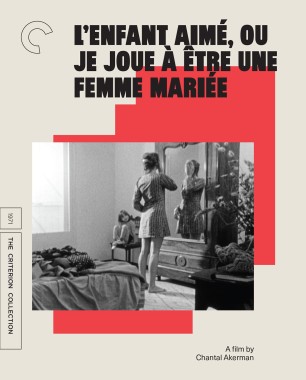
Akerman looks slapped together in about 5 minutes. Lone Star is really good and makes me very curious about the movie
as a huge Trainspotting fan I would've been annoyed had they gone with anything other than the iconic imagery and orange. but what does "glow in the dark packaging" entail??? the orange stencil part is gonna glow? cause that'd be pretty cool...surprised to not see Boyle/Welsh/Hodge/Macdonald credited on the cover
as a huge Trainspotting fan I would've been annoyed had they gone with anything other than the iconic imagery and orange. but what does "glow in the dark packaging" entail??? the orange stencil part is gonna glow? cause that'd be pretty cool...surprised to not see Boyle/Welsh/Hodge/Macdonald credited on the cover
-
aox

- Joined: Fri Jun 20, 2008 4:02 pm
- Location: nYc
Re: Criterion & Eclipse Cover Art & Packaging Babble-on Vol. 7
"Masterpieces"?
I like Ackerman's work and even admire it, but isn't that determination up to the viewer? It just seems like unnecessary editorialism.
I like Ackerman's work and even admire it, but isn't that determination up to the viewer? It just seems like unnecessary editorialism.
-
dwk

- Joined: Sat Jun 12, 2010 10:10 pm
Re: Criterion & Eclipse Cover Art & Packaging Babble-on Vol. 7
Here is the Trainspotting cover glowing in the dark

-
ryannichols7
- Joined: Mon Jul 16, 2012 6:26 pm
Re: Criterion & Eclipse Cover Art & Packaging Babble-on Vol. 7
oh duh, it's right there on the page. that's brilliant! and appears to be a legitimate slipcover too
just as ridiculous as "Essential Fellini" but leaving out City of Women and suchaox wrote: Mon Oct 16, 2023 5:41 pm "Masterpieces"?
I like Ackerman's work and even admire it, but isn't that determination up to the viewer? It just seems like unnecessary editorialism.
-
Finch

- Joined: Mon Jul 07, 2008 9:09 pm
- Location: United States
Re: Criterion & Eclipse Cover Art & Packaging Babble-on Vol. 7
Lone Star looks excellent though I have no idea how representative it is of the film. The glowing-in-the-dark cover for Trainspotting is hysterical.
-
Red Screamer

- Joined: Tue Jul 16, 2013 4:34 pm
- Location: Boston, MA
Re: Criterion & Eclipse Cover Art & Packaging Babble-on Vol. 7
Fans know that Akerman wanted to become a filmmaker after seeing Pierrot le fou, but the bold, rhetorical Godardian font they chose doesn't really fit these films. Oh well.
-
Boosmahn

- Joined: Tue Sep 05, 2017 2:08 am
Re: Criterion & Eclipse Cover Art & Packaging Babble-on Vol. 7
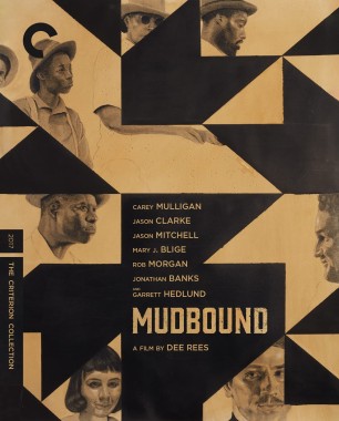
Lone Star is fantastic, the Akerman set is dull, Trainspotting is great, and Mudbound is okay.