Dazed and Confused [4K]
Three Colors Trilogy [4K]
Romeo & Juliet
Two Films by Marguerite Duras
Hollywood Shuffle
Romeo & Juliet and Hollywood Shuffle both come with inserts. The other titles come with booklets.
Both Dazed and Confused and Three Colors come in sturdy DigiPaks, similar to the November titles. Feel more solid in hand when compared to the previous Blu-ray editions (my Three Colors Blu is looking pretty beat up).
Criterion & Eclipse Cover Art & Packaging Babble-on Vol. 7
-
cdnchris

- Site Admin
- Joined: Tue Nov 02, 2004 6:45 pm
- Location: Washington
- Contact:
-
Rupert Pupkin
- Joined: Thu Oct 20, 2005 1:34 pm
Re: Criterion & Eclipse Cover Art & Packaging Babble-on Vol. 7
The grenade makes you think it's a sarcastic movie like "Lord Of War". It's rather a "pétard mouillé" like we would say in French. Niccol movie was just ok.therewillbeblus wrote: Tue Jan 17, 2023 11:44 pm I don't like it either, but part of why I posted the German UHD cover is to reference how it could be worse. Would anybody prefer that? (I guess it does seem to represent how some of you feel about the Criterion cover, so maybe it's easier to identify with a person vomiting than a L'Oréal commercial gone wrong)
I would have liked the fashion cover like the French Blu-Ray.
Since I saw Margot Robbie vomiting in "Babylon" I wonder if we could find a lenticular vomiting cover of Margot Robbie
Even if, the red dress overture a-la Dolce Vita is way better looking.
-
tenia

- Ask Me About My Bassoon
- Joined: Wed Apr 29, 2009 3:13 pm
Re: Criterion & Eclipse Cover Art & Packaging Babble-on Vol. 7
That's interesting because on the pictures, the outer cases don't seem much thicker than the BD ones. It's good though if Criterion are moving towards those more rigid "UK style" cardboard (though it seems financially counter-intuitive considering the huge increase of costs for these), as their flimsy boxsets have always felt a bit cheap for such a company.cdnchris wrote: Thu Feb 09, 2023 1:40 am Both Dazed and Confused and Three Colors come in sturdy DigiPaks, similar to the November titles. Feel more solid in hand when compared to the previous Blu-ray editions (my Three Colors Blu is looking pretty beat up).
-
swo17

- Bloodthirsty Butcher
- Joined: Tue Apr 15, 2008 2:25 pm
- Location: SLC, UT
Re: Criterion & Eclipse Cover Art & Packaging Babble-on Vol. 7
They aren't as thick as that
-
cdnchris
- Site Admin
- Joined: Tue Nov 02, 2004 6:45 pm
- Location: Washington
- Contact:
Re: Criterion & Eclipse Cover Art & Packaging Babble-on Vol. 7
No, they're still similar in material to what Criterion has always used. They just feel better constructed, not as flimsy. They'll still dent and that clearly, but they feel to be less likely to crush and fray. But I guess we'll have to see how they keep over time.
-
tenia
- Ask Me About My Bassoon
- Joined: Wed Apr 29, 2009 3:13 pm
Re: Criterion & Eclipse Cover Art & Packaging Babble-on Vol. 7
Right, thanks for the precision !
-
mfunk9786

- Under Chris' Protection
- Joined: Fri May 16, 2008 8:43 pm
- Location: Miami, FL


-
FrauBlucher

- Joined: Tue Jul 16, 2013 12:28 am
- Location: Greenwich Village
Re: Criterion & Eclipse Cover Art & Packaging Babble-on Vol. 7
A solid month of new covers. Love the Targets cover
-
black&huge
- Joined: Tue Dec 26, 2017 9:35 am
Re: Criterion & Eclipse Cover Art & Packaging Babble-on Vol. 7
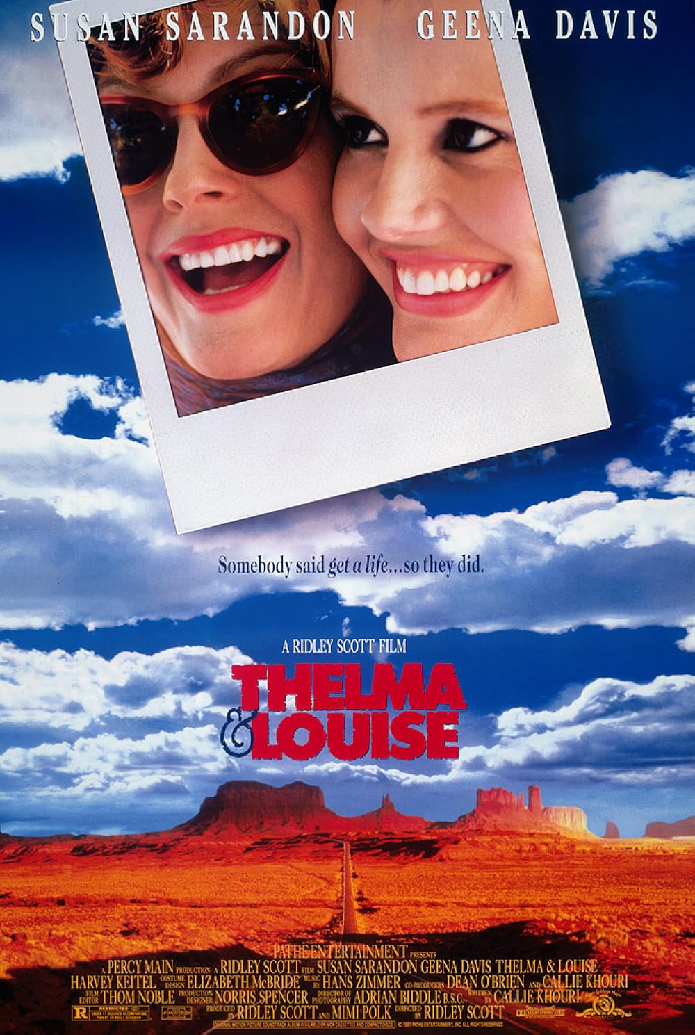
Thelma and Louise to me at least is one of their greatest covers. It's so damn beautiful
-
knives

- Joined: Sat Sep 06, 2008 10:49 pm
Re: Criterion & Eclipse Cover Art & Packaging Babble-on Vol. 7
See, I was thinking Targets as plainly the worst.
-
Saturnome

- Joined: Sun Aug 12, 2007 9:22 pm
Re: Criterion & Eclipse Cover Art & Packaging Babble-on Vol. 7
Not sure if Targets represent the film, it feels more like a cop show or a political thriller. It looks good though.
Thelma & Louise and Petite maman are 100% the films.
Thelma & Louise and Petite maman are 100% the films.
-
Aspect

- Joined: Thu Jun 09, 2011 7:36 pm
Re: Criterion & Eclipse Cover Art & Packaging Babble-on Vol. 7
That looks nothing like Geena Davis.
-
brundlefly
- Joined: Fri Jun 13, 2014 4:55 pm
Re: Criterion & Eclipse Cover Art & Packaging Babble-on Vol. 7
Hard to rant about another Thelma & Louise release when I'm too busy staring at Sarandon's hair.
-
mfunk9786
- Under Chris' Protection
- Joined: Fri May 16, 2008 8:43 pm
- Location: Miami, FL
Re: Criterion & Eclipse Cover Art & Packaging Babble-on Vol. 7
That's what's been standing out to me - Sarandon is clearly her at a glance, but Davis looks like one of those AI generated "this person does not exist" images
-
Pavel

- Joined: Fri Aug 07, 2020 6:41 pm
Re: Criterion & Eclipse Cover Art & Packaging Babble-on Vol. 7
Davis looks like Rosanna Arquette but otherwise all the covers are terrific imo
-
therewillbeblus

- Joined: Tue Dec 22, 2015 7:40 pm
Re: Criterion & Eclipse Cover Art & Packaging Babble-on Vol. 7
They all feel like suitable covers for the respective films, though nothing outstanding. Thelma and Louise is the best, and I think they just tried to draw Geena Davis from an angle that inherently hides her prominent features, but it doesn't outright 'not' look like her, while Sarandon is stoically lucid
-
Walter Kurtz

- Joined: Sat Jul 25, 2020 7:03 pm
Re: Criterion & Eclipse Cover Art & Packaging Babble-on Vol. 7
our very own miss harvey
-
FrauBlucher
- Joined: Tue Jul 16, 2013 12:28 am
- Location: Greenwich Village
Re: Criterion & Eclipse Cover Art & Packaging Babble-on Vol. 7
Thelma & Louise has that digipak feel
-
Pavel
- Joined: Fri Aug 07, 2020 6:41 pm
Re: Criterion & Eclipse Cover Art & Packaging Babble-on Vol. 7
I have a feeling they’re only going to be making digipaks for 4K editions from now on, like they did with Malcolm X. But then again they made the 4K upgrade for NOTLD a scanavo case, so who knows
-
therewillbeblus
- Joined: Tue Dec 22, 2015 7:40 pm
Re: Criterion & Eclipse Cover Art & Packaging Babble-on Vol. 7
Haven't more 4Ks been released in scanvos than digipacks overall?
-
felipe
- Joined: Thu May 06, 2010 3:06 am
Re: Criterion & Eclipse Cover Art & Packaging Babble-on Vol. 7
Wait, so it isn't a political thriller? I've never seen itSaturnome wrote: Wed Feb 15, 2023 5:53 pm Not sure if Targets represent the film, it feels more like a cop show or a political thriller. It looks good though.
-
ryannichols7

- Joined: Mon Jul 16, 2012 6:26 pm
Re: Criterion & Eclipse Cover Art & Packaging Babble-on Vol. 7
it's.....just go in blind, promise it's the best approach. this is definitely my favorite art for it yet, just a total knockout cover. excellent job by forum favorite Sister Hyde
I agree that all these covers are pretty good. already hoping Carson Ellis gets invited back for round 2, she should've been doing CC art years ago!
-
swo17
- Bloodthirsty Butcher
- Joined: Tue Apr 15, 2008 2:25 pm
- Location: SLC, UT
Re: Criterion & Eclipse Cover Art & Packaging Babble-on Vol. 7
Both the BFI and Criterion covers fit Targets just fine
-
Pavel
- Joined: Fri Aug 07, 2020 6:41 pm
Re: Criterion & Eclipse Cover Art & Packaging Babble-on Vol. 7
Oh yeah, way more I’d say. I just think that all the digipaks will be reserved for boxes and 4Ks from now ontherewillbeblus wrote: Wed Feb 15, 2023 10:19 pm Haven't more 4Ks been released in scanvos than digipacks overall?
-
Computer Raheem

- Joined: Wed Jun 16, 2021 11:45 pm
Re: Criterion & Eclipse Cover Art & Packaging Babble-on Vol. 7
MONTHLY COVER THOUGHTS: May 2023
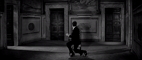
- Wings of Desire: OLD COVER ALERT! I've never been particularly fond of this cover. Keeping in mind that I have not seen the film in its entirety, it feels far too simple; maybe watching the film in full will illuminate what others see in this cover, but to me, it just looks like the artist simply used an iconic shot and called it a day. The many theatrical posters from the film's release(s) are far more effective from my immediately limited perspective (a dash of color wouldn't hurt, given the film's visual scheme)
- Branded to Kill : OLD COVER ALERT! Now this cover is a work of art! The seeming incongruity of the butterflies and pink text with the film's black-and-white aesthetics and hitman plot are a perfect way to prepare the uninitiated for the oddball experience that awaits. I've always had a soft spot for this cover, and I'm happy it's being kept
- Targets: Given that this cover is designed by Sister Hyde, who - other than Greg Ruth - has created some of my favorite recent Criterion covers, I knew this would grow to be my personal favorite of the batch. It's a fairly simple cover, but it's a very effective one. The design puts the film's basic elements (Karloff, sniper, commentary on violence) and smartly balances it all together with eye-catching colors. The only issue is that the images of the newspaper adds an element of busyness that I don't particularly like, but it's a minor quibble for an otherwise great cover
- Petit maman: It's a decent cover, but I find its style a little too simplistic for my tastes. I get that it emphasizes the fantasy aspects of the film, but it's a little too cutesy in my opinion. Maybe it will grow on me as time goes on, but I'm not particularly feeling it at this point in time
- Thelma & Louise: I'm a sucker for detail-heavy covers like this one, so I would enjoy it anyway, but I just enjoy how laid-back it feels. It helps highlight the relationship center to the film, and that's aided by the detail in the painting. Anything simplier, and it probably would give off the somewhat cheap vibes of the original theatrical poster. Also, Geena Davis looks fine here, it's just a funky angle
