The Adventures of Baron Munchausen [4K]
Imitation of Life
Lars von Trier's Europe Trilogy [Booklet]
This is Not a Burial, It's a Resurrection
Bergman Island (My copy is damaged)
Criterion & Eclipse Cover Art & Packaging Babble-on Vol. 7
-
cdnchris

- Site Admin
- Joined: Tue Nov 02, 2004 6:45 pm
- Location: Washington
- Contact:
-
CSM126

- Joined: Thu Nov 04, 2004 12:22 pm
- Location: The Room
- Contact:
Re: Criterion & Eclipse Cover Art & Packaging Babble-on Vol. 7
Disappointed that Munchausen isn’t a digipak. That cover looked ripe for a die-cut layering effect or a pop-up book similar to the Zeman set.
-
DarkImbecile

- Ask me about my visible cat breasts
- Joined: Mon Dec 09, 2013 10:24 pm
- Location: Albuquerque, NM


-
soundchaser

- Leave Her to Beaver
- Joined: Sun Aug 28, 2016 4:32 am
Re: Criterion & Eclipse Cover Art & Packaging Babble-on Vol. 7
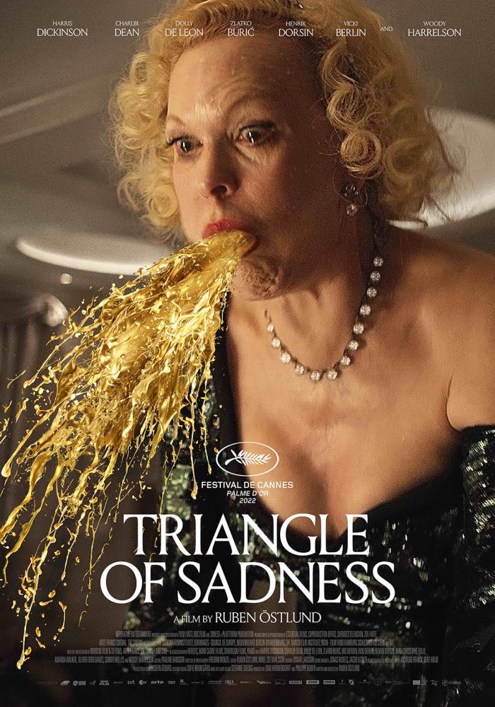
Maybe there's something to that Triangle of Sadness cover, but none of these are doing it for me otherwise.
-
JabbaTheSlut
- Joined: Thu Sep 07, 2006 2:37 pm
- Location: Down there
Re: Criterion & Eclipse Cover Art & Packaging Babble-on Vol. 7
Triangle of Sadness cover great match for the shallow populist satire.
-
therewillbeblus

- Joined: Tue Dec 22, 2015 7:40 pm
Re: Criterion & Eclipse Cover Art & Packaging Babble-on Vol. 7
Criterion should fire their cover art dept head for not replicating the way more marketable German UHD cover
-
mteller

- Joined: Tue Nov 02, 2004 7:23 pm
Re: Criterion & Eclipse Cover Art & Packaging Babble-on Vol. 7
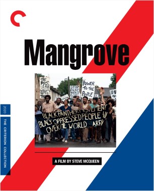
I love Small Axe and will buy it regardless, but those covers are ugly and way too busy.
-
Boosmahn

- Joined: Tue Sep 05, 2017 2:08 am
Re: Criterion & Eclipse Cover Art & Packaging Babble-on Vol. 7
The set cover for Small Axe is fine, but those individual ones are awful. Extremely low-effort.
-
swo17

- Bloodthirsty Butcher
- Joined: Tue Apr 15, 2008 2:25 pm
- Location: SLC, UT
Re: Criterion & Eclipse Cover Art & Packaging Babble-on Vol. 7
Don't worry, I'm sure the individual covers won't actually appear in the release
-
agnamaracs

- Joined: Thu Dec 21, 2006 7:13 am
Re: Criterion & Eclipse Cover Art & Packaging Babble-on Vol. 7
I, too, am disappointed that they didn't go with the vomit.therewillbeblus wrote: Tue Jan 17, 2023 6:05 pm Criterion should fire their cover art dept head for not replicating the way more marketable German UHD cover
-
soundchaser
- Leave Her to Beaver
- Joined: Sun Aug 28, 2016 4:32 am
Re: Criterion & Eclipse Cover Art & Packaging Babble-on Vol. 7
That's the one-sheet, isn't it? At least in the U.S.
-
swo17
- Bloodthirsty Butcher
- Joined: Tue Apr 15, 2008 2:25 pm
- Location: SLC, UT
Re: Criterion & Eclipse Cover Art & Packaging Babble-on Vol. 7
This is more tasteful like their Antichrist or Ai no korīda covers--the streams of liquid are merely implied
-
Swift
- Joined: Sun Oct 28, 2012 7:52 pm
- Location: Calgary, Alberta
Re: Criterion & Eclipse Cover Art & Packaging Babble-on Vol. 7
The Small Axe release is a pretty bad design. There are four corners of the flag, but you've got five individual releases, meaning one of the corners gets repeated, but a little offset. Screams of someone coming up with an idea and sticking to it even though it doesn't quite work.
-
HinkyDinkyTruesmith

- Joined: Tue Aug 08, 2017 2:21 am
Re: Criterion & Eclipse Cover Art & Packaging Babble-on Vol. 7
They could have resolved that issue too by making one of the film's the center of the flag.
-
Boosmahn
- Joined: Tue Sep 05, 2017 2:08 am
Re: Criterion & Eclipse Cover Art & Packaging Babble-on Vol. 7
Honestly, I would be fine with that.swo17 wrote: Tue Jan 17, 2023 7:37 pmDon't worry, I'm sure the individual covers won't actually appear in the release
Maybe the middle film for symmetry... it's even called Red, White and Blue!HinkyDinkyTruesmith wrote: Tue Jan 17, 2023 10:12 pmThey could have resolved that issue too by making one of the film's the center of the flag.
-
Pavel

- Joined: Fri Aug 07, 2020 6:41 pm
Re: Criterion & Eclipse Cover Art & Packaging Babble-on Vol. 7
The Triangle of Sadness cover is probably the worst they’ve ever put out imo. Small Axe is also not very good
-
mfunk9786

- Under Chris' Protection
- Joined: Fri May 16, 2008 8:43 pm
- Location: Miami, FL
Re: Criterion & Eclipse Cover Art & Packaging Babble-on Vol. 7
Triangle of Sadness is the worst Criterion cover of all time. Hope you all are well!
-
therewillbeblus
- Joined: Tue Dec 22, 2015 7:40 pm
Re: Criterion & Eclipse Cover Art & Packaging Babble-on Vol. 7
I don't like it either, but part of why I posted the German UHD cover is to reference how it could be worse. Would anybody prefer that? (I guess it does seem to represent how some of you feel about the Criterion cover, so maybe it's easier to identify with a person vomiting than a L'Oréal commercial gone wrong)
-
swo17
- Bloodthirsty Butcher
- Joined: Tue Apr 15, 2008 2:25 pm
- Location: SLC, UT
Re: Criterion & Eclipse Cover Art & Packaging Babble-on Vol. 7
I thought you were being sincere about preferring the German cover!
I don't love the cover for the film but I do think it's at least an aesthetically pleasing image
I don't love the cover for the film but I do think it's at least an aesthetically pleasing image
-
therewillbeblus
- Joined: Tue Dec 22, 2015 7:40 pm
Re: Criterion & Eclipse Cover Art & Packaging Babble-on Vol. 7
I mean, I think it's hilarious, and that's almost certainly the physical version I'm going to buy if it's got better UHD features, so I better learn to love it
-
Computer Raheem

- Joined: Wed Jun 16, 2021 11:45 pm
Re: Criterion & Eclipse Cover Art & Packaging Babble-on Vol. 7
MONTHLY COVER THOUGHTS: April 2023
- The Fisher King: OLD COVER ALERT!!! Which is fine by me, because it gives me an excuse to rip the cover to shreds. This is one of Criterion's worst cover, hands down. I don't even get the idea behind it; while it makes some sense conceptually (given the narrative importance of all the fantasy elements), platforming it and sidelining the realistic narrative that dominates the film is misleading advertising imo. This is not helped by the decision to have the artist's five-year-old draw it with Sharpie. Granted, the theatrical poster is bland 90s garbage, but this is NOT the solution. Just absolute dogshit, and it frustrates me that they are going to keep using this for the foreseeable future
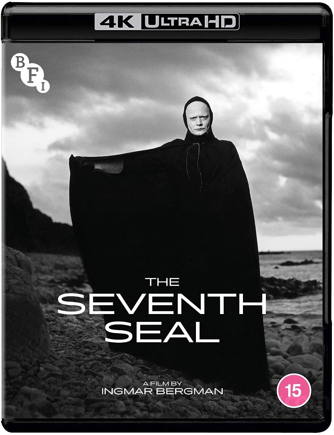
- The Seventh Seal: OLD COVER ALERT!!! Unlike The Fisher King, this cover is excellent! It's simple - some would say too simple, perhaps lacking in iconic imagery - but I prefer this to whatever would have been the obvious choice (probably something involving Death, like the BFI cover). This has always been a favorite of mine, so I'm happy that Criterion has decided to keep this one in rotation
- Small Axe: Now it's time for the new covers... yay (*shudders*). Someone has already described this as looking like the work of someone who had an idea and refused to abandon it even though it wasn't working, and that basically summarizes my thoughts. I get the idea, but the execution makes it look sloppy. Not only is the composition of the images chosen messy, but the fact that there are only four corners and five films means that Red, White and Blue gets shunted into one corner with little thought. That should have been the point that made them change to a different design, but they had the idea, and I guess they had to make it work somehow! Very disappointing
- Triangle Of Sadness: Unlike some members here, I don't think this is bad at all; it's just painfully dull. The joke (if you can call it that) works well enough, but it feels anonymous in a way that it shouldn't. For a movie that has a memorable set-piece in the ship tipping, you'd think they'd lean on that as a potential cover, but I guess that would mean they couldn't rush this cover pre-Oscars nominations date (since this movie is clearly going to sweep). At the very least, they could have gone with this poster - it's not like Criterion cares much with making people uncomfortable with their covers
-
therewillbeblus
- Joined: Tue Dec 22, 2015 7:40 pm
Re: Criterion & Eclipse Cover Art & Packaging Babble-on Vol. 7
Reminds me of another scathing artwork critique that I’ve never forgotten since I was twelveComputer Raheem wrote: Wed Jan 18, 2023 3:39 am MONTHLY COVER THOUGHTS: April 2023
- The Fisher King: OLD COVER ALERT!!! Which is fine by me, because it gives me an excuse to rip the cover to shreds. This is one of Criterion's worst cover, hands down. I don't even get the idea behind it; while it makes some sense conceptually (given the narrative importance of all the fantasy elements), platforming it and sidelining the realistic narrative that dominates the film is misleading advertising imo. This is not helped by the decision to have the artist's five-year-old draw it with Sharpie. Granted, the theatrical poster is bland 90s garbage, but this is NOT the solution. Just absolute dogshit, and it frustrates me that they are going to keep using this for the foreseeable future
-
Kracker

- Joined: Sat Sep 28, 2013 6:06 pm
Re: Criterion & Eclipse Cover Art & Packaging Babble-on Vol. 7
Count me as one of those who likes the Triangle of Sadness cover. Its simple, effective, and vivid. They obviously wanted to go with something more tasteful than the 'Woman Vomiting" poster and I'm glad that they did. Haven't gotten around to watching this yet, but i will tonight to see if I want add it to my shelf.
-
ryannichols7

- Joined: Mon Jul 16, 2012 6:26 pm
Re: Criterion & Eclipse Cover Art & Packaging Babble-on Vol. 7
love when the worst covers imaginable are for the worst movies (Tiny Furniture, anyone?) so I don't feel any FOMO in not getting them. glad they tossed in The Fisher King, one of their worst efforts.JabbaTheSlut wrote: Tue Jan 17, 2023 5:41 pm Triangle of Sadness cover great match for the shallow populist satire.
I'll agree with Computer Raheem that The Seventh Seal remains an extremely incredible cover. the inside/booklet design is really nice too, but watch them turn it into a foldout insert somehow
-
yoloswegmaster

- Joined: Tue Nov 01, 2016 7:57 pm
Re: Criterion & Eclipse Cover Art & Packaging Babble-on Vol. 7
Carson Ellis revealed that she is working on the Petite Maman cover. You can see the art that she has done previously just to get an idea of what the cover will look like.