Criterion & Eclipse Cover Art & Packaging Babble-on Vol. 7
-
Omensetter

- Yes We Cannes
- Joined: Sun Apr 24, 2011 12:17 am
- Location: Lawrence, KS, U.S.
Re: Criterion & Eclipse Cover Art & Packaging Babble-on Vol. 7
Yeah, I'm honestly baffled how that Some Like It Hot cover gets approved. Not a fan of the movie, but it's awful in such in an obvious way.
-
Big Ben

- Joined: Mon Feb 08, 2016 4:54 pm
- Location: Great Falls, Montana
Re: Criterion & Eclipse Cover Art & Packaging Babble-on Vol. 7
The funniest thing about the Some Like It Hot cover is that we all missed Lemmon and Curtis on Monroe. How fortuitous that it was pointed out and no one had to find this out when it was in their hands.
-
domino harvey

- Dot Com Dom
- Joined: Wed Jan 11, 2006 6:42 pm
Re: Criterion & Eclipse Cover Art & Packaging Babble-on Vol. 7
Unfortunately I saw them right away, and given contractual agreements that we know Criterion is beholden to from MGM licenses, you all should've known Lemmon and Curtis were on there somewhere!
-
Ashirg

- Joined: Wed Nov 03, 2004 1:10 pm
- Location: Atlanta
Re: Criterion & Eclipse Cover Art & Packaging Babble-on Vol. 7
I saw Curtis, but missed Lemmon. For some reason, I get Shelley Winters vibe from this Monroe photo...
-
domino harvey
- Dot Com Dom
- Joined: Wed Jan 11, 2006 6:42 pm
Re: Criterion & Eclipse Cover Art & Packaging Babble-on Vol. 7
Ha! On that way, way side note, I've been reading some Hollywood gossipy histories and Winters was apparently as well known as "Dick and Liz" for her ribald personal life. I literally never figured her as a sex symbol from her on-screen work, but apparently she was!
-
Gerald Christie
- Joined: Wed Jun 08, 2016 4:06 pm
Re: Criterion & Eclipse Cover Art & Packaging Babble-on Vol. 7
Honestly, they should just go with the original film posters and call it a day. I do like the Magnificent Ambersons one, but the one for SLH is just weird, tacky and just plain photoshop. Plus, what an unflattering angle for poor Marilyn.
-
cdnchris

- Site Admin
- Joined: Tue Nov 02, 2004 6:45 pm
- Location: Washington
- Contact:
-
alacal2
- not waving but frowning
- Joined: Tue Dec 09, 2008 5:18 pm
Re: Criterion & Eclipse Cover Art & Packaging Babble-on Vol. 7
Attack Of The 80-Foot Monroe. Nobody's perfect.
-
Zot!
- Joined: Wed Jan 20, 2010 4:09 am

-
Feego

- Joined: Thu Aug 16, 2007 11:30 pm
- Location: Texas
Re: Criterion & Eclipse Cover Art & Packaging Babble-on Vol. 7
I'm very surprised that Monroe, Curtis and Lemmon's names are not on the Some Like It Hot cover. They appear on every previous VHS, laserdisc, DVD and Blu-ray cover, so I figured it was a contractual obligation.
-
domino harvey
- Dot Com Dom
- Joined: Wed Jan 11, 2006 6:42 pm
Re: Criterion & Eclipse Cover Art & Packaging Babble-on Vol. 7
Hopefully they'll use that as an excuse to save face and redesign the cover
-
FrauBlucher

- Joined: Tue Jul 16, 2013 12:28 am
- Location: Greenwich Village
Re: Criterion & Eclipse Cover Art & Packaging Babble-on Vol. 7
Or maybe they reached out from the afterlife and collectively said do not put our names on that cover.Feego wrote: Thu Aug 16, 2018 1:34 pm I'm very surprised that Monroe, Curtis and Lemmon's names are not on the Some Like It Hot cover. They appear on every previous VHS, laserdisc, DVD and Blu-ray cover, so I figured it was a contractual obligation.
-
Finch

- Joined: Mon Jul 07, 2008 9:09 pm
- Location: United States
Re: Criterion & Eclipse Cover Art & Packaging Babble-on Vol. 7
Still wouldn't buy it.domino harvey wrote: Thu Aug 16, 2018 1:40 pm Hopefully they'll use that as an excuse to save face and redesign the cover
-
movielocke

- Joined: Fri Jan 18, 2008 4:44 am
Criterion & Eclipse Cover Art & Packaging Babble-on Vol. 7
I never react too much to cover art and mostly just skim the covers on my phone on announcement day. So I just went back to look at the cover on my computer. Didn’t notice the boys before. Doesn’t bother me, quirky, playful design fits the film.Feego wrote:I'm very surprised that Monroe, Curtis and Lemmon's names are not on the Some Like It Hot cover. They appear on every previous VHS, laserdisc, DVD and Blu-ray cover, so I figured it was a contractual obligation.
My guess is that if any of the three have their names written out, all three must be written out. If any of the three have their image used, all three must have their image used.
-
Graphist

- Joined: Thu Jul 23, 2015 6:18 am
- Location: New York City
Re: Criterion & Eclipse Cover Art & Packaging Babble-on Vol. 7
Really happy for Some Like It Hot finally (re)joining the collection. That cover though…
Ok, I am glad they kept the original typography for the title. But why is it crowded like that? It definitely needs more room to breathe. And why, why Curtis and Lemmon look like paper cutouts?! I too did not notice them at first and was questioning their absence from the cover. But when I saw them I wished they were not there.
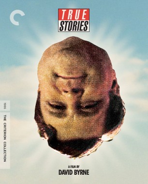
The cover for True Stories that is based on Tibor Kalman’s designs is intriguing and probably partially would explain the sloppy head photoshop cutout. I haven’t seen the film and look forward to checking it out.
And this will probably be the first release to include a CD with music, right?
Ok, I am glad they kept the original typography for the title. But why is it crowded like that? It definitely needs more room to breathe. And why, why Curtis and Lemmon look like paper cutouts?! I too did not notice them at first and was questioning their absence from the cover. But when I saw them I wished they were not there.
The cover for True Stories that is based on Tibor Kalman’s designs is intriguing and probably partially would explain the sloppy head photoshop cutout. I haven’t seen the film and look forward to checking it out.
And this will probably be the first release to include a CD with music, right?
-
Blutarsky

- Joined: Fri Dec 01, 2017 2:09 am
Re: Criterion & Eclipse Cover Art & Packaging Babble-on Vol. 7
True Stories I am guessing will be digipack right?
-
The Fanciful Norwegian

- Joined: Tue Nov 02, 2004 6:24 pm
- Location: Teegeeack
Re: Criterion & Eclipse Cover Art & Packaging Babble-on Vol. 7
The two Criterion LDs (CAV and CLV, with different cover designs) and the very first LD release from Fox Video didn't have the names on the cover either.Feego wrote: Thu Aug 16, 2018 1:34 pmI'm very surprised that Monroe, Curtis and Lemmon's names are not on the Some Like It Hot cover. They appear on every previous VHS, laserdisc, DVD and Blu-ray cover, so I figured it was a contractual obligation.
-
colinr0380

- Joined: Mon Nov 08, 2004 8:30 pm
- Location: Chapel-en-le-Frith, Derbyshire, UK
Re: Criterion & Eclipse Cover Art & Packaging Babble-on Vol. 7
Criterion have put up a video on Richard Haines and his Tom Jones cover

-
mfunk9786

- Under Chris' Protection
- Joined: Fri May 16, 2008 8:43 pm
- Location: Miami, FL
Re: Criterion & Eclipse Cover Art & Packaging Babble-on Vol. 7
Ah, the most memorable imagery of the film... the inside of a nearly hatched chicken egg...
-
ModelShopAbschied
- Joined: Tue Mar 13, 2018 4:27 am
Re: Criterion & Eclipse Cover Art & Packaging Babble-on Vol. 7
Just to throw out a more glass half-full suggestion about the way Curtis and Lemmon are styled on the cover: it's possible (using that word very lightly) that the designer may have been trying to play into the whole "they're not real women" aspect. They're cheap fakes of women, so next to Marilyn (real woman) they should look like cheap fakes. They're gazing up at her in a romantic-daydream/sexualized way, but those could also be looks of admiration because she's something that they'll never be more than a "paper cutouts" of — she's real, they're not.Graphist wrote: Fri Aug 17, 2018 3:07 am Ok, I am glad they kept the original typography for the title. But why is it crowded like that? It definitely needs more room to breathe. And why, why Curtis and Lemmon look like paper cutouts?! I too did not notice them at first and was questioning their absence from the cover. But when I saw them I wished they were not there.
To be clear, none of the above is intended as a serious, hardline interpretation, haha. It just popped it my head when I read the "paper cutouts" part of your post, and I felt like a little contrasting positive thought towards this cover art couldn't hurt. (Regardless of how unlikely and conjectured the thought is, ha.)
But you're absolutely right about it being crowded. That's the most jarring thing about the design to me. And it looks like someone's hand slipped and screwed the proportions up or something, then saved it without noticing.
And I also noticed both Curtis and Lemmon when I first saw it — but after seeing the several folks ITT who didn't notice them, I took a second look and couldn't help but see it as just a weird blob of body parts. If I leaned back a little bit it would look like a Cronenberg throwaway.
-
kcota17

- Joined: Sat Mar 01, 2014 1:05 am
Re: Criterion & Eclipse Cover Art & Packaging Babble-on Vol. 7
Some Like it Hot cover has been updated.

-
mfunk9786
- Under Chris' Protection
- Joined: Fri May 16, 2008 8:43 pm
- Location: Miami, FL
Re: Criterion & Eclipse Cover Art & Packaging Babble-on Vol. 7
Somehow worse*!
*maybe that's an exaggeration, but it's still lousy
*maybe that's an exaggeration, but it's still lousy
-
kcota17
- Joined: Sat Mar 01, 2014 1:05 am
Re: Criterion & Eclipse Cover Art & Packaging Babble-on Vol. 7
At least Marilyn looks more flattering!
But the black and white promo image with ugly orange text mix doesn’t help.
But the black and white promo image with ugly orange text mix doesn’t help.
-
Bumstead

- Joined: Sat Sep 24, 2016 4:25 pm
- Location: Dubai
Re: Criterion & Eclipse Cover Art & Packaging Babble-on Vol. 7
Criterion just can't win, can they?
Last edited by Bumstead on Tue Aug 28, 2018 9:25 pm, edited 1 time in total.