Cold Bishop wrote:I like the font, I don't know if the black-and-white to orange really works. A monochromatic font design or a tinted image may have sold the cover.
On Twitter they have a monochrome cover as a flip.
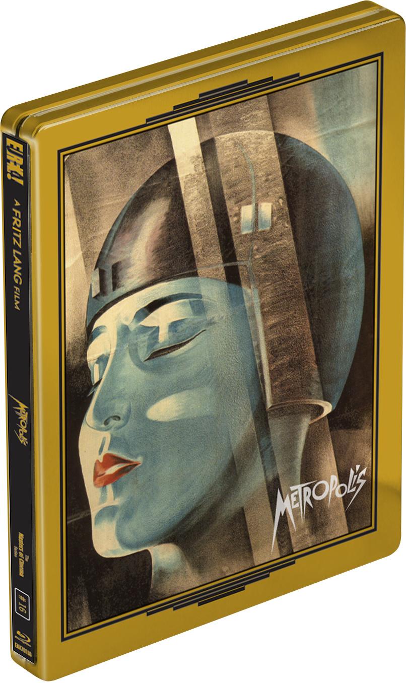
FrauBlucher wrote:Does anyone know if MoC changed their case for the Metropolis blu ray? The image on their web-site shows it in their standard clear case.
No, they did not change it. They used a general, common template to generate all the cover arts. That's why the Metropolis case is showing up like that. It is still in a blue case with sleep cover.
I can see how that cover could be divisive, but I do like how the character's pose with the two handguns pre-imagines the endless action movie posters since that have featured people posing with guns. I also like the original font.
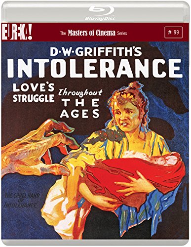
Drucker wrote:Two in a row at least. Not to mention I can't remember the last duff cover from these guys.
I'm not so fond of the overloaded Youth of the Beast. Spione was also quite weird (and felt a bit rushed "screencap + the title slapped on it). Otherwise, I can't think of anything except Serpico (but the original artwork was bland too so...).


