MoC Cover Art & Packaging Babble-on
-
knives

- Joined: Sat Sep 06, 2008 10:49 pm
Re: MoC Forthcoming, Wishlist and Random Speculation
I rather like it though I'll admit it isn't the best example.
-
Moe Dickstein

- Joined: Sat Aug 25, 2012 3:19 am
Re: MoC Cover Art & Packaging Babble-on
That poster might work on a 1998 Image snapper case.
-
Der Spieler

- Joined: Fri Oct 16, 2009 3:05 pm
Re: MoC Cover Art & Packaging Babble-on
I hope MoC get their act together cover-wise. The movie is what counts in the end but damn, they went from the label with the most gorgeous cover arts to... Kuroneko.
-
tenia

- Ask Me About My Bassoon
- Joined: Wed Apr 29, 2009 3:13 pm
Re: MoC Forthcoming, Wishlist and Random Speculation
That also reminds me how a simple change on the font and title placement could have drastically improved the new Onibaba cover, but it also hasn't been heard.Finch wrote:I think Craig has designed all the covers after Nick left (check the last page of your booklet for MoC credits). To be fair to Craig, some of the covers are as good as Nick's, and I certainly wasn't keen on every single cover Nick made but some decisions were just baffling: the cover for Trouble in Paradise had a great image but when some of us suggested that the giant title font be moved to the bottom and get rid of the cast names, it fell on deaf ears, and the June/July covers all represented a step down from the original releases (though I'm fond of the new Tabu cover). I agree that perhaps someone else ought to do the covers which would free Craig up to focus on other features of the new MoC releases.
Let's say that, even if I'm unsure the Caligari cover is real or not, MoC's covers have become hit or miss, when it used to be so consistent in quality.
-
HJackson

- Joined: Wed Jul 20, 2011 11:27 pm
Re: MoC Cover Art & Packaging Babble-on
You have to feel bad for the guys though, they have incredibly big shoes to fill when it comes to cover art. Nobody would be complaining about covers like The Naked Island or Tabu if this wasn't MoC.
-
Tommaso

- Joined: Fri May 19, 2006 2:09 pm
Re: MoC Cover Art & Packaging Babble-on
Sure, if they were new films in the series. But as they already had perfect covers for the original SD-releases for the Shindos, why in God's name did they change them for the blus? Still, MoC is such a well-established label now that most people would buy their releases regardless of how the covers look like, because thankfully the content is still on the same high level as it always has been.
-
YnEoS

- Joined: Fri Oct 08, 2010 2:30 pm
Re: MoC Cover Art & Packaging Babble-on
The re-drawing #55 as #65 on Nick's fake Caligari artwork is priceless.
-
Peacock

- Joined: Mon Dec 22, 2008 11:47 pm
- Location: Scotland
Re: MoC Cover Art & Packaging Babble-on
Am I the only person who is confused by the cover for Tabu?
On Facebook, MoC have said that it's a still of the lead male actor of Tabu but the guy on the cover looks totally different.... Caucasian with sideburns and I've looked at stills from the film where Mahati is in profile and he looks completely different.
I'm not trying to stir up trouble, it's a beautiful cover, but I'm just making sure if it's actually a still from Tabu... or if instead it's a photograph by someone like Flaherty from around the same time of someone else on the island.
Correct me if i'm being stupid here! I just don't get why no one else seems to have noticed this but me?!
-
TMDaines

- Joined: Wed Nov 11, 2009 5:01 pm
- Location: Greater Manchester
Re: MoC Cover Art & Packaging Babble-on
We're just gutted the original poster art has gone. 
-
Ozu Teapot

- Joined: Fri Jul 16, 2010 3:33 pm
- Location: UK
- Contact:
Re: MoC Cover Art & Packaging Babble-on
The same image is on page 46 of the original DVD booklet (book really) where it's described as "Mataharii Tama (Matahi), production still by Robert Flaherty".Peacock wrote:Am I the only person who is confused by the cover for Tabu?
On Facebook, MoC have said that it's a still of the lead male actor of Tabu but the guy on the cover looks totally different.... Caucasian with sideburns and I've looked at stills from the film where Mahati is in profile and he looks completely different.
I'm not trying to stir up trouble, it's a beautiful cover, but I'm just making sure if it's actually a still from Tabu... or if instead it's a photograph by someone like Flaherty from around the same time of someone else on the island.
Correct me if i'm being stupid here! I just don't get why no one else seems to have noticed this but me?!
Now, whether it is him and it's a case of the photo being a bad likeness or whether amongst all the ephemera and materials MoC gathered to make the book it's incorrectly listed as him I of course don't know! I agree the photo does look different, though I wouldn't say Caucasian (maybe more Caucasian), but I couldn't confidently say it isn't just a "bad" photo.
EDIT : Actually I've just looked through the booklet at other photos of Mataharii Tama and now I'm convinced that's NOT him on the new Blu cover!


-
Minkin

- Joined: Fri Aug 07, 2009 3:13 am
Re: MoC Cover Art & Packaging Babble-on
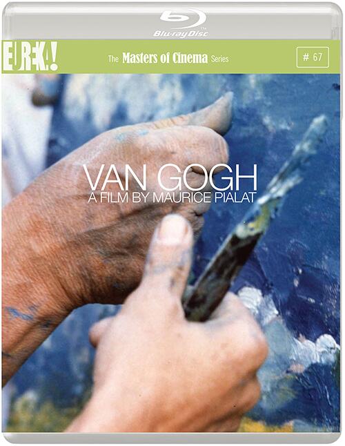
Oh god, that Van Gogh cover... ](*,) Can MOC please just let that font die a horrible, horrible death? When did anyone think white text, done with the most awfully boring font, in the middle of a still would sell a movie?
I'm glad their using an original poster for Il Bidone, but did they have to use such an ugly one? (that said, on looking up posters for the movie, none of them have ever been decent, so I guess it will do).
As for Tarnished Angel, I feel like they've already used up their outlines quota for the year (floating weeds).
Overall, there's some improvement over the last batch of covers.. but the Nick-designed cover just stands out so much, that its completely frustrating. Perhaps let covers come to a vote before making the final call? The cover quality, along with the decision to drop Dual Formats have both been really terrible decisions by the new MOC. I'll still buy most of your releases, but I'll grumble along the way.
-
tenia
- Ask Me About My Bassoon
- Joined: Wed Apr 29, 2009 3:13 pm
Re: MoC Cover Art & Packaging Babble-on
I thought at first that the Van Gogh cover was a extract of the cover from the old Gaumont DVD but no. I admit to like it, but indeed, the most simple font makes it looks quite cheap, and simply too lazy. That's probably the main culprit ot the latest MoC covers, largely discussed these past months : screenshot, lazy font, boom, artwork is done.
-
repeat

- Joined: Wed Jun 24, 2009 8:04 am
- Location: high in the Custerdome
Re: MoC Cover Art & Packaging Babble-on
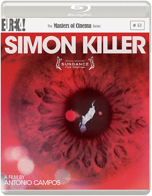
I don't know about you guys, but the fact that Simon Killer is a MoC instead of a regular Eureka release shocks me far more than anything about those covers. What's the point?
EDIT: sorry, didn't notice this had already been discussed - anyway who cares, as long as Van Gogh is coming!!
EDIT: sorry, didn't notice this had already been discussed - anyway who cares, as long as Van Gogh is coming!!
-
domino harvey

- Dot Com Dom
- Joined: Wed Jan 11, 2006 6:42 pm
Re: MoC Cover Art & Packaging Babble-on
Of the new covers, the Tarnished Angels is great. The others ain't
-
Finch

- Joined: Mon Jul 07, 2008 9:09 pm
- Location: United States
Re: MoC Cover Art & Packaging Babble-on
Of course, the one film I'm most interested in gets the worst cover of the month. Figures. The font on the Van Gogh is just horrid. Please, Craig, drop those bland fonts already!
I wonder if A Time To Love And A Time To Die would have gotten a new cover if the old DVD had gotten a new transfer too, as I'm assuming that was the reason behind changing the Tabu artwork. Thumbs up for Il Bidone and Tarnished Angels (even if I won't be buying the latter).
I wonder if A Time To Love And A Time To Die would have gotten a new cover if the old DVD had gotten a new transfer too, as I'm assuming that was the reason behind changing the Tabu artwork. Thumbs up for Il Bidone and Tarnished Angels (even if I won't be buying the latter).
-
Fierias

- Joined: Sat Jul 15, 2006 1:49 am
Re: MoC Cover Art & Packaging Babble-on
Would something like this really have been so difficult? (I used the French poster)

-
Jack Phillips
- Joined: Mon Jun 25, 2007 6:33 am
Re: MoC Cover Art & Packaging Babble-on
The still is misleading to boot. No film about an artist spends less time on the actual making of art than does Pialat's Van Gogh. So the cover is dull and a cheat.Minkin wrote:Oh god, that Van Gogh cover... ](*,) Can MOC please just let that font die a horrible, horrible death? When did anyone think white text, done with the most awfully boring font, in the middle of a still would sell a movie?
-
knives
- Joined: Sat Sep 06, 2008 10:49 pm
Re: MoC Cover Art & Packaging Babble-on
Andrei Rublev.Jack Phillips wrote:The still is misleading to boot. No film about an artist spends less time on the actual making of art than does Pialat's Van Gogh. So the cover is dull and a cheat.Minkin wrote:Oh god, that Van Gogh cover... ](*,) Can MOC please just let that font die a horrible, horrible death? When did anyone think white text, done with the most awfully boring font, in the middle of a still would sell a movie?
-
RossyG

- Joined: Sat May 30, 2009 9:50 pm
Re: MoC Cover Art & Packaging Babble-on
That's good, Fierias.Fierias wrote:
-
Jack Phillips
- Joined: Mon Jun 25, 2007 6:33 am
Re: MoC Cover Art & Packaging Babble-on
No film about an artist with the exception of Andrei Rublev spends less time on the actual making of art than does Pialat's Van Gogh.knives wrote:Andrei Rublev.Jack Phillips wrote:The still is misleading to boot. No film about an artist spends less time on the actual making of art than does Pialat's Van Gogh. So the cover is dull and a cheat.Minkin wrote:Oh god, that Van Gogh cover... ](*,) Can MOC please just let that font die a horrible, horrible death? When did anyone think white text, done with the most awfully boring font, in the middle of a still would sell a movie?
Happy?
-
The Elegant Dandy Fop

- Joined: Thu Dec 09, 2004 7:25 am
- Location: Los Angeles, CA
Re: MoC Cover Art & Packaging Babble-on
I hope the return to the original posters is a continuing trend again. One of the things that make Masters of Cinema release so aesthetically pleasing is their use of the original posters. The Tarnished Angels cover choice is beautiful with its mid-century American line art, the type you'd see on jazz records.
That said, the Van Gogh cover is terribly dull. But I'm not complaining as I was very close to ordering the Gaumont release, but I'm glad I held off!
That said, the Van Gogh cover is terribly dull. But I'm not complaining as I was very close to ordering the Gaumont release, but I'm glad I held off!
-
zedz

- Joined: Sun Nov 07, 2004 11:24 pm
Re: MoC Cover Art & Packaging Babble-on
I wasn't exactly thrilled by Gaumont's cover for Van Gogh, but it looks like a masterpiece compared to that mess:

-
Finch
- Joined: Mon Jul 07, 2008 9:09 pm
- Location: United States
Re: MoC Cover Art & Packaging Babble-on
We'll just get Fierias to make some custom copies of that cover. \:D/ 
-
Moe Dickstein
- Joined: Sat Aug 25, 2012 3:19 am
Re: MoC Cover Art & Packaging Babble-on
When did Swimminghorses join the MoC design team?