MoC Cover Art & Packaging Babble-on
-
CSM126

- Joined: Thu Nov 04, 2004 12:22 pm
- Location: The Room
- Contact:
Re: MoC Cover Art & Packaging Babble-on
Masters of Cinema presents Soul Train - um, er Power.
-
tenia

- Ask Me About My Bassoon
- Joined: Wed Apr 29, 2009 3:13 pm
Re: MoC Cover Art & Packaging Babble-on
I haven't watched Cleopatra yet, but the Steelbook is a pure beauty.
It is a bit sad that the discs layout is so meh, but the front art is marvelous, with the symetry of the picture and this kind-of golden color being both hypnotic and classy.
I've never found the Mabuse cover great (just not of my tastes : I found it in fact pretty "gross"), but this one is wonderful.
Also, a little nitpicking : I'd wish MoC would decide definitely how they arrange their J-card. I always liked the idea of having a standardised look for a collection, and I believe that back-covers should be standardised too.
I like the ones like the Wilders, because it's both handy and nice looking, even if the thicker cardboard like Cleopatra feels classier, and absolutely hate the one from Metropolis, which is unpractical like hell.
The one for Mabuse is quite nice, but having to remove twice the back-cover to open the Steel (once for the top and once for the bottom) is quite tedious. Also, the bottom part is likely to be damaged within time, due to the frictions on the shelf when you take it out and in several time.
-
TheGodfather

- Joined: Sun Sep 17, 2006 8:39 pm
- Location: The Netherlands
Re: MoC Cover Art & Packaging Babble-on
I always just take the J-cards off the steelbooks and just don`t put them back on again. I got all of the cards next to the steelbooks.tenia wrote:I haven't watched Cleopatra yet, but the Steelbook is a pure beauty.
It is a bit sad that the discs layout is so meh, but the front art is marvelous, with the symetry of the picture and this kind-of golden color being both hypnotic and classy.
I've never found the Mabuse cover great (just not of my tastes : I found it in fact pretty "gross"), but this one is wonderful.
Also, a little nitpicking : I'd wish MoC would decide definitely how they arrange their J-card. I always liked the idea of having a standardised look for a collection, and I believe that back-covers should be standardised too.
I like the ones like the Wilders, because it's both handy and nice looking, even if the thicker cardboard like Cleopatra feels classier, and absolutely hate the one from Metropolis, which is unpractical like hell.
The one for Mabuse is quite nice, but having to remove twice the back-cover to open the Steel (once for the top and once for the bottom) is quite tedious. Also, the bottom part is likely to be damaged within time, due to the frictions on the shelf when you take it out and in several time.
-
peerpee
- not perpee
- Joined: Tue Nov 02, 2004 7:41 pm
Re: MoC Cover Art & Packaging Babble-on
The J-cards are really intended to be removed, folded in half, and placed inside the SteelBook. They're a temporary, commercial necessity, not really part of the overall package design of the SteelBooks.
Because of this, whether they bend round the top, the bottom, or whether they're horizontal was never really a concern – it's more important that the J-card doesn't obscure the underlying SteelBook artwork, so this is why the J-cards are sometimes inconsistent in that way.
Because of this, whether they bend round the top, the bottom, or whether they're horizontal was never really a concern – it's more important that the J-card doesn't obscure the underlying SteelBook artwork, so this is why the J-cards are sometimes inconsistent in that way.
-
TheGodfather
- Joined: Sun Sep 17, 2006 8:39 pm
- Location: The Netherlands
Re: MoC Cover Art & Packaging Babble-on
hmmm :-k never really thought about them like that. Does the steelbook still close properly?peerpee wrote:The J-cards are really intended to be removed, folded in half, and placed inside the SteelBook.
-
zedz

- Joined: Sun Nov 07, 2004 11:24 pm
Re: MoC Cover Art & Packaging Babble-on
Most of the MoC J-Cards are proportioned so they can be placed (with the top and / or bottom tab folded back) under the plastic tray inside the steelbook.
-
Finch

- Joined: Mon Jul 07, 2008 9:09 pm
- Location: United States
Re: 121 Trouble in Paradise
Only request I have for MOC now is to fix the artwork. The image is fine but the giant title over the faces doesn't work. Keep the leads' names, get rid of everything else and move the title to the bottom. Fixed.MoC Twitter wrote:Announcing our main on-disc special feature for our forthcoming DVD release of Ernst Lubitsch's TROUBLE IN PARADISE...Our upcoming edition of TROUBLE IN PARADISE includes a new and exclusive 45-minute video conversation between Kent Jones and Dan Sallitt...Naturally, on the subject of TROUBLE IN PARADISE, and Ernst Lubitsch's body of work as a whole.
-
evillights
- Joined: Mon Nov 15, 2004 6:47 pm
- Location: U.S.
- Contact:
Re: MoC Cover Art & Packaging Babble-on
We're not changing the artwork.
-
eerik

- Joined: Sun Mar 22, 2009 8:53 pm
- Location: Estonia


-
TMDaines

- Joined: Wed Nov 11, 2009 5:01 pm
- Location: Greater Manchester
Re: MoC Cover Art & Packaging Babble-on
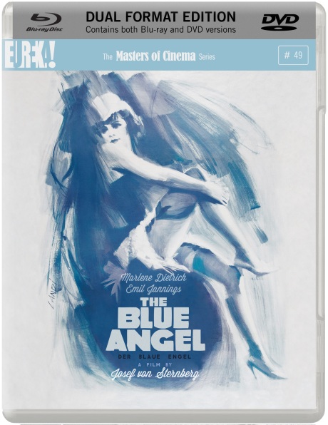
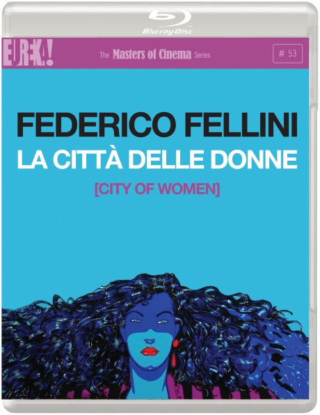
Don't like the Fellini at all. The colours look a bit too bright compared to the original poster and it doesn't really work in that orientation, given all the dead space.
The first three are tremendous, however, especially Der blaue Engel.
The first three are tremendous, however, especially Der blaue Engel.
-
Calvin
- Joined: Sun Apr 10, 2011 3:12 pm
Re: MoC Cover Art & Packaging Babble-on
I have to agree - the rest are great (especially The Blue Angel) but I really don't like the artwork for City of Women. There's some art by Italian comic book artist Milos Manara that could make a pretty good cover.
-
Anhedionisiac

- the Displeasure Principle
- Joined: Thu Feb 28, 2008 6:25 pm
Re: MoC Cover Art & Packaging Babble-on
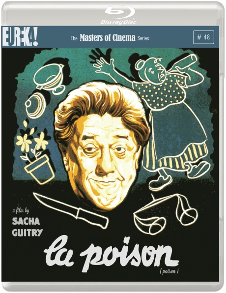
Well, I for one think they 're all fantastic covers. The stand-outs are La poison and Der Blaue Engel, of course but I think La città delle donne is very striking as well and, all in all, the use of dead space is perfectly appropiate next to that lovely illustration. My only criticism is that the typography doesn't quite work and the addition of the parenthesis bookends for the english translation of The City of Women cheapens it a bit. But, honestly, those are minor quibbles. Great work, MOC!
-
criterion10
Re: MoC Cover Art & Packaging Babble-on
Anyone else prefer Kino's color scheme for the Fear and Desire cover?
-
Gregory

- Joined: Tue Nov 02, 2004 8:07 pm
Re: MoC Cover Art & Packaging Babble-on
I'm curious what's with all the spoiler tags the past couple days in this thread and the random speculation one.
-
AlexHansen

- Joined: Thu Mar 20, 2008 2:39 am
- Location: Idaho
Re: MoC Cover Art & Packaging Babble-on
Tomorrow's announcements leaked.
-
Gregory
- Joined: Tue Nov 02, 2004 8:07 pm
Re: MoC Cover Art & Packaging Babble-on
Right, but I don't recall having seen this done with discussions of leaked announcements before, and the reason wasn't apparent. It doesn't conceal it from a Google search for example, and each title now has its own thread, so I found the spoilering of all comments curious.
-
peerpee
- not perpee
- Joined: Tue Nov 02, 2004 7:41 pm
Re: MoC Cover Art & Packaging Babble-on
Everybody's ashamed.
-
Jeff

- Joined: Wed Nov 03, 2004 1:49 am
- Location: Denver, CO
Re: MoC Cover Art & Packaging Babble-on
I just removed everyone's spoiler tags because it did seem kind of unnecessary and made the thread hard to read. I saw the covers and spine numbers in eerik's post like everyone else, and figured it couldn't hurt to go ahead and make the individual threads.
-
peerpee
- not perpee
- Joined: Tue Nov 02, 2004 7:41 pm
Re: MoC Cover Art & Packaging Babble-on
It's difficult to try and line up all the dominoes in order to knock them down on a specific day. It'd be good if eerik would be kind enough to say where he got all the packshots and details?
-
evillights
- Joined: Mon Nov 15, 2004 6:47 pm
- Location: U.S.
- Contact:
Re: MoC Cover Art & Packaging Babble-on
Yes, as Nick just mentioned, I too would be interested to know where these came from, apparently as of yesterday (Saturday) afternoon.
eerik, are you associated at all, or friendly with, anyone from hidefninja.com?
I should also note that ONIBABA is not a locked cover, at least in terms of color scheme, and has been leaked on this forum (and another) too early out of the gate. This was for internal/PR-placeholder usage in the interim before I personally had a chance to sit down with it. It's fine for those purposes, but doesn't necessarily reflect what would go up at the site, etc.
-
R0lf

- Joined: Tue May 19, 2009 11:25 am
Re: MoC Cover Art & Packaging Babble-on
The chosen cover is also one of the original movie posters.Calvin wrote:I have to agree - the rest are great (especially The Blue Angel) but I really don't like the artwork for City of Women. There's some art by Italian comic book artist Milos Manara that could make a pretty good cover.
-
MichaelB

- Joined: Fri Aug 11, 2006 10:20 pm
- Location: Worthing
- Contact:
Re: MoC Cover Art & Packaging Babble-on
Indeed it is - I remember seeing it on display in London when the film came out.
-
Calvin
- Joined: Sun Apr 10, 2011 3:12 pm
Re: MoC Cover Art & Packaging Babble-on
It is indeed but it doesn't please me artistically, perhaps because it's next to a couple of covers that rank among MoC's best. When it comes down to it, it's what's on the disc (and booklet) that matters!
-
beamish13
- Joined: Sun Oct 14, 2007 9:31 am
Re: 128 / BD 53 La città delle donne
Love that they're using Milo Manara's original poster art for La città delle donne.