MoC Cover Art & Packaging Babble-on
-
domino harvey

- Dot Com Dom
- Joined: Wed Jan 11, 2006 6:42 pm
OH HI DOGGY
I wonder if the steelbooks were cheep cheep cheep
-
tenia

- Ask Me About My Bassoon
- Joined: Wed Apr 29, 2009 3:13 pm
Re: MoC Cover Art & Packaging Babble-on
RossyG wrote:Did you like the films?
I won't have the time to watch them this week end (The Lost Weekend will be my priority though, since I've already seen Double Indemnity).
However, since we are in the MoC packaging topic...
-
Finch

- Joined: Mon Jul 07, 2008 9:09 pm
- Location: United States

-
BrokenFace
- Joined: Fri Dec 17, 2010 5:34 pm
Re: MoC Cover Art & Packaging Babble-on
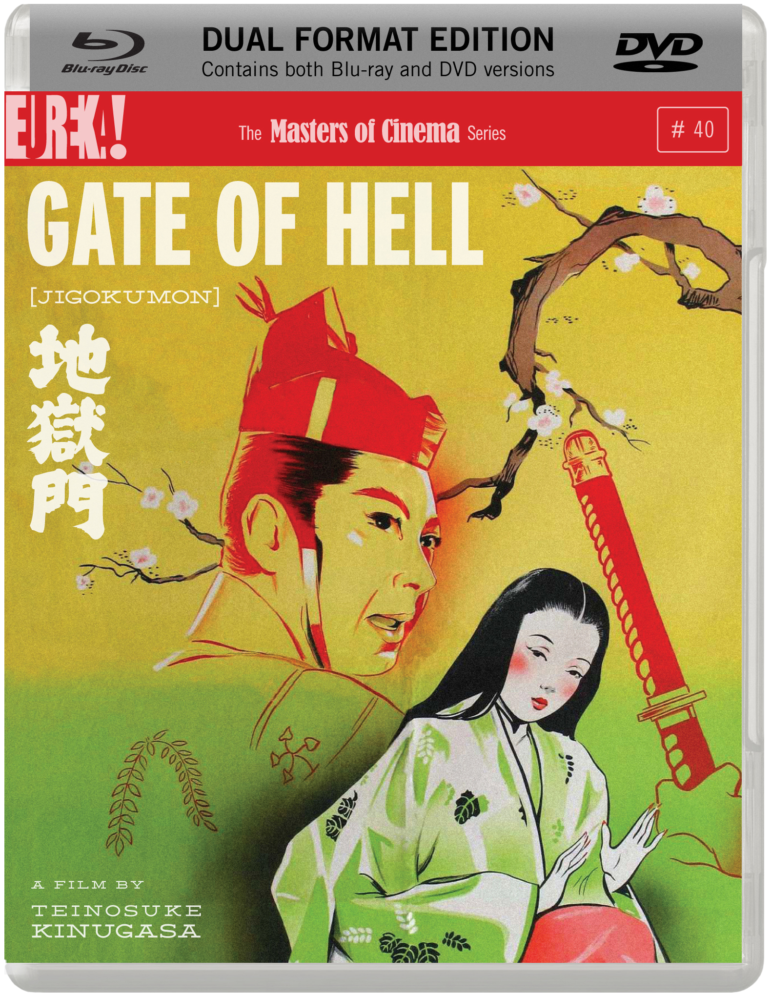
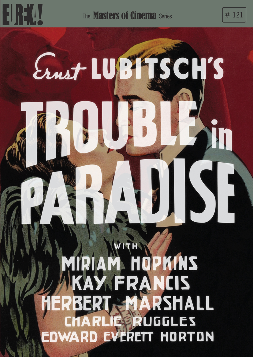
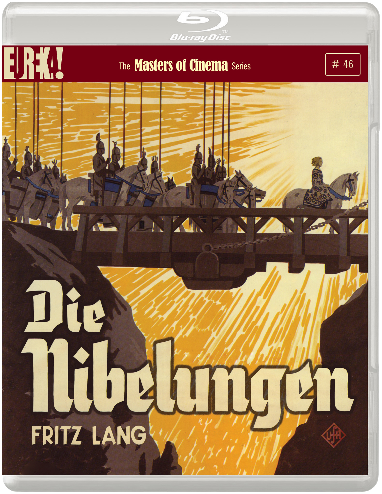
at first glance Die Nibelungen & Gate of Hell look great. Not sure about Trouble in Paradise with the giant text
-
Minkin

- Joined: Fri Aug 07, 2009 3:13 am
Re: MoC Cover Art & Packaging Babble-on
No Steelbook for Nibelung? Seems like a missed opportunity. I already had my hopes for another shirt + poster + steelbook fantasy. Sure, I'm happy that it's coming out anyway, and I'll buy several copies of it, but I think it deserves something extra special.
Last edited by Minkin on Mon Jul 16, 2012 11:55 am, edited 1 time in total.
-
eerik

- Joined: Sun Mar 22, 2009 8:53 pm
- Location: Estonia
Re: MoC Cover Art & Packaging Babble-on
Last edited by eerik on Mon Jul 16, 2012 11:56 am, edited 1 time in total.
-
Finch
- Joined: Mon Jul 07, 2008 9:09 pm
- Location: United States
Re: MoC Cover Art & Packaging Babble-on
Gate of Hell is an awesome cover. Pity it won't be a steelbook!
-
NABOB OF NOWHERE

- Joined: Thu Sep 01, 2005 4:30 pm
- Location: Brandywine River
Re: MoC Cover Art & Packaging Babble-on
Well until later developments it looks like MoC have wiped the floor with the opposition. All will be wending their way to Chateau Nabob but I would have hoped that Floating paid more of a tribute to its ravishing colour photography and maybe lure the more hesitant/casual buyer.
Like Finch hope that End of Summer gets similar treatment.
Like Finch hope that End of Summer gets similar treatment.
-
bamwc2
- Joined: Mon Jun 02, 2008 3:54 pm
Re: MoC Cover Art & Packaging Babble-on
Right. I usually don't care too much about cover art, but Trouble in Paradise looks like a real disaster. Why would anyone think that it's a good idea to cover the cast's faces with the title in such a clumsy manner?BrokenFace wrote:at first glance Die Nibelungen & Gate of Hell look great. Not sure about Trouble in Paradise with the giant text
-
BrokenFace
- Joined: Fri Dec 17, 2010 5:34 pm
Re: MoC Cover Art & Packaging Babble-on
Yeah, I don't really see need to list the cast for that one, considering none of them are too well-known today, except amongst people who will already be fans. Then they could've shifted the title down.bamwc2 wrote:Right. I usually don't care too much about cover art, but Trouble in Paradise looks like a real disaster. Why would anyone think that it's a good idea to cover the cast's faces with the title in such a clumsy manner?BrokenFace wrote:at first glance Die Nibelungen & Gate of Hell look great. Not sure about Trouble in Paradise with the giant text
I prefer the one they used in its original form: http://www.movieposterdb.com/poster/b23f98ba" onclick="window.open(this.href);return false;
However, I think this poster would've made for an awesome cover:

-
bainbridgezu

- Joined: Wed Jan 19, 2011 2:54 am
Re: MoC Cover Art & Packaging Babble-on
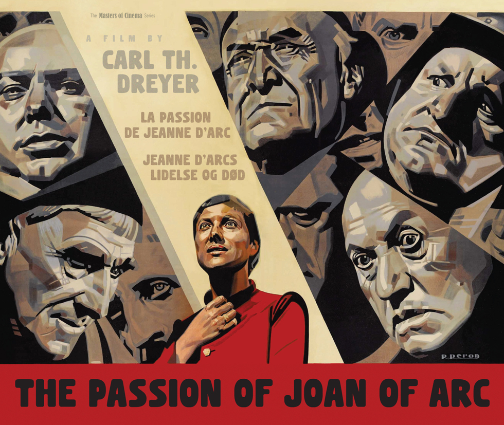
Best of luck to Criterion, or anyone else, who has to follow that incredible Passion of Joan cover. Anybody here feeling intrepid and care to make it into a wallpaper?
-
bamwc2
- Joined: Mon Jun 02, 2008 3:54 pm
Re: MoC Cover Art & Packaging Babble-on
My point has nothing to do with the star power of the cast. It's just plain weird to put up a pair of faces and cover them with letters. I suppose that it's been done for dramatic effect on some covers in the past, though nothing leaps to mind right now. Here it just seems wrong.BrokenFace wrote:Yeah, I don't really see need to list the cast for that one, considering none of them are too well-known today, except amongst people who will already be fans. Then they could've shifted the title down.
I prefer the one they used in its original form: http://www.movieposterdb.com/poster/b23f98ba" onclick="window.open(this.href);return false;
However, I think this poster would've made for an awesome cover:
-
BrokenFace
- Joined: Fri Dec 17, 2010 5:34 pm
Re: MoC Cover Art & Packaging Babble-on
I was agreeing with you - I only mentioned the cast list because if that wasn't so prominent, you could shift the title down and not cover the faces on the image.bamwc2 wrote:My point has nothing to do with the star power of the cast. It's just plain weird to put up a pair of faces and cover them with letters. I suppose that it's been done for dramatic effect on some covers in the past, though nothing leaps to mind right now. Here it just seems wrong.
-
andyli

- Joined: Thu Sep 24, 2009 8:46 pm
Re: MoC Cover Art & Packaging Babble-on
I think steelbook version of the newly announced titles are not out of question yet. As far as I remember the Metropolis steelbook was not announced along with the regular version, rather at a later time.
-
Sloper

- Joined: Wed May 30, 2007 2:06 am
Re: MoC Cover Art & Packaging Babble-on
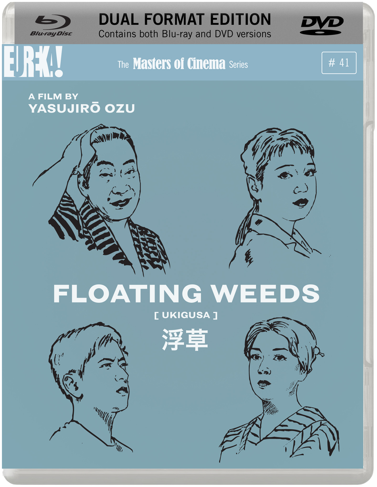
I really like the Trouble In Paradise cover, actually - it's a bit like a screenshot from a title sequence, and I think the slight transparency of the lettering will be more apparent when we see it 'in the flesh'. Magnificent take on Joan. Floating Weeds is a dud, though - in the same lacklustre vein as Finances of the Grand Duke. I just can't imagine anyone being enticed by it if they saw it on a shelf.
-
Calvin
- Joined: Sun Apr 10, 2011 3:12 pm
Re: MoC Cover Art & Packaging Babble-on
I don't really like the Floating Weeds cover either. I'd prefer it if they used the still from the Japanese cover and maybe stylised it a little:

-
thatobscurecharm

- Joined: Tue Aug 24, 2010 5:19 pm
- Location: Northern California
Re: MoC Cover Art & Packaging Babble-on
Die Nibelungen and Joan of Arc, finally! Also, I seem to remember that Nibelungen was spine #40? Or was that only for the supposed DVD release?
-
TMDaines

- Joined: Wed Nov 11, 2009 5:01 pm
- Location: Greater Manchester
Re: MoC Cover Art & Packaging Babble-on
All the covers are at MoC's usual awesome standard... except for Trouble. Die Nibelungen and Joan look especially great!
-
HJackson

- Joined: Wed Jul 20, 2011 11:27 pm
Re: MoC Cover Art & Packaging Babble-on
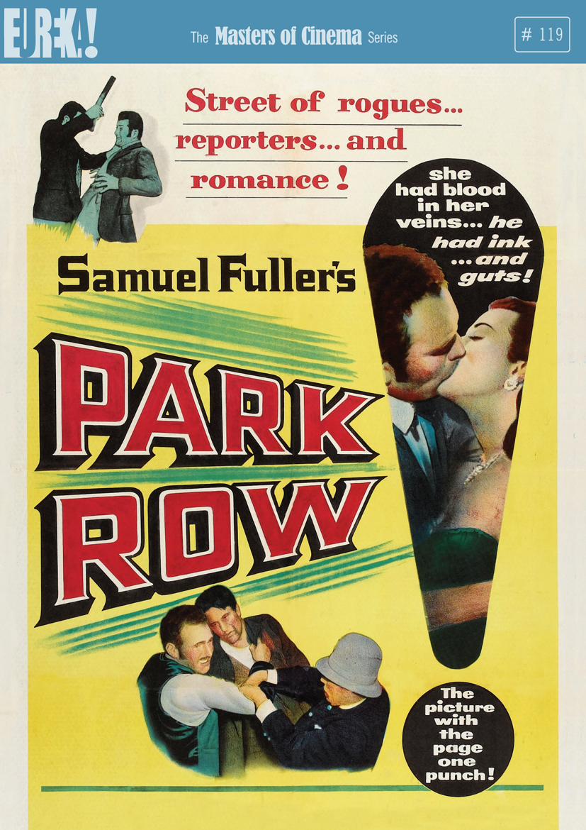
I like the TROUBLE IN PARADISE cover art. The PARK ROW cover is clearly faithful to a piece of promotional art from the original release, but I don't find it particularly appealing aesthetically.
-
TheGodfather

- Joined: Sun Sep 17, 2006 8:39 pm
- Location: The Netherlands
Re: MoC Cover Art & Packaging Babble-on
That is an amazing line-up for the winter. Finally Die Nibelungen is coming out,still love to see a steelbook for it though. And what about the Joan of Arc cover? stunning!!
And a pity to see no blu-ray for Trouble in Paradise. Is there a special reason for it? Will be buying all of them of course
MoC is having a great year!!
And a pity to see no blu-ray for Trouble in Paradise. Is there a special reason for it? Will be buying all of them of course
MoC is having a great year!!
-
swo17

- Bloodthirsty Butcher
- Joined: Tue Apr 15, 2008 2:25 pm
- Location: SLC, UT
Re: MoC Cover Art & Packaging Babble-on
MoC Twitter wrote:The reason PARK ROW and TROUBLE IN PARADISE are DVD-only is due to the condition (resolution-wise) of best extant materials. A difference would barely be discernible on Blu-ray. That said, though, our masters & the resulting DVDs look quite lovely.
-
TheGodfather
- Joined: Sun Sep 17, 2006 8:39 pm
- Location: The Netherlands
Re: MoC Cover Art & Packaging Babble-on
Ok thanks for that. Looking forward to see the differences between the Criterion and MoC Trouble in Paradis dvd`sswo17 wrote:MoC Twitter wrote:The reason PARK ROW and TROUBLE IN PARADISE are DVD-only is due to the condition (resolution-wise) of best extant materials. A difference would barely be discernible on Blu-ray. That said, though, our masters & the resulting DVDs look quite lovely.
-
eerik
- Joined: Sun Mar 22, 2009 8:53 pm
- Location: Estonia

-
tenia
- Ask Me About My Bassoon
- Joined: Wed Apr 29, 2009 3:13 pm
Re: MoC Cover Art & Packaging Babble-on
Just received this morning Rumble Fish steelbook, and I have to say that, not even being a packaging / collection fetish, I wish for MoC to settle down with how they put their J-card paper backcover.
I can understand the one for Island of Lost Souls being different, so the consumers can still see the title on front of it in stores and so on, but now, if you start to put it "upside down"...
On the other end, I'm pleased with the fact that there is now only two points of glue for it, which makes it much easier to be able to actuallw open the steelbook, but still keep the J card glued so it doesn't fall off everytime I'm taking the title of my shelf.
-
zitherstrings
- Joined: Wed Mar 03, 2010 4:35 am
Re: MoC Cover Art & Packaging Babble-on
#-oeerik wrote: