Seriously? The number of times I've read on this board of people having this problem makes me wonder just how delicate some of you are. Or gentle. Possessors of a feather-light touch, a lover's caress.Cinephrenic wrote:Well they are budget sets, but how much extra can it cost to add a flap on the bottom of the sets??? Everytime I lift an Eclipse set, all the films fall straight to my toes.mfunk9786 wrote:Do Eclipse sets fall within that umbrella?
Criterion & Eclipse Cover Art & Packaging Babble-on Vol.4
-
med

- Joined: Tue Mar 17, 2009 9:58 pm
Re: Criterion & Eclipse Cover Art & Packaging Babble-on
-
Matt

- Joined: Tue Nov 02, 2004 4:58 pm
Re: Criterion & Eclipse Cover Art & Packaging Babble-on
I originally viewed them this way, too (and was very adamant about it as evidenced by my posts in this thread back when the line came out), but now I'm regretting throwing them away and am thinking of asking Criterion if I can PayPal them some cash to get the sleeves back. I'm having a hard time remembering which titles were in which sets and now find myself keeping the new Eclipse sets I buy shelved as sets with the o-sleeve.Jeff wrote:Honestly, I view the o-sleeve on Eclipse set as a disposable marketing necessity -- a tool for bundling multiple titles for retail. I collapse the Eclipse sleeves and store them flat in the event that I want to sell a set, but I yank all of the titles out and shelve them alphabetically.
-
Svevan

- Joined: Mon Nov 22, 2004 11:49 pm
- Location: Portland, OR
Re: Criterion & Eclipse Cover Art & Packaging Babble-on
Saw a picture (can't find it now) of a guy who had all the Eclipse sets; arranged next to each other they look pretty sexy. I'd had mine scattered throughout my shelves but I put them all next to each other after I saw it.
-
med
- Joined: Tue Mar 17, 2009 9:58 pm
Re: Criterion & Eclipse Cover Art & Packaging Babble-on
I'm like Matt re: shelving the Eclipse sets. I like being able to read from a distance what each set is and to not look at a bunch of slimline cases. And, yes, there is the sexiness factor.
-
Feego

- Joined: Thu Aug 16, 2007 11:30 pm
- Location: Texas
Re: Criterion & Eclipse Cover Art & Packaging Babble-on
I actually have not been having this problem with the most recent Eclipse sets I bought (Nikkatsu, Chantal Akerman, Oshima). The earliest ones I bought (William Klein, Carlos Saura, Lubitsch) did have a tendency to slip right out of the sleeve when I picked them up. I assumed, based on my recent purchases, that Criterion was producing tighter sleeves for the newer sets.
I have to say, though, I've never liked slipcovers that are open at the bottom. I have the same problem with the Olivier's Shakespeare set, even though it is a little sturdier than the Eclipses.
I have to say, though, I've never liked slipcovers that are open at the bottom. I have the same problem with the Olivier's Shakespeare set, even though it is a little sturdier than the Eclipses.
-
movielocke

- Joined: Fri Jan 18, 2008 4:44 am
Re: Criterion & Eclipse Cover Art & Packaging Babble-on
That was probably me in this postSvevan wrote:Saw a picture (can't find it now) of a guy who had all the Eclipse sets; arranged next to each other they look pretty sexy. I'd had mine scattered throughout my shelves but I put them all next to each other after I saw it.
-
Svevan
- Joined: Mon Nov 22, 2004 11:49 pm
- Location: Portland, OR
Re: Criterion & Eclipse Cover Art & Packaging Babble-on
There it is. Yeah, too sexy, too sexy.
-
domino harvey

- Dot Com Dom
- Joined: Wed Jan 11, 2006 6:42 pm
Re: Criterion & Eclipse Cover Art & Packaging Babble-on
Man, enjoy them fitting perfectly in one shelf like that while it lasts
-
swo17

- Bloodthirsty Butcher
- Joined: Tue Apr 15, 2008 2:25 pm
- Location: SLC, UT
Re: Criterion & Eclipse Cover Art & Packaging Babble-on
This just in: Criterion discontinues Eclipse line. 
Peter Becker wrote:We determined that this was more cost effective than buying movielocke another shelf. Sorry, guy who would've bought a Gorin set.
-
movielocke
- Joined: Fri Jan 18, 2008 4:44 am
Re: Criterion & Eclipse Cover Art & Packaging Babble-on
lol, that's a shame, but at least Becker is attuned to my needs.
the shelf is two deep, so I moved the bergman set to the back and everything to the left to fit in the kurosawa set. :-p but it ooesn't fit as perfectly (which is good because it was hard to pull out a set there when they were like that picture.
And I've watched most of them, and really enjoy the line, otherwise I wouldn't buy them. Each set is a great bargain, imo. :-p
-
HistoryProf

- Joined: Mon Mar 13, 2006 7:48 am
- Location: KCK
Re: Criterion & Eclipse Cover Art & Packaging Babble-on
aw man...it's all "page not found" now
I also don't care for the opened tops and bottoms of the Eclipse sleeves. I don't really understand why they do it to be honest. i just assume they must somehow be cheaper....but how much cheaper could it be? is a slip case w/ only one opening really that hard?
but i've never had any of them fall out on me either...I tend to consider those tales a bit exaggerated.
-
bsmit
- Joined: Tue Apr 11, 2006 1:38 am
Re: Criterion & Eclipse Cover Art & Packaging Babble-on
If anyone is having a problem with them falling out, a reasonable method I think is to cut out the plastic from the top of the Eclipse set. That way the slim cases won't fall from the bottom, and you can still slide them out from the top. I know this doesn't help those who already took off all the plastic, but in the future it may be helpful.
-
Matt
- Joined: Tue Nov 02, 2004 4:58 pm
Re: Criterion & Eclipse Cover Art & Packaging Babble-on
As one of two complainers about the use of two display typefaces on the Sternberg covers, I want to say that the covers don't look half bad in person. They are printed with a slightly metallic silver ink that was not apparent from the online cover shots, and it catches the light nicely. The repetition of the herringbone pattern of Sternberg's coat on the spine and inside the box is a really nice touch.
-
godardslave

- Joined: Tue Nov 02, 2004 8:44 pm
- Location: Confusing and open ended = high art.
Re: Criterion & Eclipse Cover Art & Packaging Babble-on
This is a good idea.bsmit wrote:If anyone is having a problem with them falling out, a reasonable method I think is to cut out the plastic from the top of the Eclipse set. That way the slim cases won't fall from the bottom, and you can still slide them out from the top. I know this doesn't help those who already took off all the plastic, but in the future it may be helpful.
Even more radically, Criterion could actually make boxes with a bottom to them, like every other box in the world. ](*,)
-
swo17
- Bloodthirsty Butcher
- Joined: Tue Apr 15, 2008 2:25 pm
- Location: SLC, UT
Re: Criterion & Eclipse Cover Art & Packaging Babble-on
Breaking news! November cover art! Be the first to comment on it, anywhere on the internet!
[img]http://criterion_production.s3.amazonaws.com/release_images/3067/541_box_348x490.jpg[/img][img]http://criterion_production.s3.amazonaws.com/release_images/3049/542_box_348x490.jpg[/img]
[img]http://criterion_production.s3.amazonaws.com/release_images/3061/543_box_348x490.jpg[/img][img]http://criterion_production.s3.amazonaws.com/release_images/3043/Sonybox_348x490.jpg[/img]
Last edited by swo17 on Wed Aug 18, 2010 4:04 am, edited 1 time in total.
-
Jeff

- Joined: Wed Nov 03, 2004 1:49 am
- Location: Denver, CO
Re: Criterion & Eclipse Cover Art & Packaging Babble-on
I guess if you're going to use a publicity still for The Night of the Hunter, that's a pretty good one. It avoids the now-cliched knuckles image and includes a fun wink for those who've seen the film. This would have been cool too:

I was really hoping they'd go with an original illustration though. The film is like a nightmarish fairy tale, a children's book told as a horror movie. I thought it would be very cool to do it as a vintage book with an illustration that evokes dimestore creepy novels for teenagers from the 50s. Something like what they did for The Fugitive Kind would be good, but with an illustration reminiscent of an old Hardy Boys book. Here is a cool illustration I found online, but maybe it's not quite the right style:

This would have been a cool scene to illustrate, but maybe it's too spoilery.
Here is another illustration that somebody did that looks ready-made for a Wacky C. I like the (again spoilerish) Shelly Winters image at the bottom.
That Modern Times cover makes me think it might be a template for all of the future Chaplin releases. I hope not.
I was really hoping they'd go with an original illustration though. The film is like a nightmarish fairy tale, a children's book told as a horror movie. I thought it would be very cool to do it as a vintage book with an illustration that evokes dimestore creepy novels for teenagers from the 50s. Something like what they did for The Fugitive Kind would be good, but with an illustration reminiscent of an old Hardy Boys book. Here is a cool illustration I found online, but maybe it's not quite the right style:
This would have been a cool scene to illustrate, but maybe it's too spoilery.
Here is another illustration that somebody did that looks ready-made for a Wacky C. I like the (again spoilerish) Shelly Winters image at the bottom.
That Modern Times cover makes me think it might be a template for all of the future Chaplin releases. I hope not.
-
movielocke
- Joined: Fri Jan 18, 2008 4:44 am
Re: Criterion & Eclipse Cover Art & Packaging Babble-on
I love the Modern Times Cover. I'm looking forward to the process blog post the artist promised on it.
the touch I like most on Night of the Hunter is the title font making a stair step, its just ominous looking.
I imagine we don't have cover art for the seven movies in the set because even criterion is trying to figure out what the hell they're going to do with putting Drive He Said and A Safe place on a single bluray disc but on two separate DVDs. My guess is a two disc case for those two titles on the DVD side and they'll share the same dual cover art for both the dvd and the bluray editions. The alternative, separate cases and separate art for the dvd titles and then a single case with different art for the bluray combined disc would be quite upsetting to collectors and would be really odd within the collection.
I will be curious how they do the spine numbers on the cover for Drive He Said and A Safe Place though, they already have individual spine numbers.
-
Feego
- Joined: Thu Aug 16, 2007 11:30 pm
- Location: Texas
Re: Criterion & Eclipse Cover Art & Packaging Babble-on
I hate the Modern Times cover. It reminds me too much of this poster for A Clockwork Orange. It seems to suggest that Chaplin plays a mechanical man, which is extremely inappropriate for a movie that stresses the unceasing humanity of his character in an increasingly mechanized society.
I must admit that I didn't care for the Night of the Hunter cover when I first saw it, although it's growing on me. Still, I was hoping for an original illustration too, maybe something styled after Grimm's fairy tales, with a Hansel and Gretel motif.
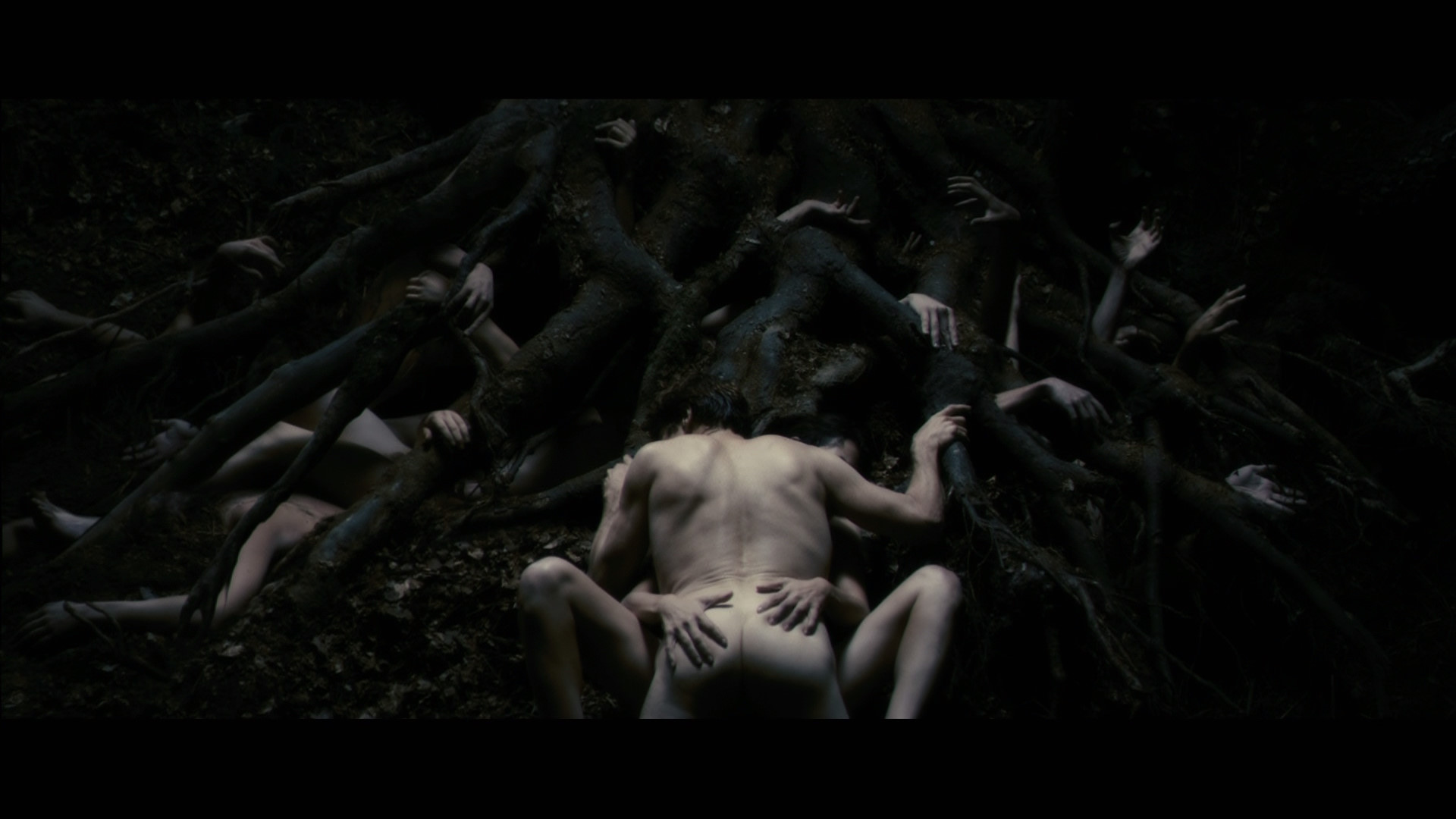
I'm surprised and pleased by the Antichrist cover. It's appropriately offensive without being over the top. I was pretty much expecting them to use the widely seen shot of Dafoe's naked ass.
And I'm loving the America Lost and Found cover. Can't wait to see what the individual covers look like (especially Head).
I must admit that I didn't care for the Night of the Hunter cover when I first saw it, although it's growing on me. Still, I was hoping for an original illustration too, maybe something styled after Grimm's fairy tales, with a Hansel and Gretel motif.
I'm surprised and pleased by the Antichrist cover. It's appropriately offensive without being over the top. I was pretty much expecting them to use the widely seen shot of Dafoe's naked ass.
And I'm loving the America Lost and Found cover. Can't wait to see what the individual covers look like (especially Head).
Last edited by Feego on Tue Aug 17, 2010 9:33 am, edited 1 time in total.
-
Highway 61

- Joined: Mon Nov 08, 2004 8:40 pm
Re: Criterion & Eclipse Cover Art & Packaging Babble-on
I rarely outright hate a Criterion cover, but I despise the cover of Modern Times. I can't believe we were treated to such a beautiful Chaplin poster, and now this.
-
Feego
- Joined: Thu Aug 16, 2007 11:30 pm
- Location: Texas
Re: Criterion & Eclipse Cover Art & Packaging Babble-on
Oh, and the year on the Night of the Hunter cover is 1940. [-X
-
Tommaso

- Joined: Fri May 19, 2006 2:09 pm
Re: Criterion & Eclipse Cover Art & Packaging Babble-on
I very rarely comment on this thread because normally I don't care for cover designs too much, but I was shocked to see that Chaplin cover, too. It looks like someone took a cheap 5$-disc of this and tried to make it look a little bit more 'artsy'. Almost as bad as the cover of the UK disc of "Antichrist". But at least CC did it right for that title.Highway 61 wrote:I rarely outright hate a Criterion cover, but I despise the cover of Modern Times. I can't believe we were treated to such a beautiful Chaplin poster, and now this.
-
Flike
- Joined: Sun Jun 08, 2008 11:47 pm
Re: Criterion & Eclipse Cover Art & Packaging Babble-on
I keep looking at the Modern Times cover and think I'm simply missing something. There has to be a reason for its ugliness. In addition, it's done by Sam Smith who a fantastic designer. I hope it isn't in fact a template for future releases. Blah.
All the other covers are fantastic. I suspect The Night of the Hunter will be an attractive digipak.
All the other covers are fantastic. I suspect The Night of the Hunter will be an attractive digipak.
-
domino harvey
- Dot Com Dom
- Joined: Wed Jan 11, 2006 6:42 pm
Re: Criterion & Eclipse Cover Art & Packaging Babble-on
Why would you hire Beaton for the poster, then churn out that for the cover art?
-
cysiam

- Joined: Wed Nov 10, 2004 12:43 am
- Location: Texas
Re: Criterion & Eclipse Cover Art & Packaging Babble-on
It definitely seems lacking in something. Effort is the first thing that comes to mind. There are gears in the film, gears are kinda round, hey so are eyes. Cover done.
Last edited by cysiam on Tue Aug 17, 2010 2:31 pm, edited 1 time in total.
-
Murdoch

- Joined: Mon Apr 21, 2008 3:59 am
- Location: Upstate NY
Re: Criterion & Eclipse Cover Art & Packaging Babble-on
This.domino harvey wrote:Why would you hire Beaton for the poster, then churn out that for the cover art?
Although I absolutely love the Antichrist cover.