Criterion & Eclipse Cover Art & Packaging Babble-on Vol.4
-
Svevan

- Joined: Mon Nov 22, 2004 11:49 pm
- Location: Portland, OR
Re: Criterion & Eclipse Cover Art & Packaging Babble-on
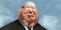
Wow, I love everything about that Crumb set except for the awkward rectangular photo on the top of the back cover. The artwork portfolio looks great and I love love love the cover of the booklet, which is of Crumb's brother I gather (not Crumb himself).
-
Jean-Luc Garbo

- Joined: Thu Dec 09, 2004 5:55 am
- Contact:
Re: Criterion & Eclipse Cover Art & Packaging Babble-on
I think that the top photo on back works alright even if slightly overlapping the title and mission statement over it would have been a nice touch. Charles' tiny writing on the inside cover was an excellent idea, too. All in all, it looks great.
-
mfunk9786

- Under Chris' Protection
- Joined: Fri May 16, 2008 8:43 pm
- Location: Miami, FL
Re: Criterion & Eclipse Cover Art & Packaging Babble-on
I absolutely love this art. It's such a beautiful move to make the inside a shrine to Charles. If I have one gripe it's that I wish they'd done something more creative with the actual disc art.
I'd highly recommend this book as a companion piece to the film. It includes scans from Charles' notebook and letters from Charles (that were sadly edited for grammar by Maxon Crumb, ruining a bit of his writing's unique charm), as well as comics from Robert and scans of some of Maxon's bizarre work. The standout of the book, however, is a full scan of Charles' delightfully subversive art school application, which is an invaluable piece of work in and of itself (and is included in this Criterion release as well apparently, to some extent).
I'd highly recommend this book as a companion piece to the film. It includes scans from Charles' notebook and letters from Charles (that were sadly edited for grammar by Maxon Crumb, ruining a bit of his writing's unique charm), as well as comics from Robert and scans of some of Maxon's bizarre work. The standout of the book, however, is a full scan of Charles' delightfully subversive art school application, which is an invaluable piece of work in and of itself (and is included in this Criterion release as well apparently, to some extent).
Last edited by mfunk9786 on Mon Jul 19, 2010 3:45 pm, edited 2 times in total.
-
Flike
- Joined: Sun Jun 08, 2008 11:47 pm
Re: Criterion & Eclipse Cover Art & Packaging Babble-on
Yeah, I wasn't very hopeful considering they used old art for the cover and Crumb and Zwigoff really don't get on well these days, but... wow. Favorite package of the year so far.
-
Matt

- Joined: Tue Nov 02, 2004 4:58 pm
Re: Criterion & Eclipse Cover Art & Packaging Babble-on
That might be the case for the DVD, since disc art usually differs between DVD and Blu-ray releases.mfunk9786 wrote:If I have one gripe it's that I wish they'd done something more creative with the actual disc art.
-
PfR73

- Joined: Sun Mar 27, 2005 10:07 pm
Re: Criterion & Eclipse Cover Art & Packaging Babble-on
I just went to Barnes & Noble intending to purchase The Red Shoes & Black Narcissus (neither of which they had gotten in-stock) & found a copy of Bottle Rocket on Blu-Ray in the plastic case. Having been holding off on purchasing it waiting for just such an event, I snapped it up. Hopefully the other early releases will follow suit in more rapid succession.
-
HistoryProf

- Joined: Mon Mar 13, 2006 7:48 am
- Location: KCK
Re: Criterion & Eclipse Cover Art & Packaging Babble-on
I keep hoping for the same...lucky you! That and Marienbad are two i've never seen in plastic cases. has anyone ever seen Marienbad in plastic in a store? I don't want to order it on-line for fear of getting the old one.
-
fdm

- Joined: Fri Apr 21, 2006 5:25 pm
Re: Criterion & Eclipse Cover Art & Packaging Babble-on
I think Bottle Rocket and The Third Man are the only two so far to make the transition. The rest you need to get the cases from Criterion. (Wasn't it this thread where I posted once or twice recently about these two?)
-
movielocke

- Joined: Fri Jan 18, 2008 4:44 am
Re: Criterion & Eclipse Cover Art & Packaging Babble-on
I also saw bottle rocket in a real case in stores today, alas I also so el norte, marienbad, 400 blows and last metro still in the cardboard.
-
Max von Mayerling

- Joined: Wed Dec 22, 2004 10:02 pm
- Location: Ann Arbor, MI
Re: Criterion & Eclipse Cover Art & Packaging Babble-on
Re: Crumb - I was going to wait to see what people said about the unused footage, but I think these printed materials just sealed the deal for me. Fantastic.
Last edited by Max von Mayerling on Thu Jul 22, 2010 3:38 pm, edited 1 time in total.
-
felipe
- Joined: Thu May 06, 2010 3:06 am
Re: Criterion & Eclipse Cover Art & Packaging Babble-on
I love that you took a picture of the open case, showing the spine. I'm always anxious to find out what color they'll go on the spine, so it's great I can see it on the picture.cdnchris wrote:Here you go!mfunk9786 wrote:I have been so eagerly anticipating photos from the Zwigoffs, and this is just cruel on the part of Criterion at this point. Send them to Chris nowwwww!
Crumb Blu-ray
Thanks a lot.
-
Cinephrenic
- Joined: Tue Nov 02, 2004 6:58 pm
- Location: Paris, Texas
Re: Criterion & Eclipse Cover Art & Packaging Babble-on
[img]http://criterion_production.s3.amazonaws.com/release_images/3022/538_BD_box_348x490.jpg[/img]
I like it. Very iconic.
I like it. Very iconic.
-
Flike
- Joined: Sun Jun 08, 2008 11:47 pm
Re: Criterion & Eclipse Cover Art & Packaging Babble-on
They even got to use a derivation of the original poster's font they seemed determined to use.
-
dad1153

- Joined: Thu Apr 16, 2009 2:32 pm
- Location: New York, NY
Re: Criterion & Eclipse Cover Art & Packaging Babble-on
Thumbs Up Soldier! 
-
domino harvey

- Dot Com Dom
- Joined: Wed Jan 11, 2006 6:42 pm
Re: Criterion & Eclipse Cover Art & Packaging Babble-on
A Film by Wes Anderson
-
Matt
- Joined: Tue Nov 02, 2004 4:58 pm
Re: Criterion & Eclipse Cover Art & Packaging Babble-on
Nah, that's not Futura. Well, the title at least. The other stuff might be Futura Condensed (but it looks a little vertically stretched).
-
aox

- Joined: Fri Jun 20, 2008 4:02 pm
- Location: nYc
Re: Criterion & Eclipse Cover Art & Packaging Babble-on
Kirk Douglas is rolling over in his gr.... wait, no, that isn't right.
-
movielocke
- Joined: Fri Jan 18, 2008 4:44 am
-
Alphonse Doinel

- Joined: Sun Dec 06, 2009 4:42 pm
Re: Criterion & Eclipse Cover Art & Packaging Babble-on
Type is nice, but this is the most disappointed I've been in a long time. I can understand why they wouldn't want to portray it as a gorgeous war film, but this is just a bore.
-
scotty2

- Joined: Wed Dec 31, 2008 4:24 am
Re: Criterion & Eclipse Cover Art & Packaging Babble-on
I like it. Their gritty version of putting the Hollywood star on the cover.
-
cdnchris

- Site Admin
- Joined: Tue Nov 02, 2004 6:45 pm
- Location: Washington
- Contact:
Re: Criterion & Eclipse Cover Art & Packaging Babble-on
I guess I was the only one but I actually liked the image on the press cover (yeah, the font was awful.) This one's fine, though.
-
Matt
- Joined: Tue Nov 02, 2004 4:58 pm
Re: Criterion & Eclipse Cover Art & Packaging Babble-on
No, I thought that was a great image, too. But no one could see it for the typeface. Maybe Kirk demanded that his face be bigger. Do your best Kirk Douglas impression:
<slams fist on table> It's GOT to be BIGGER, DAMMIT! <storms off in a huff>
<slams fist on table> It's GOT to be BIGGER, DAMMIT! <storms off in a huff>
-
bugsy_pal

- Joined: Mon May 12, 2008 5:28 am
Re: Criterion & Eclipse Cover Art & Packaging Babble-on
I like it too - the typography is nice and the photo works well.
-
matrixschmatrix

- Joined: Wed May 26, 2010 3:26 am
Re: Criterion & Eclipse Cover Art & Packaging Babble-on
It's pretty, but it doesn't really convey anything about the movie to me- it looks sort of static, and as though it's about the physical suffering of Douglas' character.
-
Cinephrenic
- Joined: Tue Nov 02, 2004 6:58 pm
- Location: Paris, Texas
Re: Criterion & Eclipse Cover Art & Packaging Babble-on
You have to admit that this is a hard picture to convey.