I want to make a couple of points which hopefully will help clarify the confusion here and elsewhere regarding "M" and the two releases on Blu-ray disc.triodelover wrote:I'm not sure anyone is saying that lighter with more detail is always preferred. This is a 1931 film, and the film stocks of the time just couldn't achieve the level of contrast available later (like in 1987). To boost contrast and deepen blacks creates an unnatural appearance that wouldn't accurately represent the original (while also obscuring detail). It's like recording a jazz quartet and over-miking the bass. Some folks may like "feeling" the bass, but it's not what the music sounded like acoustically in the recording venue. Jonathan S is correct. If you want that effect you either have or can add controls to your home system to achieve that. The producers of the disc - BD, DVD or CD - shouldn't be making that decision for you.swo17 wrote:Just to play devil's advocate for a moment, is lighter with more detail always preferred? See the debate in the Sous le soleil de satan thread.
I worked in very great detail and length (6 days) with the 35mm film elements that was the source of what later would become the two Blu-ray editions. But let me backtrack a bit and correct a few things:
1) Transit Film had absolutely nothing to do with the restoration effort at all. This is probably a mixup with Metropolis.
2) MTI Technologies has nothing to do with the company (of a very different name) in Melbourne that worked on cleanup and encoding and authoring of the Eureka DVD at the time. In fact, the work by that company lead to several unauthorized alterations in the grayscale causing, indeed, a "contrast boost". The transfer master from us was perfectly fine in that way, with no crushed blacks, no blownout whites, and no added digital sharpness.
3) As for the claim that "film stocks of the time just couldn't achieve the level of contrast available later (like in 1987)" - well, it is exactly the other way around. Who or whatever the source of that definition was, is wrong. In fact, nitrate film stocks because of their attributes based on a very different chemical composition could by far surpass the grayscale capabilities of the later following safety stocks, especially those of the 1980s, which were comparatively very limited in range. The results were far better and more luminous registration in the upper grayscale leading up to white, and extremely velvety dark gray tones leading to a very solid black. This kind of range can just barely be achived with the latest Kodak Vision stocks established in the first years since 2000. By now, you may already guess what "M" really looks like. And "M" is no exception, but the rule.
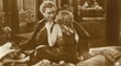
Now, there is no denying that each and everyone of those who own or want to own the film have their very own individual, very subjective preferences. But so did Lang. And he left very clear documentation as to what "M" should look like, both in form of the film elements themselves as well as written and verbal statements describing his intentions and instructions [re: the set design and lighting]. There are several very clear indicators that even if those statements would not exist and the film elements were to have survived completely skewed would point the way to the correct result. One very important aspect is the first scene, which is playing in the labyrinth-like living quarters that have lots of interconnected backyards that are uniquely tied to the city of Berlin, Germany. The opener with the children, the stairwell, the small, very dark and intentionally gritty rooms of the Elsie's mother's apartment - all this is a scenery that Lang wanted to capture precisely as it was in reality then. And the reality was very, very gritty - there was very little natural light coming in even on a bright sunny day. These locations [which were for the film build as a set on the lot of the Tempelhof studios] were literally pitch dark. I know these quarters [that have been restored and considerably "brightend up" in the last decade or so] very well, since I grew up near there and often visited school mates of mine who used to live there, with these living quarters having changed very little since the 30s at that time. It was depressing, with the stairwells often only lit by a naked bulb, and almost no natural light whatsoever. Without the light of such a bulb you could see little to nothing in front of you. The backyards were just as "dim". Lang often spoke about the enormous attention to detail with which these quarters were build - and lit - on the Tempelhof lot. He wanted to capture the depressing reality of living there "to the t". And as was his nature, he did so with all the other scenes as well. Lang noted that in his attempt to portray evil, one of his artistic tools was to make one of the main characters the shadow. "M" is a dark figure, a shadow, always lurking. Lang captured Lorre with that photography as menacing as he possibly could - and the impact on audiences was just as intense. After the film's opening, people who recognized the then unknown actor on the streets would grab their children in panic calling him, Lorre, "der Kindermörder" (the child murderer). Even much later, with Hitchcock in the UK and in Hollywood, Peter Lorre would be associated with and typecast as an evil man, something that hauted him to his final days. In the eyes of many, Lorre had become the very image he portrayed. Having all that play out in a very bright setting and atmosphere contradicts the entire story and certainly would not have had the impact it did.
Some comments were made that the Criterion Blu-ray Disc is "contrast boosted". In fact, contrast levels were not touched at all. Quite the opposite. We worked together with Criterion on the corrections of the initial transfer master to finalize the film's correct appearance, and it has been a very professional and wonderful experience throughout. As one can see on the Criterion DVD, both gamma curve and the black level in many scenes were a bit elevated, but nowhere near the bright levels that I have noticed on the Eureka BD. As to why this is or how that happend, I do not know. [By the way, the mentioned knuckles are visible way overexposed on the Eureka, as are many signs, etc] The scenes / shots with a an elevated gamma curve and/or black levels and in some also the white levels were corrected in great detail, matching the 35mm elements' image and intent. It now, finally, looks like it was supposed to all these years. The film's dark, menacing atmosphere [another giveaway is the Reward Poster with Lorre's shadow] is now captured as hauting as people saw it during the film's initial run. Shortly thereafter, it was banned by the Nazi regime, the beginning of an odyssey that the film almost did not survive and with many reincarnations such as false reformatting (to 1.37:1, cutting people's heads off) and sound syncs where no sound was supposed to be that had to be "unrestored" to get to the true, correct photochemical restoration Martin Koerber finalized in 2001. And it did not end there...
So, some of those who posted may prefer to see the film with a significantly elevated grayscale, but the Criterion Edition is very much accurate as to the originally intended image and what is actually registering on the 35mm film elements. I for myself can honestly say that, finally, with the gracious offer from Criterion to work together on this "M" Blu-ray edition, I am relieved and very satisfied to know that "M" is correct now also as a final master. Re: technical work the book "M" is closed now, to my great delight. It has been a privilege - and I hope you enjoy it.
Torsten Kaiser
TLEFilms
Film Mastering, Preservation and Restoration Services
Projects in High Definition; 2K, 4K
http://www.TLE-Films.com" onclick="window.open(this.href);return false;