Fake Criterion Covers
-
Tribe

- The Bastard Spawn of Hank Williams
- Joined: Tue Nov 02, 2004 11:59 pm
- Location: Toledo, Ohio
- Contact:
Re: Fake Criterion Covers
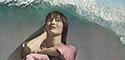
Re: Night of the Hunter...the second is the best (the reflection in the river under the title is a nice effect)...and the last one isn'tbad either.
-
Feego

- Joined: Thu Aug 16, 2007 11:30 pm
- Location: Texas
Re: Fake Criterion Covers
Thanks, I was leaning toward the second one too. And the reflection is actually not an effect. I simply took a shot from the film that included a reflection in the river and then split the still in half.Tribe wrote:Re: Night of the Hunter...the second is the best (the reflection in the river under the title is a nice effect)...and the last one isn'tbad either.
-
Peacock

- Joined: Mon Dec 22, 2008 11:47 pm
- Location: Scotland
Re: Fake Criterion Covers
I agree the second one is the best, but I don't like the black bar inbetween the two images, maybe put a fade between the black and each image?
-
TheGodfather

- Joined: Sun Sep 17, 2006 8:39 pm
- Location: The Netherlands
Re: Fake Criterion Covers
The First Name: Carmen cover is excellent!
-
Feego
- Joined: Thu Aug 16, 2007 11:30 pm
- Location: Texas
Re: Fake Criterion Covers
Fixed. A subtle but significant difference. The spine colors are HORRIBLY off, but I'm done with this.Peacock wrote:I agree the second one is the best, but I don't like the black bar inbetween the two images, maybe put a fade between the black and each image?


-
Tribe
- The Bastard Spawn of Hank Williams
- Joined: Tue Nov 02, 2004 11:59 pm
- Location: Toledo, Ohio
- Contact:
Re: Fake Criterion Covers
I don't mind using the iconic image for a cover...but I don't like the font at all.
-
James
- Joined: Wed Jun 04, 2008 8:11 pm
Re: Fake Criterion Covers
I like the font.Tribe wrote:I don't mind using the iconic image for a cover...but I don't like the font at all.
-
CSM126

- Joined: Thu Nov 04, 2004 12:22 pm
- Location: The Room
- Contact:
Re: Fake Criterion Covers
I forgot that Night of the Hunter was a Twilight Zone episode.Oggilby wrote:
Last edited by CSM126 on Mon Sep 21, 2009 5:29 am, edited 1 time in total.
-
so lightly here
- Joined: Wed Apr 29, 2009 3:38 pm
Re: Fake Criterion Covers
Think this is the best of anyone's efforts for NOFH. Think that using the kids instead of the iconic images really works to your advantage. Because it is so ready-to-go, your wacky ''C" on the front cover stands out as being overly wacky, especially when you have that pesky "C" correct on the back and spine. You would be best served by taking up Stop Making Sense's generous offer of his template and use it to correct your future efforts.Feego wrote:Fixed. A subtle but significant difference. The spine colors are HORRIBLY off, but I'm done with this.Peacock wrote:I agree the second one is the best, but I don't like the black bar inbetween the two images, maybe put a fade between the black and each image?
-
oldsheperd

- Joined: Thu Nov 11, 2004 9:18 pm
- Location: Rio Rancho/Albuquerque
Re: Fake Criterion Covers
Re: Wraparound cover for Night of the Hunter: I'm glad Caterine Deneuve and Roman Polanski are finally willing to do a commentary on that film.
-
Feego
- Joined: Thu Aug 16, 2007 11:30 pm
- Location: Texas
Re: Fake Criterion Covers
8-[ Hehe. The jig is up!oldsheperd wrote:Re: Wraparound cover for Night of the Hunter: I'm glad Caterine Deneuve and Roman Polanski are finally willing to do a commentary on that film.

-
swo17

- Bloodthirsty Butcher
- Joined: Tue Apr 15, 2008 2:25 pm
- Location: SLC, UT
Re: Fake Criterion Covers
Both very nice!
-
LQ
- Joined: Thu Jun 19, 2008 11:51 am
- Contact:
Re: Fake Criterion Covers
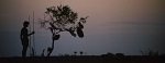
Although it took me a beat longer to figure out the title on the Weerasethakul cover, it looks fantastic.
-
Murdoch

- Joined: Mon Apr 21, 2008 3:59 am
- Location: Upstate NY
Re: Fake Criterion Covers
Love the Syndromes cover, although the title is weirdly placed.
-
Tribe
- The Bastard Spawn of Hank Williams
- Joined: Tue Nov 02, 2004 11:59 pm
- Location: Toledo, Ohio
- Contact:
Re: Fake Criterion Covers
Stagecoach is very nice...the second one had someone not said what the title was, I'd never been able to figure it out on my own.
-
Finch

- Joined: Mon Jul 07, 2008 9:09 pm
- Location: United States
Re: Fake Criterion Covers
Stagecoach looks excellent (if only Criterion would use this; I'd be very surprised albeit pleasantly if theirs turns out to be as good as yours), and I do like the Syndromes cover but I had a hard time also to figure out the title from looking at it.
-
HistoryProf
- Joined: Mon Mar 13, 2006 7:48 am
- Location: KCK
Re: Fake Criterion Covers
Here's my first try at this....
Can I ask one question on photoshop technique with the CC logo and bars at the bottom - how do you get the colors to have a slight transparency - same with text overlaid on pictures (or vice versa) - i'm sure it's a simple trick...but can anyone point me to the right filter or whatever it is? I've learned photoshop - such as I have - via pure trial and error. seems like a learn a new trick every time...but that one escapes me.
anyway...More Volker...could coincide with the U.S. release of the quite AWESOME Der Baader Meinhof Komplex that's doing the art house circuit right now (and a most assured SEE IT).
-
Cosmic Bus

- Joined: Tue Sep 12, 2006 2:12 am
- Location: Seattle, WA
- Contact:
Re: Fake Criterion Covers
Make sure the "Layers" window is turned on, and that your wacky C and sidebar are on their own layer separate from the rest of the image. You can then adjust their opacity in that little window.HistoryProf wrote:Can I ask one question on photoshop technique with the CC logo and bars at the bottom - how do you get the colors to have a slight transparency - same with text overlaid on pictures


-
HistoryProf
- Joined: Mon Mar 13, 2006 7:48 am
- Location: KCK
Re: Fake Criterion Covers
agreed on both accounts. the one with the reflection is the clear favorite for me.Tribe wrote:Re: Night of the Hunter...the second is the best (the reflection in the river under the title is a nice effect)...and the last one isn'tbad either.
-
HistoryProf
- Joined: Mon Mar 13, 2006 7:48 am
- Location: KCK
Re: Fake Criterion Covers
LOVE Stagecoach...but after much staring, i still can't decipher the 2nd title...it shouldn't be that much work.Klaylock wrote:
-
HistoryProf
- Joined: Mon Mar 13, 2006 7:48 am
- Location: KCK
Re: Fake Criterion Covers
Cosmic Bus wrote:Make sure the "Layers" window is turned on, and that your wacky C and sidebar are on their own layer separate from the rest of the image. You can then adjust their opacity in that little window.HistoryProf wrote:Can I ask one question on photoshop technique with the CC logo and bars at the bottom - how do you get the colors to have a slight transparency - same with text overlaid on pictures
awesome...thanks! [navinjohnson]opacity eh??? I gotcha...it's an opacity racket! "STEP RIGHT UP AND GET YOUR FAKE CRITERIONS FOLKS - WITH FREE OPACITY![/navinjohnson]
is there a trick to lifting them into their own layer? I probably do it wrong, but i basically just make the rectangle shape and fill the color I want in it....
ETA: ANd I promise i'll never ask another photoshop question again
-
aox

- Joined: Fri Jun 20, 2008 4:02 pm
- Location: nYc
Re: Fake Criterion Covers
yeah, I still haven't figured it out. I now just don't care.HistoryProf wrote:
LOVE Stagecoach...but after much staring, i still can't decipher the 2nd title...it shouldn't be that much work.
-
manicsounds

- Joined: Wed Nov 03, 2004 2:58 am
- Location: Tokyo, Japan
Re: Fake Criterion Covers
I'd fix the spelling on his name first....HistoryProf wrote: