The hell with the video cooking contest.
Shouldn't Criterion open a Cover Designing Competition?
They could choose one of the long-announced but slow-to-be-released titles, such as Greed. Or use the competition to drum up interest in an obscure title.
Winning entry goes into the collection.
I'd think they'd get some fine cover art to choose from, and the entries might just give them some ideas for new directions to explore in cover art.
Fake Criterion Covers
-
Lemmy Caution

- Joined: Wed Mar 29, 2006 7:26 am
- Location: East of Shanghai
-
godardslave

- Joined: Tue Nov 02, 2004 8:44 pm
- Location: Confusing and open ended = high art.
Re: Fake Criterion Covers
I like this. =D>LastLament wrote:

-
agnamaracs

- Joined: Thu Dec 21, 2006 7:13 am
Re: Fake Criterion Covers
This is really less an actual cover than a sketch of an idea... I just think that a DVD cover for this film should use the butterfly motif.
This is all I could come up with. Maybe a more skilled photoshopper can do better. Butterfly is ripped directly from the film.

This is all I could come up with. Maybe a more skilled photoshopper can do better. Butterfly is ripped directly from the film.
-
agnamaracs
- Joined: Thu Dec 21, 2006 7:13 am
Re: Fake Criterion Covers
Then do better.
I mean I already said that
--it wasn't very good,
--Photoshop is not my strongest suit, and
--this is only a sketch of an idea,
so the only possible reason for further criticism must be setting up your own fantastic faux-cover, correct?
(Oh, and I add to my idea: a new DVD cover for BTK should include butterflies and/or Annu Mari. She stole this film.)


-
Napier

- Joined: Wed Nov 03, 2004 1:48 pm
- Location: The Shire
Re: Fake Criterion Covers
Haha....I forgot about Joe and his rice sniffing fetish. I'd give it a little more work, but a great idea.
-
Stop Making Sense
- Joined: Tue Aug 25, 2009 6:58 pm
Re: Fake Criterion Covers
Batman: Arkham Asylum has been winning out over cover making this week, but I still managed two.

-
zedz

- Joined: Sun Nov 07, 2004 11:24 pm
Re: Fake Criterion Covers
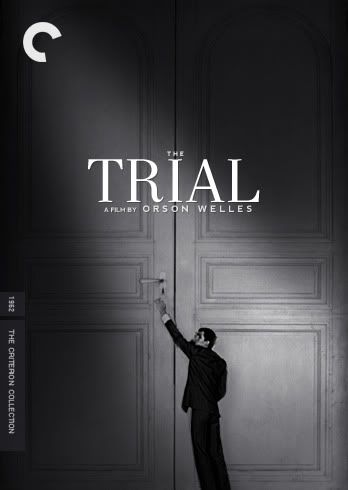
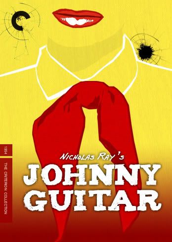
The chances of Criterion actually using that great poster image for the Bresson are fainter than faint, but I'm glad you did. The Trial is excellent too.
-
HistoryProf

- Joined: Mon Mar 13, 2006 7:48 am
- Location: KCK
Re: Fake Criterion Covers
Stop Making Sense wrote:Yeah, I've messed around with this one before, but I could never quite make it work. However, seeing it again, I had an idea. So, ganking a bit from it, I came up with Johnny Cover Mk. II:Jeff wrote:Here is a high-res illustration that Michael Kupperman did for The New Yorker. It's the wrong shape, but maybe you could find a way to use it.
Oh, and that Age of Innocence cover is great, LastLament.
not onlly is this an awesome cover, but I just noticed this is on TCM Thursday night
-
Stop Making Sense
- Joined: Tue Aug 25, 2009 6:58 pm
Re: Fake Criterion Covers
Forget Rivette, we all know who Criterion is truly ducking...

-
TheGodfather

- Joined: Sun Sep 17, 2006 8:39 pm
- Location: The Netherlands
Re: Fake Criterion Covers
God I`d wish they`d use both of them! especially the Bresson cover is brilliantStop Making Sense wrote:Batman: Arkham Asylum has been winning out over cover making this week, but I still managed two.
-
Harmonov

- Joined: Thu Apr 17, 2008 3:26 pm
- Location: Bloomington, IN
Re: Fake Criterion Covers
The French title really classes it up.Stop Making Sense wrote:Forget Rivette, we all know who Criterion is truly ducking...
Great work on all of your covers. I enjoy seeing what new ones you come up with.
-
Stop Making Sense
- Joined: Tue Aug 25, 2009 6:58 pm
Re: Fake Criterion Covers
Masters of Cinema must give you the vapors then. I make covers for the fun of it, and simply posting a great image wouldn't show how it would work in practice as a cover. If you can show the full effect, why not go ahead and do so? I thought I'd give a short demo on the how this particular cover came to be.so lightly here wrote:My personal aversion to using an existing film poster and redoing the font and adding the CC template (while in and of themselves are important decisions and an integral part of the design process) is that I take the comments posted here to be about the image. When that image is not significantly altered it doesn't seem to make much sense to go crazy in love or hate with something done primarily by another person. If I found an existing poster image I thought would make a great CC cover I would simply post the image.
Here is the original poster I came across while googling for a theatrical poster for A Man Escaped, not for cover making but for use in DVDpedia. I liked it, I saved it.

This is the finished product and what I started with. Obviously there were issues with the black levels, so I added a Multiply layer.

Ew. The background looks about right, but the rest... easily remedied with a Lighten layer over the head.

That's better, but it looks a little flat. Selective use of a low opacity black paintbrush produces the desire effect.

Hmm, the hair is a little too yellow for my taste. A light tan color overlay gets it to my liking.

A slight difference, but I'm pleased with the image itself. Let's add the CC template. Pulling the colors directly from the poster works best in most cases.

Now it's font time. I usually go through my entire font library 3-5 times before I find one I'm happy with. For me, fonts make or break a cover. Just look at Criterion's Monsoon Wedding. I actually love the image itself, but the font and its placement is just bad. Anyway, after a few tries I decided that a script font struck my fancy better than a serif or sans-serif. I chose one called JaneAustin.

A little too bright for the dark image. Selective use of a low opacity eraser and placement of the director's credit (which I often use Nevis for, thanks to its readability at small sizes) and we're done.
This was one of the simpler covers, but it still took longer than I've portrayed here, as there's lots of fiddling to get just the right effect. The Trial took ages and involved completely redoing the perspective on the door and recreating a portion of the door as I wanted to be a dick and make Anthony Perkins just a tad too short to reach the handle.
-
Stop Making Sense
- Joined: Tue Aug 25, 2009 6:58 pm
Re: Fake Criterion Covers
I assure you that I've credited any and all obscure Eastern European painters inside the respective booklets.
-
Lemmy Caution
- Joined: Wed Mar 29, 2006 7:26 am
- Location: East of Shanghai
Re: Fake Criterion Covers
I think we need a new thread where obsessive writers can create their own Fake Criterion Booklets and post them.
-
Feego

- Joined: Thu Aug 16, 2007 11:30 pm
- Location: Texas
Re: Fake Criterion Covers
People, it's all in good fun. Calm down. Nobody is telling So Lightly Here that he's a worthless piece of shit. This thread is dedicated to fake cover art. Great, bring it on. But his verobse posts about serious critical analysis and formal bibliographic references for FAKE CRITERION COVERS clearly draw more attention to him than they do to his covers, so we're just giving him the attention that he wants. And in case you haven't noticed, the CRITERION FORUM is NOT the place to be if you're that sensitive.tajmahal wrote:Agreed. I thought he must have insulted someone's mother. Twice. I like his 'house' style. If he wants to explain his creations, more power to him.mteller wrote:Okay, slh's covers are not that hot, but the glee with which you all pile on him is truly revolting. Grow the hell up.
Here's one of my fake covers. Have at it. Praise, bashing. I don't care. It's a FAKE CRITERION COVER.

-
Matango

- Joined: Mon Aug 01, 2005 5:19 am
- Location: Hong Kong
Re: Fake Criterion Covers
Not too good. In fact it looks like a fake So Lighly cover. 
-
Feego
- Joined: Thu Aug 16, 2007 11:30 pm
- Location: Texas
Re: Fake Criterion Covers
#-o Haha! Well, can't win 'em all. It's NOT a fake So Lightly (before I get accused of further making fun). Just something I did in my spare time. :-"Matango wrote:Not too good. In fact it looks like a fake So Lighly cover.
-
HerrSchreck

- Joined: Sun Sep 04, 2005 3:46 pm
Re: Fake Criterion Covers
Jeez, dude. My cornflakes smell like you.mteller wrote:Yeah, but just about every post I see from you is rude and condescending. Who pissed in your cornflakes?HerrSchreck wrote:To the guys above: guys, it's the web-- a sucking black hole of porn and schadenfreude. Celebrities, reviewers, authors, bloggers, etc, get attacked on their own sites...
-
Stop Making Sense
- Joined: Tue Aug 25, 2009 6:58 pm
Re: Fake Criterion Covers
Let's get this train back on the rails, shall we?

-
skuhn8

- Joined: Tue Dec 14, 2004 8:46 pm
- Location: Chico, CA
Re: Fake Criterion Covers
But a cover should also help sell a DVD on some level. This cover says to me: we shot in 8mm, projected onto a kitchen wall where we filmed that with 16mm and voila! don't mind the sound dropping out...the boom guy couldn't keep up.Stop Making Sense wrote:Let's get this train back on the rails, shall we?
-
HarryLong
- Joined: Tue Nov 25, 2008 4:39 pm
- Location: Lebanon, PA
Re: Fake Criterion Covers
You've nailed my problem with a lot of these theoretical covers. They show no awareness that in a video store (or section of a store), they need to shout (or state very firmly) to the potential buyer, "Take me home!"But a cover should also help sell a DVD on some level.
-
Feego
- Joined: Thu Aug 16, 2007 11:30 pm
- Location: Texas
Re: Fake Criterion Covers
And nothing shouts "Take me home!" like blurry lights on a purple background.
-
Stop Making Sense
- Joined: Tue Aug 25, 2009 6:58 pm
Re: Fake Criterion Covers
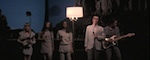
Serious question: Besides a cover or two like Benjamin Button, has Criterion ever released a cover that would sell a movie to someone that didn't already know what the movie was? Ran is a film about Jackson Pollack, Wages of Fear is a gay love story about mud wrestling, The Third Man is about sewer inspection, 8 1/2 is about an elderly Rachel Maddow not wanting hugs, Hiroshima mon amour is about gropers on the Japanese subway systems, F for Fake is about Orson Welles squishing your head, and Au hasard Balthazar is about... oh dear god. None of this defends my choice for the cover, of course. I actually expected some people to dislike this one, but it accurately reflects my own aesthetic likes and would catch me eye. Here's an alternate design I did at the same time:skuhn8 wrote:But a cover should also help sell a DVD on some level. This cover says to me: we shot in 8mm, projected onto a kitchen wall where we filmed that with 16mm and voila! don't mind the sound dropping out...the boom guy couldn't keep up.
I wasn't totally pleased with how it came out, but the general idea for it and the other was for the image to almost be coming apart at the edges, becoming indistinct, as future (in the film) became less easy to foretell, ready to split into the three possibilities shown. I also tooled around with the idea of working the three separate realities into the cover, but it became a bit crowded and gimmicky.
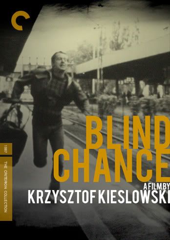
It's very hard to come to a balance on making a cover "saleable" and artistically pleasing. If I wanted to sell the film on the stands at Best Buy I'd probably have to slap on a huge critic quote from Roger Ebert or maybe Quentin Tarantino's face. Sadly, Blind Chance doesn't have any actors famous enough for GIANT FLOATING HEADS.
I totally get what you're saying though, it was a thought that occurred to me too, and maybe I'll experiment with something a bit clearer later. It's all for fun anyways.
Last edited by Stop Making Sense on Thu Sep 17, 2009 8:01 pm, edited 1 time in total.