Fake Criterion Covers
-
tenia

- Ask Me About My Bassoon
- Joined: Wed Apr 29, 2009 3:13 pm
Re: Fake Criterion Covers
I find that cover pretty nice too. A lot better than the ugly green one just before. But here, it's very simple, very dark. I think it suits the movie quite well.
-
Stop Making Sense
- Joined: Tue Aug 25, 2009 6:58 pm
Re: Fake Criterion Covers
Blackface and Mommie Dearest.


-
Jeff

- Joined: Wed Nov 03, 2004 1:49 am
- Location: Denver, CO
Re: Fake Criterion Covers
Good God, man. Those are magnificent!
-
souvenir

- Joined: Wed Nov 03, 2004 4:20 pm
Re: Fake Criterion Covers
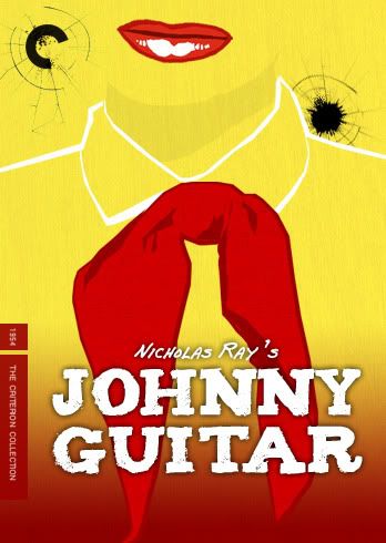
When I think of Johnny Guitar, a bell-shaped noose isn't my first or hundredth thought. That cover makes it look like a standard issue western.
-
Jeff
- Joined: Wed Nov 03, 2004 1:49 am
- Location: Denver, CO
Re: Fake Criterion Covers
Guitar.souvenir wrote:bell-shaped noose
-
The Elegant Dandy Fop

- Joined: Thu Dec 09, 2004 7:25 am
- Location: Los Angeles, CA
Re: Fake Criterion Covers
That Othello one is absolutely gorgeous! Must be one of the greatest fan covers I've ever seen!
But I haven't been taking enough drugs. Maybe my straight conformist mind is too use to beauty.
EDIT: Oh, and Stop Making Sense, I noticed the font for Othello is very similar to the font from Dr. Strangelove and... ahem... Stop Making Sense.
But I haven't been taking enough drugs. Maybe my straight conformist mind is too use to beauty.
EDIT: Oh, and Stop Making Sense, I noticed the font for Othello is very similar to the font from Dr. Strangelove and... ahem... Stop Making Sense.
Last edited by The Elegant Dandy Fop on Sun Sep 06, 2009 6:19 am, edited 1 time in total.
-
Saturnome

- Joined: Sun Aug 12, 2007 9:22 pm
Re: Fake Criterion Covers
It's a guitar, not a bell. It's a fun idea but I'm not sure I like the cover. I'm saying it because I liked everything else so far.
Edit: wow, 3 replies in 30 seconds. Where are your values, people? Let the people finish writting before you start! Kids these days
Edit: wow, 3 replies in 30 seconds. Where are your values, people? Let the people finish writting before you start! Kids these days
-
souvenir
- Joined: Wed Nov 03, 2004 4:20 pm
Re: Fake Criterion Covers
Guitar, bell-shaped noose, either way it's unrepresentative of the film and this forum would tear it apart if Criterion used that cover. No offense intended to Stop Making Sense, whose other covers I've also enjoyed.
-
Mr. Ned
- Joined: Sun Apr 05, 2009 10:58 pm
Re: Fake Criterion Covers
Stop Making Sense wrote:Just a quick one.
Wow, talk about going above and beyond the call of duty! That's the exact color tone I was thinking about, and you even used the font from the title sequence--it really is a perfect cover for the film. You are a cover creating super genius, Stop Making Sense.
-
Stop Making Sense
- Joined: Tue Aug 25, 2009 6:58 pm
Re: Fake Criterion Covers
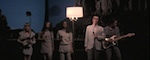
The inherent problem with making a Johnny Guitar cover is that there are about 3 high quality images from the film on the entire internet, all seeming to feature Johnny and/or Vienna standing about staring. Not very eye catching. The ideal version of the cover would be illustrated, but since I don't have access to a Mike Allred, Paul Pope or Jaime Hernandez, I tried something a bit outside the box. Eh, I like it. Win some, lose some.
The font is called Pablo for a reason. :-"The Elegant Dandy Fop wrote: EDIT: Oh, and Stop Making Sense, I noticed the font for Othello is very similar to the font from Dr. Strangelove and... ahem... Stop Making Sense.
-
The Elegant Dandy Fop
- Joined: Thu Dec 09, 2004 7:25 am
- Location: Los Angeles, CA
Re: Fake Criterion Covers
I forgot his name. All I know is that he was an alum of my old high school. I was just making sure it wasn't a coincidence.Stop Making Sense wrote:The font is called Pablo for a reason. :-"The Elegant Dandy Fop wrote: EDIT: Oh, and Stop Making Sense, I noticed the font for Othello is very similar to the font from Dr. Strangelove and... ahem... Stop Making Sense.
EDIT: I just bothered Googling his name. It's Pablo Ferro and he's not an alum of my high school. Some title graphic artist is, but not him.
-
Finch

- Joined: Mon Jul 07, 2008 9:09 pm
- Location: United States
Re: Fake Criterion Covers
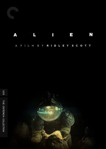
Stop Making Sense, your Alien cover is the best one I've seen for this film. What I'd give for that to be in my collection! You've truly outdone yourself with this one. =D>
-
Matango

- Joined: Mon Aug 01, 2005 5:19 am
- Location: Hong Kong
Re: Fake Criterion Covers
Stop Making Sense, are you ready to start taking requests already? If so, I'd like to get a jump on the others by requesting a Saint Jack cover. Hats off to you, either way, sir. =D>
-
Jeff
- Joined: Wed Nov 03, 2004 1:49 am
- Location: Denver, CO
Re: Fake Criterion Covers
Here is a high-res illustration that Michael Kupperman did for The New Yorker. It's the wrong shape, but maybe you could find a way to use it.Stop Making Sense wrote:The inherent problem with making a Johnny Guitar cover is that there are about 3 high quality images from the film on the entire internet...The ideal version of the cover would be illustrated
-
HistoryProf

- Joined: Mon Mar 13, 2006 7:48 am
- Location: KCK
Re: Fake Criterion Covers
Thanks a lot...i should be able to fashion something with that...i'm no where near the level of some of you guys, but i can cut and paste stuffship_destroyer wrote:and the font criterion uses along the spine is kartika, i believe.
sorry i can't really help with your other query.

-
Stop Making Sense
- Joined: Tue Aug 25, 2009 6:58 pm
Re: Fake Criterion Covers
Yeah, I've messed around with this one before, but I could never quite make it work. However, seeing it again, I had an idea. So, ganking a bit from it, I came up with Johnny Cover Mk. II:Jeff wrote:Here is a high-res illustration that Michael Kupperman did for The New Yorker. It's the wrong shape, but maybe you could find a way to use it.
Oh, and that Age of Innocence cover is great, LastLament.
-
Feego

- Joined: Thu Aug 16, 2007 11:30 pm
- Location: Texas
Re: Fake Criterion Covers
Oh my God. Seriously dude, you need to go beat down someone's door at Criterion until they hire you. This is untapped greatness.
-
Sloper

- Joined: Wed May 30, 2007 2:06 am
Re: Fake Criterion Covers
Great stuff, SMS! Not sure I've seen a Criterion cover that uses the wacky C so well. It really evokes those great scenes of Crawford standing unmoved while the trigger-happy mob closes in on her.
-
Finch
- Joined: Mon Jul 07, 2008 9:09 pm
- Location: United States
Re: Fake Criterion Covers
The new JG cover is excellent work, and I'd encourage you too to send some samples of your work to Criterion. Nothing ventured, nothing gained!
-
Guido
- Joined: Sun Jun 01, 2008 3:31 am
Re: Fake Criterion Covers
I'll reiterate what most have already said: Stop Making Sense's work is stellar! I'm looking forward to your next batch.
Here are a few covers which all share the same kind of minimal design. The last one is for Nothing!


Here are a few covers which all share the same kind of minimal design. The last one is for Nothing!
-
Stop Making Sense
- Joined: Tue Aug 25, 2009 6:58 pm
Re: Fake Criterion Covers
Those are absolutely beautiful!

-
Stop Making Sense
- Joined: Tue Aug 25, 2009 6:58 pm
Re: Fake Criterion Covers
I (a dude, btw) guess I should have been more specific. I think the IMAGE LastLament chose is great. I'm also fine with the white space. No, I don't particularly like the font, but then again, I don't like the font on the original theatrical poster either. From experience I know that choosing the perfect font is quite difficult and I didn't felt like nitpicking.so lightly here wrote:... Certainly SMS has a variety of styles under his or her belt to cover the many moods of the films (s)he is making great creating covers for. I am slightly surprised that his/her great eye has taken special note of "The Age Of Innocence" cover. The font seems way out of place for Scorsese's try at Edith Warton's now period piece and the drawing and layout seem to lack the handsomeness of the twosome - Pfeiffer and Day-Lewis.
If I can offer some creative criticism, I think one of the reasons people harp on your covers is because there seems to be no accounting for mood. Everything is overexposed, over-sharpened and over-neon. Now that may well work for some films, but not for something like Alien where shadows and darkness play a huge role. The cover should reflect that. I've aborted more than a few covers because I just couldn't get the mood right.
I've only seen a trailer for the movie, but I think I can try something when I get the chance.Matango wrote:Stop Making Sense, are you ready to start taking requests already? If so, I'd like to get a jump on the others by requesting a Saint Jack cover. Hats off to you, either way, sir.
-
knives

- Joined: Sat Sep 06, 2008 10:49 pm
Re: Fake Criterion Covers
This is what that was? I think I used to watch this all the time as a kid. It has some weird fog and B&W stock footage correct? I wish Criterion would release it if just so I could see it again.Oggilby wrote: