Definitely, I loved the previous one, it was up there with the most gorgeous covers I've seen.james wrote:I don't know if it's open for suggestion or a done deal, but I personally prefer the previous Phantom cover.
MoC Cover Art & Packaging Babble-on
-
Murdoch

- Joined: Mon Apr 21, 2008 3:59 am
- Location: Upstate NY
Re: MoC Cover Art & Packaging Babble-on
-
Finch

- Joined: Mon Jul 07, 2008 9:09 pm
- Location: United States
Re: MoC Cover Art & Packaging Babble-on
I like the new one quite a bit more, especially since they have changed the font. Nick could always put the first cover on the inside if so inclined.
-
Murdoch
- Joined: Mon Apr 21, 2008 3:59 am
- Location: Upstate NY
Re: MoC Cover Art & Packaging Babble-on
Here's the new cover:

I will admit I like the font better, but the image just doesn't wow me like the last one.
I will admit I like the font better, but the image just doesn't wow me like the last one.
-
Sloper

- Joined: Wed May 30, 2007 2:06 am
Re: MoC Cover Art & Packaging Babble-on
I love the new font - reminiscent of the Nosferatu cover - but also preferred the old image, which was genuinely creepy; the new one is also very nice, and would certainly be creepy if it weren't for the little stars. And if this really is the final cover for the complete set, I'm glad the second film is no longer mentioned. I doubt they'll sell any fewer copies this way, and it looks much more elegant.
I feel bad for nit-picking any of these though, given the depths to which Criterion seems to be sinking in this department. It's great that the MoC people care so much about getting this right.
I feel bad for nit-picking any of these though, given the depths to which Criterion seems to be sinking in this department. It's great that the MoC people care so much about getting this right.
-
Finch
- Joined: Mon Jul 07, 2008 9:09 pm
- Location: United States
Re: MoC Cover Art & Packaging Babble-on
I haven't seen the film before but perhaps the new image is more representative of the film's mood? The stars seem to suggest something more ethereal or magical. Were MoC to switch back to the previous cover, they should use the second cover's font, however. They can't go wrong with either cover but if I was to buy the DVD solely on the basis of the artwork, I'd be more tempted by the new version personally. As I said before, the ideal would be to have whichever cover doesn't get used on the front printed on the inside instead.
-
godardslave

- Joined: Tue Nov 02, 2004 8:44 pm
- Location: Confusing and open ended = high art.
Re: MoC Cover Art & Packaging Babble-on
That phantom cover is 573 times better than anything from the last batch by criterion.
-
TheGodfather

- Joined: Sun Sep 17, 2006 8:39 pm
- Location: The Netherlands
Re: MoC Cover Art & Packaging Babble-on
I loved the previous image, but I like the placing + the amount of text on this cover better. Isn`t it possible to combine it?
-
Finch
- Joined: Mon Jul 07, 2008 9:09 pm
- Location: United States
Re: MoC Cover Art & Packaging Babble-on
Not sure if that would really work, IMHO. This new cover strikes a perfect balance overall, not just in terms of the text placement but also in how the image takes up the top half of the cover and the font sits right below it. In a combination of the original image with the new font, you'd still have the font overlapping with the image. I don't doubt that it would still look very good but the placement of images and text in the new cover has an elegance to it that is hard to beat (again though that's just me). edited to add: Also, the more I think about it and the more I hear about the film, the more the old cover strikes me as too overtly creepy. Not sure if using that old cover wouldn't do the film a disservice in the context of representing tone and mood. The revised cover to me suggests a reverie, a dream-like atmosphere. In comparison, the first one seems too much like something out of a horrorfilm.
Last edited by Finch on Tue Aug 18, 2009 6:06 pm, edited 1 time in total.
-
Murdoch
- Joined: Mon Apr 21, 2008 3:59 am
- Location: Upstate NY
Re: MoC Cover Art & Packaging Babble-on
Hmm, I had exactly the opposite reaction, I thought the previous image was very dream-like and ethereal, while the new one seems like a creepy ghost appearing suddenly at night and staring at you through the window. Different strokes, I suppose.Mr Finch wrote:The revised cover to me suggests a reverie, a dream-like atmosphere. In comparison, the first one seems too much like something out of a horrorfilm.
-
rwaits
- Joined: Tue Dec 21, 2004 4:24 pm
Re: MoC Cover Art & Packaging Babble-on
Hmmm...the updated cover is good, but the previous one was fantastic! Nick, any chance this new image is not the final draft? At least tell me the first image will be found somewhere in the packaging!
-
peerpee
- not perpee
- Joined: Tue Nov 02, 2004 7:41 pm
Re: MoC Cover Art & Packaging Babble-on
The old one will be the booklet cover.
We had to play with the old one too much to make the title readable. This way, we'll be able to leave it alone on the booklet cover.
We had to play with the old one too much to make the title readable. This way, we'll be able to leave it alone on the booklet cover.
-
James
- Joined: Wed Jun 04, 2008 8:11 pm
Re: MoC Cover Art & Packaging Babble-on
Nick, have you guys made the decision to stick with cover #1 for À nos amours? When will we get to see the cover for Under the Sun of Satan?
-
peerpee
- not perpee
- Joined: Tue Nov 02, 2004 7:41 pm
Re: MoC Cover Art & Packaging Babble-on
Yes.
Now.
Now.
-
sidehacker
- Joined: Sat Mar 17, 2007 6:49 am
- Location: Bowling Green, Ohio
- Contact:
Re: MoC Cover Art & Packaging Babble-on
I like it...I think. I thought blue would be much more prominent, if only to remind those of us who have seen the movie of the brilliant sequence depicted in the current cover.
-
Zazou dans le Metro
- Joined: Wed Jan 02, 2008 2:01 pm
- Location: In the middle of an Elyssian Field
Re: MoC Cover Art & Packaging Babble-on
Have to agree. This orange hue seems totally at odds with the texture of the film in my opinion.sidehacker wrote:I like it...I think. I thought blue would be much more prominent, if only to remind those of us who have seen the movie of the brilliant sequence depicted in the current cover.
-
James
- Joined: Wed Jun 04, 2008 8:11 pm
Re: MoC Cover Art & Packaging Babble-on
I haven't seen the movie, so I may be completely off-base, but he's under the sun of Satan, not the clouds.
-
stephan73
- Joined: Wed Apr 27, 2005 5:11 am
- Location: Netherlands

-
Finch
- Joined: Mon Jul 07, 2008 9:09 pm
- Location: United States
Re: MoC Cover Art & Packaging Babble-on
The only suggestion I have is changing the colour of the MoC banner to either black or red (as per the revised Kwaidan cover).
-
Zazou dans le Metro
- Joined: Wed Jan 02, 2008 2:01 pm
- Location: In the middle of an Elyssian Field
Re: MoC Cover Art & Packaging Babble-on
Does that mean that the cover to ' Ice Cold in Alex' should be icy blue although it's set in the desert?james wrote:I haven't seen the movie, so I may be completely off-base, but he's under the sun of Satan, not the clouds.
-
James
- Joined: Wed Jun 04, 2008 8:11 pm
Re: MoC Cover Art & Packaging Babble-on
Sorry, but I don't know which movie that is. All I'm say is that the color here seems appropriate to me.Zazou dans le Metro wrote:Does that mean that the cover to ' Ice Cold in Alex' should be icy blue although it's set in the desert?james wrote:I haven't seen the movie, so I may be completely off-base, but he's under the sun of Satan, not the clouds.
-
zedz

- Joined: Sun Nov 07, 2004 11:24 pm
Re: MoC Cover Art & Packaging Babble-on
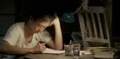
I like the image for Sous le soleil de Satan, and nobody can claim it's unrepresentative, but I'm not that fond of the monochromatic treatment (which is out of step with all of the other Pialat covers) - or the choice of colourway. For those concerned about 'sunniness', don't worry. The title might suggest the final sequence of Greed, but the film is much damper and gloomier, and the scene that resonates most strongly with the title (at least for me) takes place in the middle of the night.
I'm wondering why you didn't go with the original poster for this one (with the title maybe relocated to the top)? Did you feel you needed to make Depardieu more obvious / prominent? The poster reads: "big moody head - wait, is that Gerard Depardieu?" but your still leaves no doubt. I'm guessing that this film is likely to be your best-selling Pialat (Depardieu + Bonnaire + Palme d'Or).
I'm wondering why you didn't go with the original poster for this one (with the title maybe relocated to the top)? Did you feel you needed to make Depardieu more obvious / prominent? The poster reads: "big moody head - wait, is that Gerard Depardieu?" but your still leaves no doubt. I'm guessing that this film is likely to be your best-selling Pialat (Depardieu + Bonnaire + Palme d'Or).
-
TheGodfather
- Joined: Sun Sep 17, 2006 8:39 pm
- Location: The Netherlands
Re: MoC Cover Art & Packaging Babble-on
Good to hear that both will be present in the release.peerpee wrote:The old one will be the booklet cover.
We had to play with the old one too much to make the title readable. This way, we'll be able to leave it alone on the booklet cover.
Love the Satan cover!
-
peerpee
- not perpee
- Joined: Tue Nov 02, 2004 7:41 pm
Re: MoC Cover Art & Packaging Babble-on
zedz wrote:I like the image for Sous le soleil de Satan, and nobody can claim it's unrepresentative, but I'm not that fond of the monochromatic treatment (which is out of step with all of the other Pialat covers) - or the choice of colourway. For those concerned about 'sunniness', don't worry. The title might suggest the final sequence of Greed, but the film is much damper and gloomier, and the scene that resonates most strongly with the title (at least for me) takes place in the middle of the night.
I'm wondering why you didn't go with the original poster for this one (with the title maybe relocated to the top)? Did you feel you needed to make Depardieu more obvious / prominent? The poster reads: "big moody head - wait, is that Gerard Depardieu?" but your still leaves no doubt. I'm guessing that this film is likely to be your best-selling Pialat (Depardieu + Bonnaire + Palme d'Or).
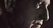
We had a real struggle with hi-res materials for this one. Lots of colour shots, none usable for a cover. Couldn't get a hi-res of the original poster anywhere... so couldn't use that.
Ended up using the best shot we could find, but that was only available in b+w. Hence the monochrome.
We're going to post a red version shortly (instead of orange or blue).
-
James
- Joined: Wed Jun 04, 2008 8:11 pm
Re: MoC Cover Art & Packaging Babble-on
Two things:
I agree about the Masters of Cinema border a the top; it should be a different color.
Would it be possible to get the Palme d'Or logo on the cover?
I agree about the Masters of Cinema border a the top; it should be a different color.
Would it be possible to get the Palme d'Or logo on the cover?
-
James
- Joined: Wed Jun 04, 2008 8:11 pm
Re: MoC Cover Art & Packaging Babble-on
The new one is red:
