MoC Cover Art & Packaging Babble-on
-
domino harvey

- Dot Com Dom
- Joined: Wed Jan 11, 2006 6:42 pm
Re: MoC Cover Art & Packaging Babble-on
Hey I like that one too. I think it's a bit more representative, for what it's worth, but flip a coin
-
peerpee
- not perpee
- Joined: Tue Nov 02, 2004 7:41 pm
Re: MoC Cover Art & Packaging Babble-on
We can't flip a coin, because we've got a 3rd one here which has strong support:

-
domino harvey
- Dot Com Dom
- Joined: Wed Jan 11, 2006 6:42 pm
Re: MoC Cover Art & Packaging Babble-on
Come up with nine more and flip a dodecahedron
-
HerrSchreck

- Joined: Sun Sep 04, 2005 3:46 pm
Re: MoC Cover Art & Packaging Babble-on
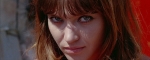
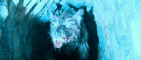
Hmm.. like the second one too, and I like the third, but I have a problem with the third-- I'd imagine the vast empty soace between Pialat & the daughter character symbolizes the gulf between the two, but it feels awkward for me, like the edges of the frame have been cropped off, and there's not enough character in the pic. If you zoomed out a touch, I might vote for that one.
The second one, if you really can't decide, is a safe choice all around. It captures the feel of the film well enough.
The second one, if you really can't decide, is a safe choice all around. It captures the feel of the film well enough.
-
tajmahal

- Joined: Tue May 12, 2009 3:10 am
Re: MoC Cover Art & Packaging Babble-on
Door number two for me, but the first is rather nice.
I see your dilemma. The first two could represent completely different films.
I see your dilemma. The first two could represent completely different films.
-
domino harvey
- Dot Com Dom
- Joined: Wed Jan 11, 2006 6:42 pm
Re: MoC Cover Art & Packaging Babble-on
The third one seems to suggest an alternate "our romance"
-
cana7cl
- Joined: Sun May 27, 2007 8:44 pm
Re: MoC Cover Art & Packaging Babble-on
Number 2, please !
-
mfunk9786

- Under Chris' Protection
- Joined: Fri May 16, 2008 8:43 pm
- Location: Miami, FL
Re: MoC Cover Art & Packaging Babble-on
My vote goes to #1, if only because it's the most visually pleasing, and therefore will sell the most copies. There's no harm in that, as it's certainly not egregiously unrepresentative of the film.
Fun fact: All three of them are better than the Criterion cover.
Fun fact: All three of them are better than the Criterion cover.
-
FerdinandGriffon

- Joined: Wed Nov 26, 2008 3:16 pm
Re: MoC Cover Art & Packaging Babble-on
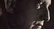
Absolutely #1, in #2 Bonnaire looks life a giraffe, and #3 does strongly suggest incest (though there are certainly undertones of that in the film).
If the special features are better than the CC's, the first cover would be a guaranteed buy for me.
If the special features are better than the CC's, the first cover would be a guaranteed buy for me.
-
T99
- Joined: Fri Nov 24, 2006 11:51 am
Re: MoC Cover Art & Packaging Babble-on
Agreed. I haven't seen the film so I don't know which cover would represent it best - but #1 is certainly the most beautiful.My vote goes to #1, if only because it's the most visually pleasing, and therefore will sell the most copies.
-
godardslave

- Joined: Tue Nov 02, 2004 8:44 pm
- Location: Confusing and open ended = high art.
Re: MoC Cover Art & Packaging Babble-on
#1.
Because it goes away from the american obsession of the close up of the face.
Because it goes away from the american obsession of the close up of the face.
-
Zazou dans le Metro
- Joined: Wed Jan 02, 2008 2:01 pm
- Location: In the middle of an Elyssian Field
Re: MoC Cover Art & Packaging Babble-on
Me too. Any way you could do a sort of 'scratch and sniff' thing where Klaus Nomi starts belting out when you rub the cover? (I'll leave it to you to decide where to rub).zedz wrote:I agree with domino, but that is a seriously great image (and now I've got Purcell running through my head).
My vote ..number 1 by a short neck from 2. 3 is an also ran.
-
foggy eyes

- Joined: Fri Sep 01, 2006 1:58 pm
- Location: UK
-
doc mccoy
- Joined: Sun Aug 02, 2009 12:07 pm
Re: MoC Cover Art & Packaging Babble-on
#2 for me - I love the rain streaked window and Bonnaire's sombre look.
#1 is a close runner-up - it is beautiful, but the poster is too similar to Leconte's Le Parfum d'Yvonne; #3 is fine, but does not really grab me.
#1 is a close runner-up - it is beautiful, but the poster is too similar to Leconte's Le Parfum d'Yvonne; #3 is fine, but does not really grab me.
-
Murdoch

- Joined: Mon Apr 21, 2008 3:59 am
- Location: Upstate NY
Re: MoC Cover Art & Packaging Babble-on
#1 most definitely for me, but this is coming from someone who has never seen the film.
-
LQ
- Joined: Thu Jun 19, 2008 11:51 am
- Contact:
Re: MoC Cover Art & Packaging Babble-on
I've never seen it either, but cover #1 is so serenely beautiful, I'd buy it in an instant.
-
James
- Joined: Wed Jun 04, 2008 8:11 pm
Re: MoC Cover Art & Packaging Babble-on
#1 is the best of those covers.
-
swo17

- Bloodthirsty Butcher
- Joined: Tue Apr 15, 2008 2:25 pm
- Location: SLC, UT
Re: MoC Cover Art & Packaging Babble-on
Numero uno.
[Number one.]
[Number one.]
-
reaky

- Joined: Wed Nov 03, 2004 12:53 pm
- Location: Cambridge, England
Re: MoC Cover Art & Packaging Babble-on
Sorry to lower the tone, but am I the only one that version #1 reminds of the Athena tennis girl?
I like #3: not pretty, but striking, with great use of space.
I like #3: not pretty, but striking, with great use of space.
-
Finch

- Joined: Mon Jul 07, 2008 9:09 pm
- Location: United States
Re: MoC Cover Art & Packaging Babble-on
I like the second cover best and the third the least (though it's still better than many CC covers this year).
-
justeleblanc

- Joined: Wed Nov 03, 2004 10:05 pm
- Location: Connecticut
Re: MoC Cover Art & Packaging Babble-on
The third one is great. The first one might sell more since people might want to nail her from behind, but the third one is terrific.
-
zedz

- Joined: Sun Nov 07, 2004 11:24 pm
Re: MoC Cover Art & Packaging Babble-on
I think number two is the most representative, but number one is the best (if the aim is to sell copies, that is). How about another reversible cover? And the third for the booklet?

-
Anhedionisiac
- the Displeasure Principle
- Joined: Thu Feb 28, 2008 6:25 pm
Re: MoC Cover Art & Packaging Babble-on
Nummer eins, certainly.
As for the charges that it's not representative of the film itself, all I can say is that, for what's it worth, whenever I reminisce about "A nos amours", those credits and Klaus Nomi's rendition of "Cold Song" usually come first since they happen to be the very first thing in the movie. Therefore, the charges sort of baffle me!
Bottom line, whatever you guys use, I'll definitely buy it in a heartbeat. But if it is the first cover in consideration, I'll buy it in a fraction of a heartbeat.
-
jbeall

- Joined: Sat Aug 12, 2006 1:22 pm
- Location: Atlanta-ish
Re: MoC Cover Art & Packaging Babble-on
Damn, that's really a tough call--I like all three.
I agree with domino that #1 doesn't really capture the feel of the movie, but damn what a beautiful image!
I like the somber tone of #2, esp. given that the title is right there. #3 is my least fave, although I like it, too, but HerrSchreck is right about it looking a little too cropped. What you're left with is less the distance between two characters and more... empty space. Zoom out a smidge and I'd like it as well as #2.