
Criterion & Eclipse Cover Art & Packaging Babble-on Vol.4
-
domino harvey

- Dot Com Dom
- Joined: Wed Jan 11, 2006 6:42 pm
-
TheGodfather

- Joined: Sun Sep 17, 2006 8:39 pm
- Location: The Netherlands
-
Cinephrenic

- Joined: Tue Nov 02, 2004 6:58 pm
- Location: Paris, Texas
-
Rupert Pupkin
- Joined: Thu Oct 20, 2005 1:34 pm
-
colinr0380

- Joined: Mon Nov 08, 2004 8:30 pm
- Location: Chapel-en-le-Frith, Derbyshire, UK
Having spent a couple of days with the Mishima set I wanted to post to say how impressed I was with the packaging. I was unsure at first but the actual set is quite beautiful.
The more I look at it, the more I'm impressed by it. I like the literalisation of a family tree of one person(!) and the attempt to tie all the themes of the film together in one piece of cover art, from the clashing, conflicting colour scemes of the various staged sequences from the novels as the background of the tree, with the past versions of Mishima on top of that, and then on top of that the various adult Mishima personas. The golden rays of the sun coming somewhere in the middle, occasionally dull compared to the rest of the composition but occasionally blinding (or at least they were in the sunshine on my desk this afternoon!), seeming to suggest the final image of the film and the guiding, unifying force or throughline of Mishima's work.

The more I look at it, the more I'm impressed by it. I like the literalisation of a family tree of one person(!) and the attempt to tie all the themes of the film together in one piece of cover art, from the clashing, conflicting colour scemes of the various staged sequences from the novels as the background of the tree, with the past versions of Mishima on top of that, and then on top of that the various adult Mishima personas. The golden rays of the sun coming somewhere in the middle, occasionally dull compared to the rest of the composition but occasionally blinding (or at least they were in the sunshine on my desk this afternoon!), seeming to suggest the final image of the film and the guiding, unifying force or throughline of Mishima's work.
That had better be in the Patriotism set, otherwise I'll feel that I've been duped!Cinephrenic wrote:I got a miniature Katana sword in mine.
-
kaujot

- Joined: Mon May 08, 2006 10:28 pm
- Location: Austin
- Contact:
-
Tommaso

- Joined: Fri May 19, 2006 2:09 pm
I have just received the two Mishima releases, and would agree with Colin, they look marvellous. I especially liked the look of booklet for the Schrader film, with its wonderful HUGE photographs/stills from the film. I'm still not so sure about the outer cover, though. It looks great and I find Colin's interpretation of the artwork entirely convincing, but to me the colour schemes in the end create a sort of psychedelic effect, and while I would have found that completely appropriate with, for instance, last year's Makavejev releases (it actually reminds me of the "WR" sleeve design), I'm not sure what a person like Mishima would have thought about it ... The booklet for "Patriotism" looks equally great, and here the cover completely fits the film, I think. In any case, two of the best releases CC ever released designwise. And probably contentwise as well if I look at the number and length of extras, which all appear to be totally relevant. Can't wait to watch these...

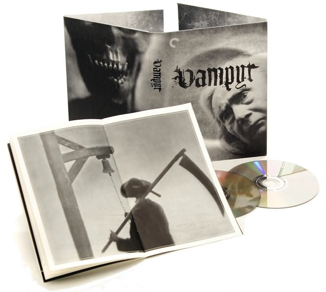
As to the above "Vampyr" cover: looks gorgeous and, btw, wasn't this the pic that was originally intended for the MoC version's cover? Also good to see another two-page photograph in the booklet (a la "Mishima"); this should become standard at least for ambitious releases like this.
I want one, too!!Cinephrenic wrote:I got a miniature Katana sword in mine.
As to the above "Vampyr" cover: looks gorgeous and, btw, wasn't this the pic that was originally intended for the MoC version's cover? Also good to see another two-page photograph in the booklet (a la "Mishima"); this should become standard at least for ambitious releases like this.
-
Jean-Luc Garbo

- Joined: Thu Dec 09, 2004 5:55 am
- Contact:
I got my copy of Mishima today. The praise of late is indeed warranted. I was impressed that the entire inside of the box was golden. Now that is detail! I must agree with Chris' review that the set photos are ruined by the middle of the book cutting them in half. Earlier stills are formatted in the manner he suggested so it's not inconceivable. They would be smaller however and I think that the producer wanted to bring out the detail in the sets in those photos. Otherwise, it's superb. Despite my earlier complaints, I'd nominate this for package design of the year.
-
colinr0380
- Joined: Mon Nov 08, 2004 8:30 pm
- Location: Chapel-en-le-Frith, Derbyshire, UK
I would agree somewhat but from a quick check it is not a total loss as all the stills turn up in the supplemental material on the second disc and look just as good on screen as on the page. In a way I thought the images split over two pages showed up in a nice fashion the symmetry of the way the sets were designed, as if the spine of the booklet were used as a vanishing point. Only the picture from the Runaway Horses story was framed in a different fashion in the booklet to emphasise the sunken, slanting gate in the foreground.Jean-Luc Garbo wrote:I must agree with Chris' review that the set photos are ruined by the middle of the book cutting them in half. Earlier stills are formatted in the manner he suggested so it's not inconceivable. They would be smaller however and I think that the producer wanted to bring out the detail in the sets in those photos. Otherwise, it's superb.
True. I kind of get the impression that the Mishima film is an impression of the crazy jumble that an outsider gets of the man himself - parts of the design are recognisable but don't seem to fit together at all until we ignore the 'in your face', almost repulsive in its bad taste aesthetic and pull back to see how it fits together as a whole.Tommaso wrote:but to me the colour schemes in the end create a sort of psychedelic effect, and while I would have found that completely appropriate with, for instance, last year's Makavejev releases (it actually reminds me of the "WR" sleeve design), I'm not sure what a person like Mishima would have thought about it
The booklet for "Patriotism" looks equally great, and here the cover completely fits the film, I think. In any case, two of the best releases CC ever released designwise. And probably contentwise as well if I look at the number and length of extras, which all appear to be totally relevant. Can't wait to watch these...
The Patriotism cover, which I also love (but which I haven't yet taken the wrapper off yet to have a closer look at!), is a complete contrast and as you suggest might be more in the style of the way Mishima would like a cover dedicated to him to be! I think that makes the releases fit together well in that they both inform each other - the carefully staged and minimal Patriotism with the classical sun imagery vs the frenzied, almost psychadelic Mishima showing the complexities and contradictions that would normally be carefully hidden beneath the surface.
Though I'll be embarrassed if I've read too much into this and it turns out the Criterion designers just thought "the colours looked cool"!
-
Morgan Creek

- Joined: Sun Jan 27, 2008 3:55 pm
- Location: NYC
The colors of the packaging are pretty much in keeping with Eiko Ishioka's palette for the novel sections of the film - compare the relevant stills in the booklet to the case design, and they're all of a piece.colinr0380 wrote:Though I'll be embarrassed if I've read too much into this and it turns out the Criterion designers just thought "the colours looked cool"!


-
godardslave

- Joined: Tue Nov 02, 2004 8:44 pm
- Location: Confusing and open ended = high art.


-
domino harvey
- Dot Com Dom
- Joined: Wed Jan 11, 2006 6:42 pm
-
hammock

- Joined: Wed Nov 03, 2004 5:52 pm
- Location: www.criteriondungeon.com
- Contact:
Does this mean they are letting the 50 Box go OOP? It is pretty expensive to do a re-pressing of a set this size and I can't imagine they sold more than 500 - 1,000 copies of this monster, so maybe they are replacing it with induvidual DVD's.
domino harvey wrote:Janus is releasing the barebones discs from the 50 Years collection individually for reduced price.
-
domino harvey
- Dot Com Dom
- Joined: Wed Jan 11, 2006 6:42 pm
-
The Fanciful Norwegian

- Joined: Tue Nov 02, 2004 6:24 pm
- Location: Teegeeack
That looks like they just scanned it in from the press materials -- it looks too low-res to be final art. And there's no way it'll be the final cover unless Criterion is unilaterally changing the Japanese title (as esl noted on the last page, the first character should be "秋").Steven H wrote:perfect for the film, if you ask me.
-
mfunk9786

- Under Chris' Protection
- Joined: Fri May 16, 2008 8:43 pm
- Location: Miami, FL

This isn't necessarily final, there's nothing on the Criterion site as of yet.
Recieved Mishima and Patriotism yesterday... wow. Such beautiful packaging for both, but Mishima just blew me away. Never once did it look fingerprinted, even though it is so ungodly shiny... it just feels expensive. Maybe my favorite Criterion package design ever.

-
Murdoch

- Joined: Mon Apr 21, 2008 3:59 am
- Location: Upstate NY
Re: Mishima
This was my experience with the Double Life of Veronique, I saw the film and liked it but didn't consider buying it, then I saw the entire criterion package and bought it right away. Hell, I might of bought that just for the gorgeous images of Irene Jacob.mbalson wrote:I had almost no interest in Mishima, but when I saw the packaging I was amazed. It's stunning.


