Criterion & Eclipse Cover Art & Packaging Babble-on Vol.4
-
domino harvey

- Dot Com Dom
- Joined: Wed Jan 11, 2006 6:42 pm
-
denti alligator

- Joined: Thu Nov 04, 2004 1:36 am
- Location: "born in heaven, raised in hell"
-
Cinephrenic

- Joined: Tue Nov 02, 2004 6:58 pm
- Location: Paris, Texas
I should have elaborated on this, but yes, that is the point. I find the cover misleading. Obviously Criterion wants to capitalize on it, which may be good business, but my problem is the still shot used. They could have at least used the stair scene or better. I just don't find a skinny bitch eating shit ecstetic on a DVD cover, but that is my view.Gotta grab the torture porn audience.
-
domino harvey
- Dot Com Dom
- Joined: Wed Jan 11, 2006 6:42 pm
It really is. The random consumer is going to feel confronted by the cover as much as the viewer will be confronted by the film if they get that far, I will go so far as to say I could not imagine a better cover for this title. Even the aesthetic pleasures of the cover force you to question why you respond positively to what is essentially grotesque, horrific imagery-- Pasolini couldn't have been prouder.denti alligator wrote:I think the cover is perfect for the film.


-
sidehacker
- Joined: Sat Mar 17, 2007 6:49 am
- Location: Bowling Green, Ohio
- Contact:
-
domino harvey
- Dot Com Dom
- Joined: Wed Jan 11, 2006 6:42 pm

-
klee13
- Joined: Tue Jan 15, 2008 6:33 pm
- Location: NYC
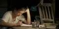
I think Brand Upon the Brain! is my favorite cover this month, though the font on Twenty-Four & Yes is pretty sweet. Salo's captures the film real well and will probably make a bitchin' digipack but I still don't think I'm in love with the actual design itself. The real stinker is The Small Back Room though. Terrible, terrible font choice.
-
domino harvey
- Dot Com Dom
- Joined: Wed Jan 11, 2006 6:42 pm
-
luridedith

- Joined: Fri Feb 01, 2008 11:34 pm

-
editman

- Joined: Sun Nov 07, 2004 8:13 pm
Count me in as another one who actually love the new Salo cover. One may think I'm sick in the head if I say this, but that blurry screen cap of Renata Moar crying and being forced to eat whasit is almost a turn-on. (Then again, that scene is always a personal favourite, if one can call that. Or perhaps I'm just excited about thef fact that 10 years of waiting is finally over, and wishful thinking that by the end of the year one might be able to pick up an authentic, second hand copy of the old disc for under 10 bucks on eBay.)
-
Antoine Doinel

- Joined: Sat Mar 04, 2006 5:22 pm
- Location: Montreal, Quebec
- Contact:
-
HerrSchreck

- Joined: Sun Sep 04, 2005 3:46 pm

-
colinr0380

- Joined: Mon Nov 08, 2004 8:30 pm
- Location: Chapel-en-le-Frith, Derbyshire, UK
I didn't think the characters in her books went much past the courtship stage!HerrSchreck wrote:It looks like a fucking Jane Austen novel or something.
Love the Salo and Shepitko covers, and like Brand and Small Back Room.
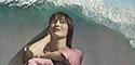
A great month though - the Shepitko is extremely exciting (while I'm also noting a little sadly the comments about this perhaps being the death-knell for her other films on DVD for a while), The Small Back Room is one of the Powell and Pressburger films I've not seen, Salo and Brand Upon The Brain are exciting and a little depressing in equal measure (I kind of hoped for more extras on Salo and would have liked more commentary tracks on Brand, though I admit that seven is a huge number!), Twentyfour Eyes is on the backburner - the extras sound interesting but I've got the MoC to get to for now.
Last edited by colinr0380 on Fri May 16, 2008 5:57 pm, edited 1 time in total.
-
Orphic Lycidas

- Joined: Fri Jun 02, 2006 11:25 pm
- Location: NY/NJ, USA
-
HerrSchreck
- Joined: Sun Sep 04, 2005 3:46 pm
Come to the Charlie Chaplin Filmmakers page. Child molesting goes there.

-
Anhedionisiac
- the Displeasure Principle
- Joined: Thu Feb 28, 2008 6:25 pm
I think Salo is a perfect fit and Brand Upon the Brain is pretty cool. The Shepitko's are great and so is The Small Back Room.
My only gripe is Twenty-Four Eyes which, as mentioned, definitely looks like Twenty-Four & Yes and is way too sweetie-pie to boot. The Masters of Cinema has a much better cover.
By the way, how come so many MoC's selections end up as Criterions shortly thereafter?
My only gripe is Twenty-Four Eyes which, as mentioned, definitely looks like Twenty-Four & Yes and is way too sweetie-pie to boot. The Masters of Cinema has a much better cover.
By the way, how come so many MoC's selections end up as Criterions shortly thereafter?