Alphonso wrote:Incidentally, and not pointed at MoC, are there dvd companies that are-- as much as I loathe the term-- taking a "green" stance on their production, as in recycled cardboard cases? I don't know a thing about the possibility of this, but its evident that we can't continue to bury ourselves in plastic.
From the looks of it, it seems to depend on the particular disc. The Futurama discs look set to be in cardboard and I assume There Will Be Blood's cardboard packaging was an extension of its 100% Carbon Neutral policy as mentioned in the film's end credits (I suppose it would be silly to made a carbon neutral film and then set about releasing it worldwide in plastic packs! - though I suppose they'll make an exception for Blu-Ray! )
Having said that I would like them to find something that doesn't cause mark the disc causing it to skip - Luckily I got through my first viewing of There Will Be Blood without that problem but it has since started occuring and I'm sure I've only seen three quarters of the first Futurama film due to the same problem!
And to keep the thread vaguely on topic - great covers! =D>
Last edited by colinr0380 on Fri May 09, 2008 8:59 pm, edited 1 time in total.
I don't think MoC will be using that box design for their Blu-ray releases. I hope.
The thing I like about Nick's designs is that he changes the hue of the top banner housing the Eureka/MoC logos based on the artwork for the disc. Having an obligatory blue color banner for all Blu-ray discs would defeat the purpose. Plus, as was posted in another thread, Nick asked Sony about the restrictions for the Blu-ray insignia, and he was relieved to hear that there were none.
I thought that was a fan cover. And then I discovered that it wasn't. And then I made this post.
I'm in shock at everything wrong with a cover that simple. The Photoshop filter (the biggest mistake), the 3/4 positioning, the boring font placement, and the capper: who else is excited that "Index" is finally coming out on DVD? This is the worst cover I've seen come out of a respected label in a long long time.
Wow! Thank God it's not a fan cover! I wished for Franju and it came!
Thank you Nick.
The films both have good original poster art, but obviously they both have to be represented on one case. The only thing that doesn't work for me on that cover is how the bottom of the image is cut off, otherwise I don't mind.
Cinetwist wrote:The films both have good original poster art, but obviously they both have to be represented on one case.
You're right, the poster art's great, I especially like the Nuits Rouges poster, so it's a shame that they couldn't be used. As it is, I agree with Domino's points (well, except for the 'Index' one) and am disappointed. But nonetheless very excited for the films themselves!
Cinetwist wrote:The films both have good original poster art, but obviously they both have to be represented on one case.
You're right, the poster art's great, I especially like the Nuits Rouges poster, so it's a shame that they couldn't be used. As it is, I agree with Domino's points (well, except for the 'Index' one) and am disappointed.
But nonetheless very excited for the films themselves!
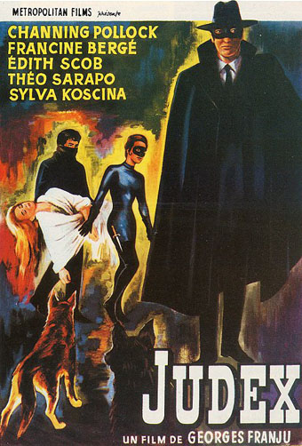
Brilliant news! I may be wrong, but the typesetting for 'Index'/'Judex' may well be from the original posters/credits of the film. Perhaps we get these original posters in the inner sleeve a la the Mizoguchi sets?
Oh, and we need a thread for the films/this release proper
Tommaso wrote:Brilliant news! I may be wrong, but the typesetting for 'Index'/'Judex' may well be from the original posters/credits of the film. Perhaps we get these original posters in the inner sleeve a la the Mizoguchi sets?
You're right, the typesetting is (roughly) from a poster. Although I prefer the font of this Polish poster:
Last edited by codam on Sun May 25, 2008 5:57 pm, edited 1 time in total.
I quite like the font and images on this poster. I also agree with codam's earlier post on the Nuits Rouge poster. I think the problem with having these two is they will be wildly different and look a bit gaudy side by side, not to mention squeezing them both in. Putting simple images in one colour does provide a certain unity but the current cover is a bit boring and so... black and white!
My first thought too was that the title looks like "Index" -- it's similar to the script on the original poster, yes, but the "J" and the "U" are much less pronounced.
My second thought was that somebody at MoC must've loved Tom Goes to the Mayor.
FSimeoni wrote:I think the problem with having these two is they will be wildly different and look a bit gaudy side by side, not to mention squeezing them both in.
I like the black and white scheme of the Judex cover, but a simple way to fix this is to un-fliter the image, stick it at the bottom, extend the loop in the J to make it look like a J, and then center the "And Nuits Rouges/Franju" text beneath the Judex title. I'd do it myself and post it but I don't have access to the unfiltered image. But seriously, maybe people who haven't worked in design don't realize how amateurish using that particular filter is, but if this were released as is, MOC would be a laughing stock.
Cinetwist wrote:The films both have good original poster art, but obviously they both have to be represented on one case.
You're right, the poster art's great, I especially like the Nuits Rouges poster, so it's a shame that they couldn't be used. As it is, I agree with Domino's points (well, except for the 'Index' one) and am disappointed.
But nonetheless very excited for the films themselves!
Yes, I have that poster. For me the French really did make the best posters. Last time I checked, the guy who runs that site was trying to sell it for a ridiculous sum of money. They appear on ebay.fr every now and again and can be got relatively cheap. Unfortunately Les Yeux Sans Visage always goes for a lot of money.
sidehacker wrote:Yeah, not very good. The plus sign is particularly awkward.
I think the plus sign isn't too bad, though it doesn't work well off-centre with 'Nuits Rouges' - the centred plus signs on all the Mizoguchi sets work fine.
domino harvey wrote:I like the black and white scheme of the Judex cover, but a simple way to fix this is to un-fliter the image, stick it at the bottom, extend the loop in the J to make it look like a J, and then center the "And Nuits Rouges/Franju" text beneath the Judex title.
You're right, it makes it look a LOT better (I couldn't find exact match for the photo, but close enough):
Have MoC ever put up a gash copy of their cover art on the website before? Since this cover seems to have gone down like a shit sandwich I'm wondering whether we're gonnae end up with this.
If anybody can locate any great quality hi-res 300dpi imagery from either film, we'll certainly try and improve things. Our usual methods are coming up blank and the licensor has nothing.


