Criterion eat your heart out. This is how cover art should be done.
As someone who enjoys the output of both companies, I don't understand why people keep slamming Criterion when they praise MoC. Its not a race or a battle - they're both trying to bring us nice editions of the films we cherish.
Criterion has many fine examples of "how cover art should be done" in their collection already.
I would say it was a race and a battle. To bring the best looking, best performing version before the other to claim that almighty dollar/pound. Unfortunately it really is all about the moolah in this business.
Bleddyn Williams wrote:As someone who enjoys the output of both companies, I don't understand why people keep slamming Criterion when they praise MoC. Its not a race or a battle - they're both trying to bring us nice editions of the films we cherish.
Perhaps it's just because MoC is the much smaller company and we're favouring the underdog? If they released 50 discs per year there surely would be the occasional let-down that one experiences with Criterion. The way things are, it is obvious that an enormous amount of personal care and devotion goes into every single disc MoC produces. Of course that doesn't mean that CC lack these qualities, but somehow MoC raises a lot more 'sympathy' and a certain willingness on my part to buy their product immediately(which admittedly has to do with their choice of films being generally closer to my personal taste). And don't forget MoC offers the same quality and sometimes even better quality than CC for a much cheaper price.
But let me finally say that I'm really glad that both these companies exist and perhaps we shouldn't enter into hair-splitting debates about who is 'better'. If anything, we need more companies like this, and very few others are doing something similar at the moment and have managed to gain such a dedicated international group of followers.
Bleddyn Williams wrote:As someone who enjoys the output of both companies, I don't understand why people keep slamming Criterion when they praise MoC. Its not a race or a battle - they're both trying to bring us nice editions of the films we cherish.
It was meant as a kind of: "Criterion, take note as to how great looking covers should be made" as most of the recently announced Criterion covers aren`t really good looking IMO
So what do we think of the Vampyr cover?
While nothing could dampen my excitement for the release, I'm not all that keen on the design.
I would have hoped for something a little more striking or downright creepy.
The more I look at the image I like it but I can't help feeling like this seems like a compromise. My guess is MoC never had the right image that would fit a DVD cover. I think it's nice but the font bothers me a little, although it's nice I don't think it's very representative of it's era it seems like a far too new looking font. I wouldn't entirely be surprised if this was rejigged or replaced entirely however.
Nevertheless the final confirmation of this release is such great news I can't wait to see the specs.
jt wrote:I would have hoped for something a little more striking or downright creepy.
What's creepier than the scene that's shot from inside the coffin? Did you want the title spelled out in a dripping-blood font? Although the title design in the original program is pretty nice.
I quite like the"Vampyr" design, it looks..ahm.., well, 'noble'. Not what you'd expect from a horror movie, old or new, but then "Vampyr" isn't really your common creepy film, or at least it's in a league of its own. The design that MoC have chosen underlines the timelessness of the film for me. Perhaps it looks a little too 'serious', but that fits perfectly to the film and especially to Dreyer as a whole.
jt wrote:I rarely care enough about cover-art to actually bother others with my opinion of it but these last few designs by MoC are of such a high standard, I can't help giving Nick and the MoC guys some virtual applause.
And to further Tommaso's suggestion, I would certainly pay good money for any posters of the UFA films MoC have been able to release. Unless I win the lottery, the original artwork for Asphalt, Die Nibelungen or Spione won't be on my wall any time soon...
Peerpee was designing gorgeous fantasy covers long before there was a Masters of Cinema DVD operation --- and I think maybe even before there was a MOC website. For instance, his mock-up of a cover for Ozu's "Floating Weeds" was a knock-out. ;~}
Whilst waiting for details on the [Der Letzte Mann] disc content itself, am curious about the cover...and before I get told to take this to the cover art thread, I am thinking in terms of the promotional art designs used in Weimar cinema, which of what I've seen is never less than stunning.
Does anyone have any insight into the drawing, were they simply assignments or were the artists involved in the film in some way, or had been given instructions by creative staff on how to tie them into the film art design itself.
It just seems to me that the posters attempt to lead on from the art design of the films itself, a continuation of the film if you will...
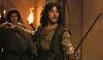
I don't wanna sound like a nitpicker, but the only problem I have with this cover is how the knights' spears (flagpoles, jousts, whatever) are cropped at the top -- at first glance it makes the bridge look like a modern suspension bridge, which is a little disorienting.
you gotta be kidding me wrote:I don't wanna sound like a nitpicker, but the only problem I have with this cover is how the knights' spears (flagpoles, jousts, whatever) are cropped at the top
Well, they're not actually cropped, that's how the original poster art is:
akaten wrote:Does anyone have any insight into the drawing, were they simply assignments or were the artists involved in the film in some way, or had been given instructions by creative staff on how to tie them into the film art design itself.
I own this bookfor the artwork, it is stacked with classic full-page posters. I'm afraid my German isn't good enough to read the majority of it but I imagine it would answer your questions if you're able to read German.
Sadly I cannot, but thanks for the link (out of stock, found it on a French site, pricey!) could always stumble through it with a dictionary at hand.


