How on Earth did they mess that Tree of Life cover upswo17 wrote:


Criterion & Eclipse Cover Art & Packaging Babble-on Vol. 7
-
pzadvance

- Joined: Mon Nov 21, 2011 11:24 pm
- Location: Vienna, Austria
Re: Criterion & Eclipse Cover Art & Packaging Babble-on Vol.

-
mfunk9786

- Under Chris' Protection
- Joined: Fri May 16, 2008 8:43 pm
- Location: Miami, FL
Re: Criterion & Eclipse Cover Art & Packaging Babble-on Vol.
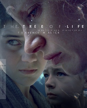
But enough about Terrence Malick!Roger Ryan wrote:If you're going to do "big heads", that's the way to do it.
-
KJones77
- Joined: Thu Aug 24, 2017 3:35 am
Re: Criterion & Eclipse Cover Art & Packaging Babble-on Vol.
Everyone: "Man that Tree of Life cover will be gorgeous. Nobody could mess it up, it really lends itself to great artwork."
Criterion: "Hold my beer."
Criterion: "Hold my beer."
-
DarkImbecile

- Ask me about my visible cat breasts
- Joined: Mon Dec 09, 2013 10:24 pm
- Location: Albuquerque, NM
Re: Criterion & Eclipse Cover Art & Packaging Babble-on Vol.
Guys, come on: it's not like there was any stunning imagery directly from the film they could just toss on the cover, like with Graduation. They did the best they could to cobble something together, and we should be thankful.
-
Ribs

- Joined: Fri Jun 13, 2014 5:14 pm
Re: Criterion & Eclipse Cover Art & Packaging Babble-on Vol.
I actually generally like it, but think the shot they've chosen for the kid in the bottom-right clearly does not match the other two whatsoever, and could probably easily be patched with something better.
-
Big Ben

- Joined: Mon Feb 08, 2016 4:54 pm
- Location: Great Falls, Montana
Re: Criterion & Eclipse Cover Art & Packaging Babble-on Vol.
I mean what's even more hilarious is that there's now fifty more minutes to choose from.DarkImbecile wrote:Guys, come on: it's not like there was any stunning imagery directly from the film they could just toss on the cover, like with Graduation. They did the best they could to cobble something together, and we should be thankful.
-
kcota17

- Joined: Sat Mar 01, 2014 1:05 am
Re: Criterion & Eclipse Cover Art & Packaging Babble-on Vol.
Why was a film about a family given a cover missing an additional brother and the father??
-
The Narrator Returns

- Joined: Tue Nov 15, 2011 10:35 pm
Re: Criterion & Eclipse Cover Art & Packaging Babble-on Vol.
My impression of the cover after first-glance managed to go even lower when I realized it was one of the other kids in the right-hand corner and not Pitt. Pitt being there would at least make this a visual representation of the film's dynamic (Jack pushed into a corner by the dueling forces of his parents), this is just nothing at all.
-
tenia

- Ask Me About My Bassoon
- Joined: Wed Apr 29, 2009 3:13 pm
Re: Criterion & Eclipse Cover Art & Packaging Babble-on Vol.
That's exactly my thought. Especially since I've litterally been using a ton of screenshots from the movie as wallpaper on my computer desktop for years now.Big Ben wrote:I mean what's even more hilarious is that there's now fifty more minutes to choose from.DarkImbecile wrote:Guys, come on: it's not like there was any stunning imagery directly from the film they could just toss on the cover, like with Graduation. They did the best they could to cobble something together, and we should be thankful.
However, I'm also quite disappointed by the new extras which are quite light, seemingly. I'm eager about the new cut, but The New World also had quite a few new extras along with all the various cuts.
-
KJones77
- Joined: Thu Aug 24, 2017 3:35 am
Re: Criterion & Eclipse Cover Art & Packaging Babble-on Vol.
It is a release that advertises "more!" though, so additional features should be on the way.tenia wrote:That's exactly my thought. Especially since I've litterally been using a ton of screenshots from the movie as wallpaper on my computer desktop for years now.Big Ben wrote:I mean what's even more hilarious is that there's now fifty more minutes to choose from.DarkImbecile wrote:Guys, come on: it's not like there was any stunning imagery directly from the film they could just toss on the cover, like with Graduation. They did the best they could to cobble something together, and we should be thankful.
However, I'm also quite disappointed by the new extras which are quite light, seemingly. I'm eager about the new cut, but The New World also had quite a few new extras along with all the various cuts.
-
Luke M
- Joined: Fri Jul 13, 2007 1:21 am
Re: Criterion & Eclipse Cover Art & Packaging Babble-on Vol.
I don’t much care for the Tree of Life cover but the other ones are all fantastic.
-
Boosmahn

- Joined: Tue Sep 05, 2017 2:08 am
Re: Criterion & Eclipse Cover Art & Packaging Babble-on Vol.
I find something in all Criterion covers even if they're bad: Tom Jones, Election, and Sid and Nancy to name a few.
But Tree of Life... it's terrible.
But Tree of Life... it's terrible.
-
swo17

- Bloodthirsty Butcher
- Joined: Tue Apr 15, 2008 2:25 pm
- Location: SLC, UT
Re: Criterion & Eclipse Cover Art & Packaging Babble-on Vol.
I like it--both cosmic and intimate.
-
FrauBlucher

- Joined: Tue Jul 16, 2013 12:28 am
- Location: Greenwich Village
Re: Criterion & Eclipse Cover Art & Packaging Babble-on Vol.
I don't mind The Tree of Life cover. It may be one of those that looks even better in person.
-
DarkImbecile
- Ask me about my visible cat breasts
- Joined: Mon Dec 09, 2013 10:24 pm
- Location: Albuquerque, NM
Re: Criterion & Eclipse Cover Art & Packaging Babble-on Vol.
I don't despise the cover image, but it is frustrating that they felt they had to patch something new together when doing a google search for Tree of Life yields hundreds of images that A) would have looked better entirely on their own and B) would be more thematically relevant to the film than what they came up with.
The kerning is just odd.
The kerning is just odd.
-
movielocke

- Joined: Fri Jan 18, 2008 4:44 am
Re: Criterion & Eclipse Cover Art & Packaging Babble-on Vol.
Are they trying to match tree of life’s color scheme to the new world?
It’s really bad kerning on the title, but why not go with the amazing baby foot artwork?
It’s really bad kerning on the title, but why not go with the amazing baby foot artwork?
-
black&huge
- Joined: Tue Dec 26, 2017 9:35 am
Re: Criterion & Eclipse Cover Art & Packaging Babble-on Vol.
The Tree of Life cover is great
-
bearcuborg

- Joined: Fri Sep 14, 2007 6:30 am
- Location: Philadelphia via Chicago
Re: Criterion & Eclipse Cover Art & Packaging Babble-on Vol.
Not really into this thread, but they all look pretty strong-however-Tree of Life is the only I haven’t seen, so I can’t really judge.
-
ptatler

- Joined: Mon Nov 24, 2008 6:08 pm
- Contact:
Re: Criterion & Eclipse Cover Art & Packaging Babble-on Vol.
Maybe it's lenticular and, if you tilt the cover, it turns into a family of dinosaurs.FrauBlucher wrote:It may be one of those that looks even better in person.
-
Bumstead

- Joined: Sat Sep 24, 2016 4:25 pm
- Location: Dubai
Re: Criterion & Eclipse Cover Art & Packaging Babble-on Vol.
The backlash on social media has been loud and vigorous. Neil Kellerhouse's brand is getting a very public beating. If Criterion proceeds anyway, then they must really think this is a work of art!
-
Finch

- Joined: Mon Jul 07, 2008 9:09 pm
- Location: United States
Re: Criterion & Eclipse Cover Art & Packaging Babble-on Vol.
Careful what you wish for. They could pull a Cries and Whispers and make it worse still.
-
StevenJ0001

- Joined: Mon May 05, 2008 4:02 pm
- Location: Los Angeles
Re: Criterion & Eclipse Cover Art & Packaging Babble-on Vol.
I check into this thread every month just to peruse the range of reactions to each batch of covers, but the Tree of Life cover is so incomparably terrible that I am finally moved to voice my opinion. Ghastly! (Such an unflattering shot of Chastain, too--her nose may as well have been illuminated by a spotlight--and that's just one of so many sins committed here!)
-
movielocke
- Joined: Fri Jan 18, 2008 4:44 am
Criterion & Eclipse Cover Art & Packaging Babble-on Vol. 7
aha! They were going for the big nose selfie aesthetic with this cover! Clearly the cover indicates she’s taking an anachronistic selfie which indicates time travel which explains the films voyage through time! Who knew that the film was actually a critique of smart phones and how their overuse is collapsing the space time continuum resulting in Sean penn being caught in purgatory? Never would have figured it out without the tip off from the coverStevenJ0001 wrote:I check into this thread every month just to peruse the range of reactions to each batch of covers, but the Tree of Life cover is so incomparably terrible that I am finally moved to voice my opinion. Ghastly! (Such an unflattering shot of Chastain, too--her nose may as well have been illuminated by a spotlight--and that's just one of so many sins committed here!)
-
Bumstead
- Joined: Sat Sep 24, 2016 4:25 pm
- Location: Dubai
Re: Criterion & Eclipse Cover Art & Packaging Babble-on Vol.
My guess is Kellerhouse boosted the illumination on the nose to create three-dimensionality (separation of foreground from mid-ground). A common lighting technique, very poorly used in this case.StevenJ0001 wrote:Ghastly! (Such an unflattering shot of Chastain, too--her nose may as well have been illuminated by a spotlight
-
tenia
- Ask Me About My Bassoon
- Joined: Wed Apr 29, 2009 3:13 pm
Re: Criterion & Eclipse Cover Art & Packaging Babble-on Vol.
Part of the issues I have with this cover is how over-crowded it feels, especially with the younger kid on the bottom right corner. He also adds a weird perspective in terms of eye direction : Chastain is looking down, one kid is looking to the left, the other one is looking up.
The whole compilation of this gives a very disjointed aspect to the the cover, adding a layer of a patchwork aspect.
The whole compilation of this gives a very disjointed aspect to the the cover, adding a layer of a patchwork aspect.