
Criterion & Eclipse Cover Art & Packaging Babble-on Vol. 7
-
dwk

- Joined: Sat Jun 12, 2010 10:10 pm
Re: Criterion & Eclipse Cover Art & Packaging Babble-on Vol. 7
Looks Paper Moon might be a digipak. (The spine looks really great )
-
ryannichols7

- Joined: Mon Jul 16, 2012 6:26 pm
Re: Criterion & Eclipse Cover Art & Packaging Babble-on Vol. 7
he also did They Live By Night, another excellent cover. just not following what the hell happenedTechnicolorAcid wrote: Thu Aug 15, 2024 5:23 pmDon’t downplay how good that Godzilla cover is too but besides that yeah pretty bland covers this month and Scarface is shockingly bad especially from someone who designed The Circus cover which remains one of my favorites from the collection.ryannichols7 wrote: Thu Aug 15, 2024 4:40 pm this reminds me of July...2022? when we got the cover art leaks and they were all such a joke I decided to believe them. being surrounded by this month, it's only all the more obvious just how good Seven Samurai remains
Paper Moon really didn't need to deviate much at all from its classic design
-
Beloved Aunt

- Joined: Tue Dec 14, 2021 7:28 pm
Re: Criterion & Eclipse Cover Art & Packaging Babble-on Vol. 7
The placing of the tommygun on the Scarface cover is especially pathetic--it's placed too high up for Muni to be realistically holding it, and it's also too perfectly squared to the angles of the sides of the cover to look at all natural. What a sorry sack of sh*t!
-
tenia

- Ask Me About My Bassoon
- Joined: Wed Apr 29, 2009 3:13 pm
Re: Criterion & Eclipse Cover Art & Packaging Babble-on Vol. 7
The tommygun placement reminds me of covers like Raw Deal.
-
olmo

- Joined: Wed Jul 16, 2014 5:10 pm
Re: Criterion & Eclipse Cover Art & Packaging Babble-on Vol. 7
I think you’re taking it a little literal, he isn’t necessarily holding it at all.Randall Maysin Again wrote: Fri Aug 16, 2024 6:38 am The placing of the tommygun on the Scarface cover is especially pathetic--it's placed too high up for Muni to be realistically holding it, and it's also too perfectly squared to the angles of the sides of the cover to look at all natural. What a sorry sack of sh*t!
I think the chunky 80’s computer graphics motif is great and reminiscent of The Smile’s latest promo videos.
-
JSC

- Joined: Thu May 16, 2013 1:17 pm
Re: Criterion & Eclipse Cover Art & Packaging Babble-on Vol. 7
Reminds me of all the lovely little black and white games on my MacPlus back in '88. Shufflepuck Cafe, anyone?
-
cdnchris

- Site Admin
- Joined: Tue Nov 02, 2004 6:45 pm
- Location: Washington
- Contact:
Re: Criterion & Eclipse Cover Art & Packaging Babble-on Vol. 7
The Long Good Friday [4K]
Repo Man [4K] (Booklet)
Gregg Araki's Teen Apocalypse Trilogy [4K] (Booklet)
All of Us Strangers [4K]
Happiness [4K]
Restoration Details:
The Long Good Friday
Repo Man
Teen Apocalypse Trilogy
Happiness
Repo Man [4K] (Booklet)
Gregg Araki's Teen Apocalypse Trilogy [4K] (Booklet)
All of Us Strangers [4K]
Happiness [4K]
Restoration Details:
The Long Good Friday
Repo Man
Teen Apocalypse Trilogy
Happiness
-
yoloswegmaster

- Joined: Tue Nov 01, 2016 7:57 pm
Re: Criterion & Eclipse Cover Art & Packaging Babble-on Vol. 7
Interesting that Criterion is crediting themselves with the 4K restoration alongside Arrow since I'm fairly certain the restoration notes on the Arrow release don't mention them at all. I will double check once I get back home to see if this is true.
-
ryannichols7
- Joined: Mon Jul 16, 2012 6:26 pm
Re: Criterion & Eclipse Cover Art & Packaging Babble-on Vol. 7
was it known that Happiness is with Universal now?
-
cdnchris
- Site Admin
- Joined: Tue Nov 02, 2004 6:45 pm
- Location: Washington
- Contact:
Re: Criterion & Eclipse Cover Art & Packaging Babble-on Vol. 7
I was still under the impression it was with Lionsgate. Not sure when that changed.ryannichols7 wrote:was it known that Happiness is with Universal now?
-
guyetgenevieve
- Joined: Thu Sep 19, 2019 2:56 am
Re: Criterion & Eclipse Cover Art & Packaging Babble-on Vol. 7
Interesting to me that All of Us Strangers doesn't say "Under Exclusive License from Searchlight Pictures" but rather lists them with a copyright. Does that mean that Disney has more ownership over this release than the usual Criterion release?
-
dwk
- Joined: Sat Jun 12, 2010 10:10 pm
Re: Criterion & Eclipse Cover Art & Packaging Babble-on Vol. 7
I believe Happiness ended up with Universal via the various mergers that created Focus Features.
-
yoloswegmaster
- Joined: Tue Nov 01, 2016 7:57 pm
Re: Criterion & Eclipse Cover Art & Packaging Babble-on Vol. 7
I just checked the restoration notes on the Arrow release and it makes no mention of Criterion being involved. Curious to know if Criterion took the existing master and did some extra work on it or if Arrow just didn't bother crediting them for their release.yoloswegmaster wrote: Fri Sep 13, 2024 5:50 pmInteresting that Criterion is crediting themselves with the 4K restoration alongside Arrow since I'm fairly certain the restoration notes on the Arrow release don't mention them at all. I will double check once I get back home to see if this is true.
-
swo17

- Bloodthirsty Butcher
- Joined: Tue Apr 15, 2008 2:25 pm
- Location: SLC, UT


-
denti alligator

- Joined: Thu Nov 04, 2004 1:36 am
- Location: "born in heaven, raised in hell"
Re: Criterion & Eclipse Cover Art & Packaging Babble-on Vol. 7
I like the new 8 1/2 a lot.
-
ryannichols7
- Joined: Mon Jul 16, 2012 6:26 pm
Re: Criterion & Eclipse Cover Art & Packaging Babble-on Vol. 7
very glad Paris, Texas remains untouched. one of my favorite covers in the collection - it's imagery not in the movie that fits it perfectly. I have never really appreciated any of the art that focuses on Kinski - not because she's not incredible, but I feel her appearance in the movie is supposed to stun the viewer, since
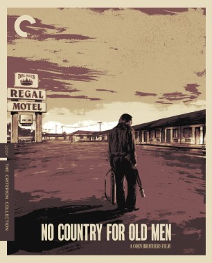
I'm undecided on the new 8 1/2 actually! the image is good, the typeface is what I'm unsure of. No Country fits along side all the other Coen covers aside from Blood Simple
Spoiler
we only meet her through the slide show photos and she only comes at the very end of the film, at its most pivotal point. so to flaunt her (and her pink sweater) in the art kinda defeats that, but that's obviously a battle lost long ago...
-
domino harvey

- Dot Com Dom
- Joined: Wed Jan 11, 2006 6:42 pm
Re: Criterion & Eclipse Cover Art & Packaging Babble-on Vol. 7
I can’t wait to play No Country For Old Men on my Sega Dreamcast
-
CSM126

- Joined: Thu Nov 04, 2004 12:22 pm
- Location: The Room
- Contact:
Re: Criterion & Eclipse Cover Art & Packaging Babble-on Vol. 7
Brown and mauve aren’t exactly the colors that No Country evokes in my memory.
8-1/2 is great
Spoiler
They should have used an image of Jones tracking his father, like in the dream he describes. Way more evocative.
-
ryannichols7
- Joined: Mon Jul 16, 2012 6:26 pm
Re: Criterion & Eclipse Cover Art & Packaging Babble-on Vol. 7
way more poetic too. focusing too much on Bardem I think kinda defeats the entire point, but I also only saw the movie once on releaseCSM126 wrote: Mon Sep 16, 2024 5:33 pm Brown and mauve aren’t exactly the colors that No Country evokes in my memory.
Spoiler
They should have used an image of Jones tracking his father, like in the dream he describes. Way more evocative.
-
Finch

- Joined: Mon Jul 07, 2008 9:09 pm
- Location: United States
Re: Criterion & Eclipse Cover Art & Packaging Babble-on Vol. 7
Really like Sam Hadley's cover for Eastern Condors!
shrugs about the rest
shrugs about the rest
-
pzadvance

- Joined: Mon Nov 21, 2011 11:24 pm
- Location: Vienna, Austria
Re: Criterion & Eclipse Cover Art & Packaging Babble-on Vol. 7
That new 8 1/2 cover has a real “AI image extender” vibe after seeing the original cover for so long
-
ryannichols7
- Joined: Mon Jul 16, 2012 6:26 pm
Re: Criterion & Eclipse Cover Art & Packaging Babble-on Vol. 7
thinking about it, and holding my original copy (to look at the booklet), I don't approve of the new cover for 8 1/2. the title on the original cover is directly off the title card, an approach also reprised for the Citizen Kane cover. I would've been fine with the new image with the old numbers, but I don't like it, it feels more divorced from the film. a shame, as Eric Skillman's designs are usually good
they've been strange with the 4K cover changes. it's interestingly usually only non-US titles that have cover changes, and until now had largely been French titles. speaking of that, I just realized this is the first Italian 4K title from Criterion!
they've been strange with the 4K cover changes. it's interestingly usually only non-US titles that have cover changes, and until now had largely been French titles. speaking of that, I just realized this is the first Italian 4K title from Criterion!
-
Brian C

- I hate to be That Pedantic Guy but...
- Joined: Wed Sep 16, 2009 3:58 pm
- Location: Northwest US
Re: Criterion & Eclipse Cover Art & Packaging Babble-on Vol. 7
I don’t think the No Country cover evokes the movie at all - it’s been some years since I’ve watched it, but I remember a lot of clear blue skies against the desert landscapes, not oppressive overcast smog. There are some key nighttime sequences as well, of course, but the feeling I remember is the opposite of what this cover portrays - I remember the feeling of nowhere to hide in the harsh light, out there exposed in the open.
Which, honestly, seems more in line with the Coens’ overarching themes throughout the years more than this.
Still a buy for me just because, but it’s disappointing.
Which, honestly, seems more in line with the Coens’ overarching themes throughout the years more than this.
Still a buy for me just because, but it’s disappointing.
-
ryannichols7
- Joined: Mon Jul 16, 2012 6:26 pm
Re: Criterion & Eclipse Cover Art & Packaging Babble-on Vol. 7
it honestly reminds me of the Fake Criterions tumblr from back in the day. lots of good work on there, but also lots that don't really correlate with the film. my surprise was learning three different artists did the three Llewyn Davis, Miller's Crossing, and No Country coversBrian C wrote: Mon Sep 16, 2024 7:46 pm I don’t think the No Country cover evokes the movie at all - it’s been some years since I’ve watched it, but I remember a lot of clear blue skies against the desert landscapes, not oppressive overcast smog. There are some key nighttime sequences as well, of course, but the feeling I remember is the opposite of what this cover portrays - I remember the feeling of nowhere to hide in the harsh light, out there exposed in the open.
Which, honestly, seems more in line with the Coens’ overarching themes throughout the years more than this.
Still a buy for me just because, but it’s disappointing.
-
Brian C
- I hate to be That Pedantic Guy but...
- Joined: Wed Sep 16, 2009 3:58 pm
- Location: Northwest US
Re: Criterion & Eclipse Cover Art & Packaging Babble-on Vol. 7
Yeah that is surprising, and also feels kinda … pointless, I guess. The art worked for Davis, I thought, and kinda worked but less so for Crossing, but seems completely inappropriate for this movie. Whether by the Coens’ request or otherwise, it feels forced, like they’ve decided that this is just the box they’re putting all the Coen films in.
More generally, I think the impulse is perhaps a bit juvenile to give a bunch of movies from the same filmmakers a single stylistic treatment. It flattens their work and implies that they’re all the same, like chapters in a book. At best it’s a very reductive application of auteur theory, and it’s often awkward even in big box sets where it’s more expected and perhaps more justifiable. I mean, even Wes Anderson has a couple movies in the Collection with completely different cover art.
Maybe this is the Coens’ doing but regardless, perhaps it’s time to shake it up for A Serious Man or whatever’s next.