Criterion & Eclipse Cover Art & Packaging Babble-on Vol. 7
-
Omensetter

- Yes We Cannes
- Joined: Sun Apr 24, 2011 12:17 am
- Location: Lawrence, KS, U.S.
Re: Criterion & Eclipse Cover Art & Packaging Babble-on Vol. 7
The DVD version does indeed contain both the traditional insert and the novella.
-
jbeall

- Joined: Sat Aug 12, 2006 1:22 pm
- Location: Atlanta-ish
Re: Criterion & Eclipse Cover Art & Packaging Babble-on Vol. 7
This is also true of the blu. (I picked up a copy in the recent B&N sale.) There are two inserts: one is the leaflet with the essay and production credits, and the other is the 44-page novella.
-
acroyear

- Joined: Mon Sep 24, 2012 2:22 am
Re: Criterion & Eclipse Cover Art & Packaging Babble-on Vol. 7
Thanks guys for clearing up my curiosity about the DVD vs Blu inserts. The more I think of the supplements inside, the more its influencing my decision to purchase.
-
KJones77
- Joined: Thu Aug 24, 2017 3:35 am
Re: Criterion & Eclipse Cover Art & Packaging Babble-on Vol. 7
It is a terrific film and the supplements do an excellent job of diving into it and its troubled history.acroyear wrote: Sun Aug 05, 2018 5:53 pm Thanks guys for clearing up my curiosity about the DVD vs Blu inserts. The more I think of the supplements inside, the more its influencing my decision to purchase.
Tremendous overall release.
-
swo17

- Bloodthirsty Butcher
- Joined: Tue Apr 15, 2008 2:25 pm
- Location: SLC, UT


-
domino harvey

- Dot Com Dom
- Joined: Wed Jan 11, 2006 6:42 pm
Re: Criterion & Eclipse Cover Art & Packaging Babble-on Vol. 7
The incomplete art for Ambersons is clever
-
Brian C

- I hate to be That Pedantic Guy but...
- Joined: Wed Sep 16, 2009 3:58 pm
- Location: Northwest US
Re: Criterion & Eclipse Cover Art & Packaging Babble-on Vol. 7
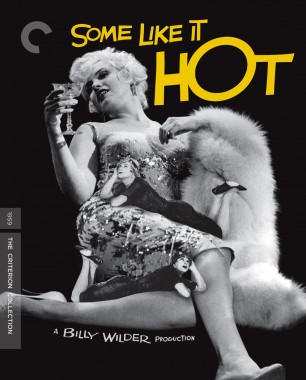
The Ambersons cover looks very nice. The Some Like It Hot cover does not look even slightly nice.
-
Luke M
- Joined: Fri Jul 13, 2007 1:21 am
Re: Criterion & Eclipse Cover Art & Packaging Babble-on Vol. 7
I like all of them especially the Mizoguchi.
-
domino harvey
- Dot Com Dom
- Joined: Wed Jan 11, 2006 6:42 pm
Re: Criterion & Eclipse Cover Art & Packaging Babble-on Vol. 7
Marilyn Monroe got the fuzzy end of the lollipop againBrian C wrote: Wed Aug 15, 2018 9:12 pm The Ambersons cover looks very nice. The Some Like It Hot cover does not look even slightly nice.
-
CantelopeSkiz
- Joined: Wed Oct 12, 2016 3:30 pm
Re: Criterion & Eclipse Cover Art & Packaging Babble-on Vol. 7
I like the cover for The Magnificent Ambersons. It looks a little bit dreamlike, like a faded memory, and the unfinished coloring is a nice nod to the missing/lost footage. I also like the vulgarity of Some Like it Hot's cover.
-
Brian C
- I hate to be That Pedantic Guy but...
- Joined: Wed Sep 16, 2009 3:58 pm
- Location: Northwest US
Re: Criterion & Eclipse Cover Art & Packaging Babble-on Vol. 7
It’s been awhile since I’ve watched it so maybe I’m being unfair ... I just don’t remember it being a one-woman stage show about a broken-down drunk.domino harvey wrote:Marilyn Monroe got the fuzzy end of the lollipop again
-
Cremildo

- Joined: Mon Jan 23, 2012 12:19 am
- Location: Brazil
- Contact:
Re: Criterion & Eclipse Cover Art & Packaging Babble-on Vol. 7
Not a single atrocious cover this month. Kudos, Criterion. The Mizoguchi one is particularly appealing in its simplicity.
-
DarkImbecile

- Ask me about my visible cat breasts
- Joined: Mon Dec 09, 2013 10:24 pm
- Location: Albuquerque, NM
Re: Criterion & Eclipse Cover Art & Packaging Babble-on Vol. 7
Ambersons and Chikamatsu look great; I don't hate SLIH, but it's certainly not ideal.
-
domino harvey
- Dot Com Dom
- Joined: Wed Jan 11, 2006 6:42 pm
Re: Criterion & Eclipse Cover Art & Packaging Babble-on Vol. 7
Yellow and black is always gross, why do they keep doing that
-
knives

- Joined: Sat Sep 06, 2008 10:49 pm
Re: Criterion & Eclipse Cover Art & Packaging Babble-on Vol. 7
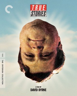
Maybe it will make sense after watching the movie, but that True Stories cover is reverse selling me.
-
stevewhamola

- Joined: Sat Mar 26, 2011 11:20 pm
- Location: NWT, Canada
Re: Criterion & Eclipse Cover Art & Packaging Babble-on Vol. 7
You're forgetting the infamous delirium tremens scene where she hallucinates miniature rubber puppets of Curtis and Lemmon first flying around the room, then posing lazily on her. Or am I confusing it with another movie?...Brian C wrote: Wed Aug 15, 2018 9:17 pm It’s been awhile since I’ve watched it so maybe I’m being unfair ... I just don’t remember it being a one-woman stage show about a broken-down drunk.
-
Feego

- Joined: Thu Aug 16, 2007 11:30 pm
- Location: Texas
Re: Criterion & Eclipse Cover Art & Packaging Babble-on Vol. 7
Wow, Some Like It Hot is all kinds of awful. It's bad enough that tiny Tony Curtis and Jack Lemmon were photoshopped onto an unflattering photo of Monroe, but they weren't even photoshopped well!
Ambersons on the other hand is beautiful. A happy addition to my collection (although I'd buy it even if they photoshopped tiny Tim Holt on a drunk Dolores Costello).
Ambersons on the other hand is beautiful. A happy addition to my collection (although I'd buy it even if they photoshopped tiny Tim Holt on a drunk Dolores Costello).
Last edited by Feego on Wed Aug 15, 2018 9:46 pm, edited 1 time in total.
-
swo17
- Bloodthirsty Butcher
- Joined: Tue Apr 15, 2008 2:25 pm
- Location: SLC, UT
Re: Criterion & Eclipse Cover Art & Packaging Babble-on Vol. 7
Oh yikes, I didn't initially notice them. Horrifying.
-
DarkImbecile
- Ask me about my visible cat breasts
- Joined: Mon Dec 09, 2013 10:24 pm
- Location: Albuquerque, NM
Re: Criterion & Eclipse Cover Art & Packaging Babble-on Vol. 7
Oh, no no no. I was initially not too disparaging because giving Monroe the full cover can't be all bad, but that was a terrible choice.
-
Brian C
- I hate to be That Pedantic Guy but...
- Joined: Wed Sep 16, 2009 3:58 pm
- Location: Northwest US
Re: Criterion & Eclipse Cover Art & Packaging Babble-on Vol. 7
Haha I didn’t notice them either. Now it’s both ugly AND stupid.
-
RPG

- Joined: Thu Feb 05, 2015 10:05 pm
Re: Criterion & Eclipse Cover Art & Packaging Babble-on Vol. 7
It reminds of the music video for "Miserable" by Lit, with a blonde sex symbol blown up to King Kong size towering over miniature men. If only she was chasing and devouring them.
-
Max von Mayerling

- Joined: Wed Dec 22, 2004 10:02 pm
- Location: Ann Arbor, MI
Re: Criterion & Eclipse Cover Art & Packaging Babble-on Vol. 7
Yes, I also did not notice this at first. Ack.
-
MongooseCmr
- Joined: Sun Dec 16, 2012 3:50 am
Re: Criterion & Eclipse Cover Art & Packaging Babble-on Vol. 7
I sort of like it now, at least in concept. It’s the bizarrely flat angle of her that sinks it
-
Gregory

- Joined: Tue Nov 02, 2004 8:07 pm
Re: Criterion & Eclipse Cover Art & Packaging Babble-on Vol. 7
Some Like a HOT Mess
-
domino harvey
- Dot Com Dom
- Joined: Wed Jan 11, 2006 6:42 pm
Re: Criterion & Eclipse Cover Art & Packaging Babble-on Vol. 7
To be fair, the typeface is the only thing the designer did take from the original key art