Posted: Wed Mar 19, 2008 3:25 am
Yeah it has.arsonfilms wrote:Before anybody blows out an artery, lets just take a moment to reflect on the fact that the official artwork has NOT yet been finalized or released.
https://www.criterionforum.org/forum/
Yeah it has.arsonfilms wrote:Before anybody blows out an artery, lets just take a moment to reflect on the fact that the official artwork has NOT yet been finalized or released.
Easily.HerrSchreck wrote:Worst CC cover ever?
You may have a point. I like the cover a lot, have never seen the movie, but now want to.reno dakota wrote:Wow. It's as if they are trying to prevent it from appealing to people who know nothing about the film.
Yes, Breathless' design ultimately kept the spirit of the film; though I can appreciate Scharphedin2's points about where the design was coming from for Mishima vis-a-vis the way Mishima's novels were marketed in the West, representing Mishima's different personas, etc, I certainly hope that, even if the cover remains unchanged, the rest of the design incorporates more of the film and its many fine visual qualities (which no one can deny, I think, even if they dislike the film), or at least something less in the grips of psychedelia.Antoine Doinel wrote:Breathless, while surprising (and a design I think ultimately works), at least was true to the spirit of Godard in some sense. I have no idea what to make of Mishima. Looking at the cover, it's like I'm gearing up to watch [bTHE TRIPPED OUT ON TOTALLY AWESOME TABS EDITION[/b]
My earlier comment--which you seem to be referencing--was made partly in jest. I certainly do not believe the cover art will scare away every newcomer, but I do think it has the potential to scare away some.rwaits wrote:I think the complaint that the cover art could deter a viewer who has never seen the film is untrue.
I'm not comparing it to either of those films... but really, what section will this dvd wind up in at, say, your local Borders?Antoine Doinel wrote:After you see Mishima you will see why stating that it is a cult film alongside those films you mentioned is completely off base.
I think it's more likely to attract potential buyers, with its colors and so forth. It just doesn't reflect the movie.reno dakota wrote:My earlier comment--which you seem to be referencing--was made partly in jest. I certainly do not believe the cover art will scare away every newcomer, but I do think it has the potential to scare away some.rwaits wrote:I think the complaint that the cover art could deter a viewer who has never seen the film is untrue.

you'll be disappointed if that's your only point of referenceAlonzo the Armless wrote:I like the cover a lot, have never seen the movie, but now want to.
uh, the Criterion section? where it will look terribly out of place.rwaits wrote:but really, what section will this dvd wind up in at, say, your local Borders?
they're afraid of being either called gay or a commie.luridedith wrote:What is with you guys and the colour pink?
Too closely associated with that awful Aerosmith song. This also explains why we hate elevators and cryin' on covers.luridedith wrote:What is with you guys and the colour pink?
No one as far as I know has objected to the color pink. To my knowledge it was only used in reference to the first draft of the Viridiana cover.luridedith wrote:What is with you guys and the colour pink?

Not to mention King of Kings, probably designed by the original Viridiana designer, and itself just this side of Total Tackorama. "Come See The New, Pop, Commie, Homo Christ! Tonite at Bowery Ballroom!"kinjitsu wrote:No one as far as I know has objected to the color pink. To my knowledge it was only used in reference to the first draft of the Viridiana cover.
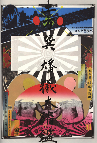
None other than Birdey Hilltop from Oshima's Diary of a Shinjuku Thief, and if they had stuck with something more along the lines of what you posted, instead of throwing little heads everywhere and adding layer upon layer of photoshopped images, we wouldn't have a squabble.kinjitsu wrote:Yokoo Tadanori, "Yukio Mishima."