422 The Last Emperor
-
Matango

- Joined: Mon Aug 01, 2005 1:19 am
- Location: Hong Kong
I'm inclined to agree about the extras. There's way too much about Bertie. Ian Buruma's 45-minute piece on the historical background is quite good, but there could have been some docu stuff on subjects like Pu Yi himself, the Cultural Revolution, Manchuria/Manchukuo, the Kuomintang, Sun Yat Sen, and Reginald Johnston (The Peter O'Toole character, on whose book much of the film was based). That said, I haven't seen all the extras yet, but probably never will anyway.
-
planetjake
-
denti alligator

- Joined: Wed Nov 03, 2004 9:36 pm
- Location: "born in heaven, raised in hell"
Having just watched this I need to comment on the colors that most of us have found troubling:
The colors in Gary's caps (DVD Beaver) seem to me to be totally inaccurate.
On my carefully calibrated system the colors in the film look nothing like the washed-out grey-tone of Gary's caps. They look much closer to the colors in the region 2 Gaumont, bright and full. The difference between imperial yellow and ordinary yellow is very clear, not a greyish yellow to ordinary yellow. The reds and greens are rich and powerful.
I don't know what's going on with Gary's system, but the Criterion disc (theatrical version) looks nothing like his caps. I even paused the screen and pulled up his caps to compare: night and day! Have others noticed this?
As for the AR: it looked fine to me. There was only one scene in which it seemed wrong, but this was short and didn't bother me. I was really hesitatnt about getting this because of the greyish tone of Gary's caps. For those of you who are holding off because of that: don't. This looks great.
-
Lino

- Joined: Wed Nov 03, 2004 6:18 am
- Location: Sitting End
- Contact:
-
Gary Tooze

- Joined: Thu Nov 04, 2004 9:07 pm
- Contact:
Total bullshit.The colors in Gary's caps (DVD Beaver) seem to me to be totally inaccurate.
This cap of the theatrical was obtained using PowerDVD 4.0 (flat - color setting 0 -0 - 0 and original, not 'vibrant' setting)
Here is from a totally different version (newer) of PowerDVD on a different computer system but with the same settings as above. You can see although the newer has flat settings it still brightens a bit. We continue to use the original for a more unmanipulated representation. PLUS the original caps - Gaumont and Artisan were taken using the old system - so that it was we use to compare. It gives us as pure and fair comparison as possible. We don't go in for this boosting crap...
We take great pride in the accuracy of our postings and certainly don't appreciate this type of unfounded accusation.
Denti, I suggest that you are not familiar with the inner workings of your own system, be it the player or the monitor (or maybe your computer monitor!), but it is VERY common now for newer systems to have built-in color boosting (they call it 'correction' systems). In future if you have issue with my work please email me directly - I promise to respond - rather than to 100's in this forum and my ListServ casting aspersions on my painstakingly diligent efforts.I don't know what's going on with Gary's system,
Regards,
Gary
-
Gigi M.

- Joined: Wed Jul 06, 2005 5:09 pm
- Location: Santo Domingo, Dominican Rep
I just made a comparison with Gary's caps with my setup calibrated with DVE and AVIA Pro, a Konica Minolta CL-200 color meter with color facts 6, and all I can say Gary's system looks identical to mine.
I was also shocked by the incredible amount of grain and digital noise this disc has. During day scenes, especially blue skies, clouds and such, are just nasty. I thought it was my projector bulb that was dying at one point, but it wasn't.
I was also shocked by the incredible amount of grain and digital noise this disc has. During day scenes, especially blue skies, clouds and such, are just nasty. I thought it was my projector bulb that was dying at one point, but it wasn't.
-
denti alligator
- Joined: Wed Nov 03, 2004 9:36 pm
- Location: "born in heaven, raised in hell"
Sorry, Gary, perhaps my original post was a little strong. I felt misled by your caps (still do), and might have worded things with more tentativeness. I did say that "it seems to me," but obviously the rest of what I wrote says otherwise. Anyway, please no hard feelings. I would like to get to the bottom of this, however.
I've worked long and hard on my system, and I have adjusted every color control very, very carefully and precisely, using both DVE and Avia calibration tools. On my display I have turned off all automatic color correction features and have even gone into the color palette to adust hue, brightness, and saturation for reds, greens, blues, yellows, magentas and cyans. With each adjustment I go back to the other colors to make sure they haven't been adversely affected. Everything in the color bars filtered through red, green and blue has been carefully matched.
Now: what I see is very different from what I see in your caps. That's all. I ask others: make the comparison and tell us what you see. Thanks, Gigi, for doing this. Perhaps my system is, after all my calibrations, still inaccurate ....
-
Gigi M.
- Joined: Wed Jul 06, 2005 5:09 pm
- Location: Santo Domingo, Dominican Rep
No problem, Denti. Did you read what I wrote about the massive presence of grain and digital noise? Do you see them in your setup?denti alligator wrote:Thanks, Gigi, for doing this. Perhaps my system is, after all my calibrations, still inaccurate ....
I'm actually very surprise no one hasn't mention it at this point.
-
denti alligator
- Joined: Wed Nov 03, 2004 9:36 pm
- Location: "born in heaven, raised in hell"
I saw some digital noise, yes, but not any more than with your average Criterion release--usually in darker shadows it's most visible. Grain didn't jump out at me as being excessive: but I'm only watching this on a 46" display.Gigi M. wrote:No problem, Denti. Did you read what I wrote about the massive presence of grain and digital noise? Do you see them in your setup?
-
DonShye
- Joined: Tue Oct 24, 2006 7:15 pm
I posted this in another forum but I have to agree that the colors look a lot less drab and washed out (at least in the theatrical version) than they do in Beaver's caps. I think it may be some sort of an optical illusion since we are seeing these alongside the Gaumont caps which are a little too colorful (and definitely not accurate).
The cropping is also not too objectionable unless again you compare the cropped frame to the full 2.35:1 frame in the Beaver caps. While the framing differs from the original theatrical exhibition, this doesn't ruin the composition as significantly as regular pan-and-scan.
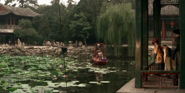
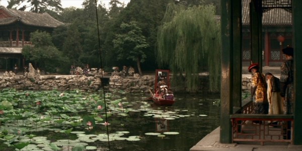
There was also some discussion about whether the cropping is different for the theatrical version vs. the TV version. In this case the cap in question (the lake scene) is taken from a scene that has a quick pan. It is possible that Beaver was off by a few frames and that explains why the cropping seems different between the two versions.
-D
The cropping is also not too objectionable unless again you compare the cropped frame to the full 2.35:1 frame in the Beaver caps. While the framing differs from the original theatrical exhibition, this doesn't ruin the composition as significantly as regular pan-and-scan.
There was also some discussion about whether the cropping is different for the theatrical version vs. the TV version. In this case the cap in question (the lake scene) is taken from a scene that has a quick pan. It is possible that Beaver was off by a few frames and that explains why the cropping seems different between the two versions.
-D
-
denti alligator
- Joined: Wed Nov 03, 2004 9:36 pm
- Location: "born in heaven, raised in hell"
That may be part of it, but I pulled up Gary's caps on my laptop and paused the DVD to compare: big difference.DonShye wrote:I think it may be some sort of an optical illusion since we are seeing these alongside the Gaumont caps which are a little too colorful (and definitely not accurate).
Given Gary's stated meticulousness in regards to faithfully rendering what's on the disc, it must be my system, however I find that hard to believe entirely, since the most sophisticated calibration tools are telling me that my display's colors are spot-on.
-
Gigi M.
- Joined: Wed Jul 06, 2005 5:09 pm
- Location: Santo Domingo, Dominican Rep
Probably Denti, size always matters. But I was so shock that I decided to test the disc on two other displays. I project on a 84" 16:9 screen, sitting just 9.5' away from the screen. I also ran the disc on a 46" lcd and the grain was still there at 5' away. Then ran the disc again on a 24" old crt to same results.denti alligator wrote:I saw some digital noise, yes, but not any more than with your average Criterion release--usually in darker shadows it's most visible. Grain didn't jump out at me as being excessive: but I'm only watching this on a 46" display.Gigi M. wrote:No problem, Denti. Did you read what I wrote about the massive presence of grain and digital noise? Do you see them in your setup?
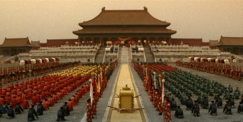
Try watching the scenes at the beginning of the film when Puyi walks out for the first time at the Forbidden City to see what I'm talking about.
Look at the sky around the palace and tell me if doesn't look nasty during playback.
-
denti alligator
- Joined: Wed Nov 03, 2004 9:36 pm
- Location: "born in heaven, raised in hell"
I think I've figured out why the discrepancy. Again, Gary, I'm sorry if I was too aggressive in my first post.
Part of it indeed has to do with how those Criterion caps look next to the (gaudy, oversaturated) Gaumont. More importantly: I was comparing the paused image on my carefully calibrated display with Gary's cap on my laptop. My laptop makes the image look less vibrant than it really it.
Second: I was looking at the Television version cap, which is, again, less vibrant.
These two factors make an marked difference. I pulled up Gary's caps on my large, calibrated display and compared them to the DVD and they look just about the same.
However, I think they look fantastic. The first cap, for example, may seem a tad grey, but the very next shot shows the young emperor in sunlight, and this makes a marked difference. Mind you, I didn't set out to compare and denigrate Gary's work. I was watching the film and was thinking: 'this isn't at all what Gary's caps made me think the colors would look like. These are vibrant and alive.'
Yeah, I see what you mean, but size does matter, and it doesn't stand out that much on my display.Gigi M. wrote:Look at the sky around the palace and tell me if doesn't look nasty during playback.
-
domino harvey

- Dot Com Dom
- Joined: Wed Jan 11, 2006 2:42 pm
-
denti alligator
- Joined: Wed Nov 03, 2004 9:36 pm
- Location: "born in heaven, raised in hell"
Um, actually, three. Had I not found mine for $22, I wouldn't have purchased it.domino harvey wrote:So we now know Criterion sold at least two of these sets, well exceeding expectations!
On the other hand, I'm pretty sure--despite its price--this will sell very well. It's a film your average joe (but not really cinephile) will recognize by name (and image).
-
domino harvey
- Dot Com Dom
- Joined: Wed Jan 11, 2006 2:42 pm
-
Gary Tooze
- Joined: Thu Nov 04, 2004 9:07 pm
- Contact:
No problem Denti
***
Although it's early in the year - I can tell you its the 5th largest boxset seller from Amazon for us. Beaten by (in order):
TCM Archives - Forbidden Hollywood Collection, Vol. 2 (The Divorcee / A Free Soul / Night Nurse / Three on a Match / Female)
Silent Ozu-Three Family Comedies
Jean-Luc Godard Box Set
Eclipse Series 8 - Lubitsch Musicals
I think it has sold just fine - this is a popular film and our page has almost 10,000 hits now - a decent gauge of interest.
Cheers,
Gary
-
Cosmic Bus

- Joined: Mon Sep 11, 2006 10:12 pm
- Location: Seattle, WA
- Contact:
It has been featured at the front of Borders' media sections for the past couple of weeks and marked on sale -- for, obviously, more than you'll pay online, but it's significant that a Criterion is sale priced at all in a retail shop -- so this one is receiving more "corporate" attention than most of their releases. I think it'll do fairly well for them in the long run.
-
domino harvey
- Dot Com Dom
- Joined: Wed Jan 11, 2006 2:42 pm
-
cdnchris

- Site Admin
- Joined: Tue Nov 02, 2004 2:45 pm
- Location: Washington
- Contact:
-
klee13
- Joined: Tue Jan 15, 2008 2:33 pm
- Location: NYC
I watched this, and I was wondering whether anyone else had as much trouble getting past the English speaking Chinese cast as I did. It wasn't even a authenticity issue so much as some of the actors seemed to be really laboring over their dialogue. English spoken with a heavy Chinese accent is often not too pretty, (and vice-versa as I can personally attest to) so I'm surprised they didn't just go with subtitled Mandarin dialogue.
(Though the movie probably would not have won half as many oscars as it did if they had.)
(Though the movie probably would not have won half as many oscars as it did if they had.)
-
Dylan
- Joined: Tue Nov 02, 2004 9:28 pm
The film (which I like very much) would've been unquestionably better had the cast spoken in Mandarin (with, of course, most of O'Toole's scenes being the only passages in English), and I'm positive the decision to film it in English largely had to do with the fact that the script was written in English, the financers were English and that most of the crew was Italian and spoke English better than Mandarin (if they spoke Mandarin at all). The accents are a tad difficult to get past in a few scenes, but John Lone does a good job.
Still, the rough accents here are easier to get past than the screwiness of 1900's dubs (where, and it doesn't matter if you watch it in French, English or Italian, half of the dubbing is highly questionable).
Still, the rough accents here are easier to get past than the screwiness of 1900's dubs (where, and it doesn't matter if you watch it in French, English or Italian, half of the dubbing is highly questionable).
-
SheriffAmbrose
- Joined: Sat Feb 03, 2007 12:08 pm
-
kevyip1
- Joined: Sat Nov 06, 2004 7:07 pm
I've never had a problem with Gary's pics. His Last Emperor caps match mine, and his Gaumont caps match the Optimum disc (no caps for it on his page but I own the Optimum disc and can attest to this).denti alligator wrote:The colors in Gary's caps (DVD Beaver) seem to me to be totally inaccurate.
On my carefully calibrated system the colors in the film look nothing like the washed-out grey-tone of Gary's caps. They look much closer to the colors in the region 2 Gaumont, bright and full. The difference between imperial yellow and ordinary yellow is very clear, not a greyish yellow to ordinary yellow. The reds and greens are rich and powerful.
When Gary said he used PowerDVD's "original profile", that meant ZERO calibration: brightness/contrast/hue/saturation all set to zero in PowerDVD. After you calibrated with DVE and Avia, who knows what the B/C/H/S would be. Everyone's setup and viewing environment are different so B/C/H/S would be different for everyone. Hence, Gary set them all to zero (default setting), and so should you if you really want to compare your caps to his.I've worked long and hard on my system, and I have adjusted every color control very, very carefully and precisely, using both DVE and Avia calibration tools.
To calibrate for a Criterion disc, I don't use DVE or Avia, but the built-in color-bar screen on the Criterion disc. "The Last Emperor" happens to look a lot brighter than what my Avia calibration gave me, so I had to recalibrate with the color bars. But that was just for my viewing environment and setup. With yours or others', the Avia calibration may be good enough.