Screen Captures (5-6 per post + links to additional images)


-
devlinnn

- Joined: Wed Nov 03, 2004 3:23 am
- Location: three miles from space
No major troubles with Minor, although sharpness looks to be a tad uneven. It is a little more grainy than we are used to these days, but I can live with it. I had forgotten how many great gags are laced in this, the Veronica Lake one is a howler. The whole package though is crying out for a Marian Keane commentary.
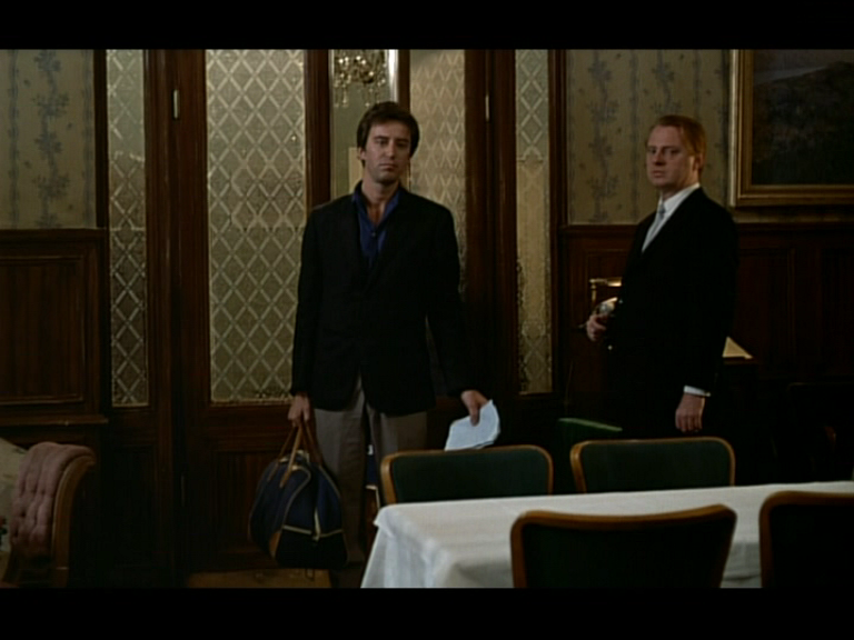
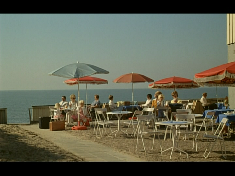
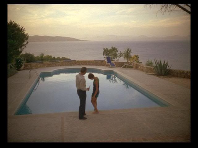
(No sign of 5 Graves this morning.)
(No sign of 5 Graves this morning.)
-
jsteffe

- Joined: Sat Mar 31, 2007 9:00 am
- Location: Atlanta, GA
Last night we screened Janus Films' 35mm print of AN AUTUMN AFTERNOON from their Ozu retrospective a few years back, and it looked stunning in its clarity. No jumping in the image, either. Ozu is one director who really benefits from seeing his films in 35mm to appreciate the subtlety of his mise-en-scene.Michael Kerpan wrote:How is the jittering and skipping at the beginning of "Autumn Afternoon". (It was in both the Shochiku print and the Shochiku DVD).
The Shochiku DVDs of these films look pretty similar color-wise.
One thing I noticed was a decided green-brown bias in the color overall--due to the Fujifilm stock, perhaps? Don't get me wrong, the print still looked beautiful and obviously wasn't faded. The frame caps above look as if the hues might have been shifted slightlky in the transfer relative to the 35mm print, but they still look good.
I only hope that in their forthcoming Ozu late films box set Criterion/Eclipse doesn't futz with the color to make it look more like Eastmancolor stock.
-
jsteffe
- Joined: Sat Mar 31, 2007 9:00 am
- Location: Atlanta, GA
Actually, I think you could argue the opposite, that the Technicolor printing matrices were mistakenly reversed on the print used for the laserdisc transfer, or that something happened in the video transfer process. Notice how in the DVD frame grab her lips are red, whereas on the old laserdisc they're orange. Now why would Michael Powell give a Venetian temptress orange lips?davidhare wrote:Tales of Hoffmann.
The Criterion laserdisc from 1995 top (with what I consider the correct color balance for blue) and the Criterion DVD below from the Studio Canal source which I consider to be blue-supressed, green biased:
[/img]

I think the the problem wasn't the caught first time around because the reversed matrices or hues still resulted in more or less "normal" looking skin tones.
-
pro-bassoonist

- Joined: Wed Jun 07, 2006 12:26 am
...like they, Criterion, have done on numerous Studio Canal-ported releases already!davidhare wrote:...the Studio Canal master print used for the Criterion is lovely in all other respects but I am certain they manipulated the chroma to push up green which ends up killing off the blue/turquoise. I don't believe they used a Technicolor reference print when they were doing it.
Pro-B
-
jsteffe
- Joined: Sat Mar 31, 2007 9:00 am
- Location: Atlanta, GA
That sounds like a plausible explanation, and I trust your color memory. One of my colleagues, who worked for quite a while at Cinepost here in Atlanta, pointed out something very interesting today. The blue headscarf and orange-ish lips in the laserdisc image are virtually complementary colors, as are the red lips and green headscarf in the DVD. I don't know whether this has any bearing on anything.davidhare wrote:It's entirely possible of course, although the liner notes on the laserdisc specifically refer to a NEW internegative which was struck from the three strip matrices to create a new interpositive (they also don't say so but one suspects it was done by Scorsese and Schoonmaker.)
The point is however the gorgeous 16mm IB print which played around NYC in the late 70s and early 80s has EXACTLY the same turquoise color in the Baracarolle sequence, but, of course the red lippy is real Helena Rubinstein Techni red, not orange - I think the laser transfer simply wasnt up to supporting a fully saturated red without color bleeding. The Studio Canal master print used for the Criterion is lovely in all other respects but I am certain they manipulated the chroma to push up green which ends up killing off the blue/turquoise. I don't believe they used a Technicolor reference print when they were doing it.
I guess the only way to get to the bottom of this would be to look at one or more surviving Technicolor IB prints for reference. Or maybe Lee Klein at Criterion could shed some light. But it's a fantastic film, either way. I saw it only for the first time when the DVD came out and was delirious for days afterwards! I would give anything to see a 35mm print.
-
HerrSchreck

- Joined: Sun Sep 04, 2005 11:46 am
Ah that drum solo..
Not bad, certainly in keeping with the high faux-grain noise of the typical30's-40's Universal transfers as of late, but with an ever so slightly uncharacteristic edge-enhancey/analoguey look about it i e around hi-contrast light-dark parallels like the glasses, jewelry & pretzel dish in the first cap. Uni's transfers lately have been absolutely spectacular (i e the Karloff's, Lugosi's, ALL QUIET, ARABIAN NIGHTS etc & GLAMOUR COLLEC in R1) and this is just a couple molecules beneath. But I certainly wouldn't throw that LADY outa my disc collection.
Not bad, certainly in keeping with the high faux-grain noise of the typical30's-40's Universal transfers as of late, but with an ever so slightly uncharacteristic edge-enhancey/analoguey look about it i e around hi-contrast light-dark parallels like the glasses, jewelry & pretzel dish in the first cap. Uni's transfers lately have been absolutely spectacular (i e the Karloff's, Lugosi's, ALL QUIET, ARABIAN NIGHTS etc & GLAMOUR COLLEC in R1) and this is just a couple molecules beneath. But I certainly wouldn't throw that LADY outa my disc collection.
-
Anonymous
-
Lino

- Joined: Wed Nov 03, 2004 6:18 am
- Location: Sitting End
- Contact:
-
Anonymous


-
devlinnn
- Joined: Wed Nov 03, 2004 3:23 am
- Location: three miles from space
I was going to post one of Ms. Kelly, but something came up as I was taking shots.....
It's a friggin' beautiful transfer, and yes, I love this movie too. Pure wall-to wall dreamland.
(I've also re-appraised the local Greatest Show... during sober viewing. The transfer is just so-so, sadly.)
Billy Wilder's Five Graves to Cairo - Madman, R4 (AUST)


Very nice.
It's a friggin' beautiful transfer, and yes, I love this movie too. Pure wall-to wall dreamland.
(I've also re-appraised the local Greatest Show... during sober viewing. The transfer is just so-so, sadly.)
Billy Wilder's Five Graves to Cairo - Madman, R4 (AUST)
Very nice.
-
devlinnn
- Joined: Wed Nov 03, 2004 3:23 am
- Location: three miles from space
If Funny Face could ever look this good, I'd need to be hosed down on the hour.
Lordy, after upteenth viewings since very young childhood (just how many screening did Bill run during the 70s and 80s?), I just have never seen this film before now. The transfer is that astonishing beautiful.
Just look at it...(how well this all goes with a wet gin and an endless supply of rum balls.)
-
HerrSchreck
- Joined: Sun Sep 04, 2005 11:46 am


-
Scharphedin2

- Joined: Fri May 19, 2006 7:37 am
- Location: Denmark/Sweden
-
devlinnn
- Joined: Wed Nov 03, 2004 3:23 am
- Location: three miles from space
It would have to be. It was released a few weeks earlier down here due to Mother's Day tie-in promotions for early May, and can be found for below AU$15 (around US$10), with all the extras.Scharphedin2 wrote:I take it, this would be the same transfer that is on the R1 SE of Thief...?
One thing to keep in mind - it's a PAL transfer, so technically speaking the colour should always be better than N(ot) T(he) S(ame) C(olour). This was always the case in the VHS days, but the mastering down here (and in the UK and Euruope) has never been as good as the US, so it all balances out in the end I guess.
-
tryavna

- Joined: Wed Mar 30, 2005 4:38 pm
- Location: North Carolina
David, I too am a big fan of Barks and have a drawer-full of his work, and I know I have the particular comic you're referring to. (Unfortunately, that drawer isn't where I currently live.) I don't remember the title, but it opens with Donald and his nephews on the beaches of Monaco, where the homages to Hitch are to be found. Donald is persuaded by a leggy spy to help her. I don't remember everything, but one part that has stuck with me is where Donald, having been drugged by the spy, falls asleep on the railroad tracks -- only to be spared when the French engineers remember that they're supposed to go on strike! (French transportation strikes are always good fodder for humorists of any kind.)davidhare wrote:Total and complete ephemera. But there is a wonderful Carl Barks Donald Duck comic book (one of the 24 page three color ones) also from the 54 era in which the great Barks - never one to shy from cinematic influence - totally replicates some of Dev's screencaps, in particular the babes on the beach in one pieces and giant sunglasses. And carries the same self-knowing insouciance.
I have a modest collection of Barks buried inna drawer somwehere but NOT this comic. Does anyone else here have it? Or remember it?
-
zedz

- Joined: Sun Nov 07, 2004 7:24 pm
Is this the one where the climactic scene involves Donald as a matador, and are they being pursued by the mysterious Monsieur Mattress-face (That Barksian dwarf with the specs and enormous bushy beard down to his knees)?tryavna wrote:David, I too am a big fan of Barks and have a drawer-full of his work, and I know I have the particular comic you're referring to. (Unfortunately, that drawer isn't where I currently live.) I don't remember the title, but it opens with Donald and his nephews on the beaches of Monaco, where the homages to Hitch are to be found. Donald is persuaded by a leggy spy to help her. I don't remember everything, but one part that has stuck with me is where Donald, having been drugged by the spy, falls asleep on the railroad tracks -- only to be spared when the French engineers remember that they're supposed to go on strike! (French transportation strikes are always good fodder for humorists of any kind.)davidhare wrote:Total and complete ephemera. But there is a wonderful Carl Barks Donald Duck comic book (one of the 24 page three color ones) also from the 54 era in which the great Barks - never one to shy from cinematic influence - totally replicates some of Dev's screencaps, in particular the babes on the beach in one pieces and giant sunglasses. And carries the same self-knowing insouciance.
I have a modest collection of Barks buried inna drawer somwehere but NOT this comic. Does anyone else here have it? Or remember it?
-
ola t

- They call us neo-cinephiles
- Joined: Wed Nov 03, 2004 4:51 am
- Location: Malmo, Sweden
The one I think we're all thinking of is Dangerous Disguise from 1951 (so it predates the film). Here's the wonderful Donald-as-matador cover picture. Just to get even more ephemeral, a nice bit of trivia is that this is the only Barks story where the non-duck characters are fully human. His editors didn't like it and made him go back to the usual dog ears, pig snouts, etc.
Lost in the Andes... but don't forget Tralla La which is a more explicit riff on Shangri La.
Voodoo Hoodoo (zombie story)
Land of the Totem Poles (steam calliope)
Not sure about the tripping story, unless it's Donald Duck's Worst Nightmare which is quite Wackylandesque.
Lost in the Andes... but don't forget Tralla La which is a more explicit riff on Shangri La.
Voodoo Hoodoo (zombie story)
Land of the Totem Poles (steam calliope)
Not sure about the tripping story, unless it's Donald Duck's Worst Nightmare which is quite Wackylandesque.
-
feckless boy

- Joined: Wed Jan 03, 2007 4:38 pm
- Location: Stockholm