Criterion & Eclipse Cover Art & Packaging Babble-on Vol. 7
-
domino harvey

- Dot Com Dom
- Joined: Wed Jan 11, 2006 2:42 pm
Re: Criterion & Eclipse Cover Art & Packaging Babble-on Vol. 7
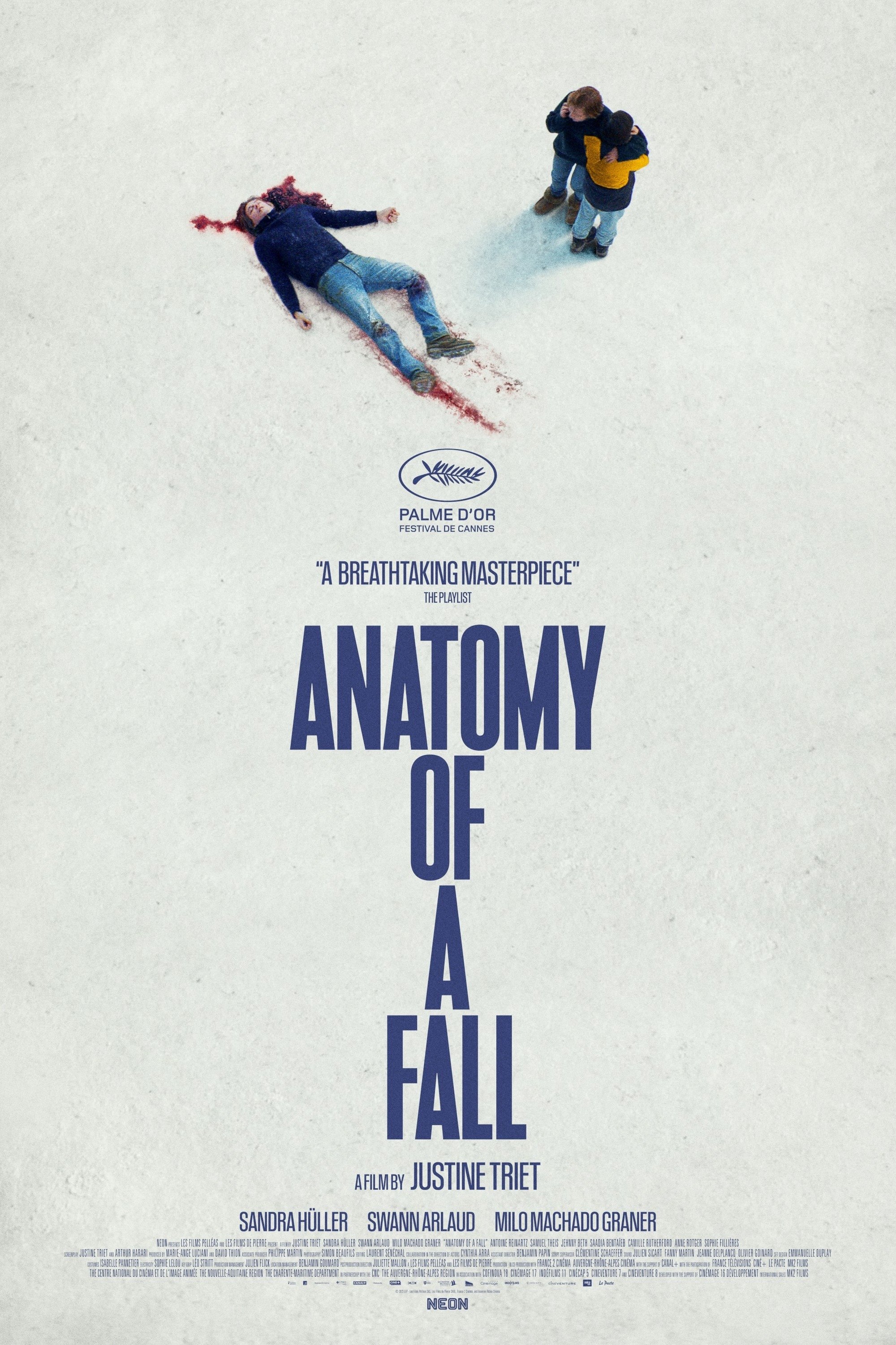
That Triet cover is hideous, why would that be what they went with? The rest are fine
-
Finch

- Joined: Mon Jul 07, 2008 5:09 pm
- Location: Edinburgh, UK
Re: Criterion & Eclipse Cover Art & Packaging Babble-on Vol. 7
Eric Skillman's cover for Peeping Tom almost makes me wish I hadn't already bought the Studio Canal edition.
-
ryannichols7

- Joined: Mon Jul 16, 2012 2:26 pm
Re: Criterion & Eclipse Cover Art & Packaging Babble-on Vol. 7
very glad they kept the Ozu cover, but brutal stuff on Anatomy of a Fall
looking at Peeping Tom zoomed in I actually quite like it...but I like the Canal one too
looking at Peeping Tom zoomed in I actually quite like it...but I like the Canal one too
-
TechnicolorAcid

- Joined: Wed Oct 11, 2023 7:43 pm
Re: Criterion & Eclipse Cover Art & Packaging Babble-on Vol. 7
All I will say is I love that Peeping Tom cover, it packs a good amount of dread and color in hat that gives people a general view of what to expect without revealing too much.
-
Matt
- Joined: Tue Nov 02, 2004 12:58 pm
Re: Criterion & Eclipse Cover Art & Packaging Babble-on Vol. 7
What a dull cover for Anatomy of a Fall, though I can't really think of anything better other than the existing poster image (which is also boring and perhaps a little too gruesome for mainstream consumption).
This does confirm that the Neon deal is continuing, in some fashion, beyond what was previously announced.
This does confirm that the Neon deal is continuing, in some fashion, beyond what was previously announced.
-
afilmcionado
- Joined: Mon Sep 28, 2020 9:14 am
Re: Criterion & Eclipse Cover Art & Packaging Babble-on Vol. 7
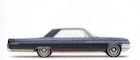
I must be the only person who likes the Anatomy of a Fall cover lol. I like how it magnifies and scrutinizes Sandra under a giant spotlight, much like the film does. The cover’s title treatment clearly implies it’s actually an anatomy of her, not a fall.
Done by Greg Ruth, same guy responsible for The Piano, Dragon Inn, A Touch of Zen and many more covers.
Done by Greg Ruth, same guy responsible for The Piano, Dragon Inn, A Touch of Zen and many more covers.
-
TechnicolorAcid
- Joined: Wed Oct 11, 2023 7:43 pm
Re: Criterion & Eclipse Cover Art & Packaging Babble-on Vol. 7
Greg Ruth is possibly my favorite Criterion artist and his covers for Notorious and Double Indemnity are my favorite covers in the entire catalogue and Anatomy of a Fall is, on an artistic level, astounding but I will agree that the image overall does look kind of boring compared to the striking image of the original poster.
-
domino harvey
- Dot Com Dom
- Joined: Wed Jan 11, 2006 2:42 pm
Re: Criterion & Eclipse Cover Art & Packaging Babble-on Vol. 7
How is it astounding?
-
FrauBlucher

- Joined: Mon Jul 15, 2013 8:28 pm
- Location: Greenwich Village
Re: Criterion & Eclipse Cover Art & Packaging Babble-on Vol. 7
I don't think the film nor the cover are astounding IMHO
-
TechnicolorAcid
- Joined: Wed Oct 11, 2023 7:43 pm
Re: Criterion & Eclipse Cover Art & Packaging Babble-on Vol. 7
IMHO I believe that on a technical level it is a good drawing and it looks almost like a real photograph, there's no denying Greg Ruth is talented. But like I said in my initial post, it is a boring idea for a cover for this film and is not that memorable in the grand scheme of things.
-
tenia

- Ask Me About My Bassoon
- Joined: Wed Apr 29, 2009 11:13 am
Re: Criterion & Eclipse Cover Art & Packaging Babble-on Vol. 7
I don't find it just hideous, but also comically generic in the way a studio could market a movie in the cheapest quickest fashion : slap the title in a bold big generic font, throw some bloodstains so that people know what they might get into (because they clearly otherwise won't be helped by this design !), put any close up on the most popular cast member, and here you go !domino harvey wrote: ↑Thu Feb 15, 2024 1:05 pmThat Triet cover is hideous, why would that be what they went with?
I can already see the trailer that can go with it (generic quickly-edited tiny bits of the movie interspesed with a ton of 5 stars review quotes, possibly with a huge "thump" noise everytime the trailer cuts to one of these).
(it might also be the temp art so we'll see on the final product, but especially with the links used here being wayyyyyyy bigger than usually, it's a jarringly low-rez pic of Huller under everything else in the template being proper HD)
-
Saturnome

- Joined: Sun Aug 12, 2007 5:22 pm
Re: Criterion & Eclipse Cover Art & Packaging Babble-on Vol. 7
It took me a while to see that the Anatomy of a Fall cover was a drawing (or parts of it? the mouth and chin are less "digital painting" than the hair or the eyes, it may have been mostly painted over a low-res photo). That's just me but I'm no fan of ultra-realistic drawings, (I mean only those you can't tell apart from a photo), I never quite get the point instead of using a photo, unless *all* you have is too low-res. A courtroom style drawing may have been good, I believe they still use these in France.
That Sembène boxset will be my birthday gift to myself, I feel.
That Sembène boxset will be my birthday gift to myself, I feel.
-
Kracker

- Joined: Sat Sep 28, 2013 2:06 pm
Re: Criterion & Eclipse Cover Art & Packaging Babble-on Vol. 7
I'm on board with Anatomy of a Fall being horrible, but everything else great.
The original poster was so effective because it gave the impression this was a mystery/whodunit/courtroom procedural but then the twist winds up being that this is really about the toll of a trial on a regular person which this new cover seems to express.
The original poster was so effective because it gave the impression this was a mystery/whodunit/courtroom procedural but then the twist winds up being that this is really about the toll of a trial on a regular person which this new cover seems to express.
-
Finch
- Joined: Mon Jul 07, 2008 5:09 pm
- Location: Edinburgh, UK
Re: Criterion & Eclipse Cover Art & Packaging Babble-on Vol. 7
I never noticed that the Huller image was a drawing until you guys pointed it out. I need new glasses and/or pay closer attention.
Did Greg Ruth do the Kidman drawing for The Others, too, or was that someone else?
Did Greg Ruth do the Kidman drawing for The Others, too, or was that someone else?
-
dwk

- Joined: Sat Jun 12, 2010 6:10 pm
Re: Criterion & Eclipse Cover Art & Packaging Babble-on Vol. 7
Yes, The Others was done by Greg Ruth
-
Matt
- Joined: Tue Nov 02, 2004 12:58 pm
Re: Criterion & Eclipse Cover Art & Packaging Babble-on Vol. 7
Now if it was a photorealistic drawing of Snoop (the dog, Messi), that would have been something.
On Criterion’s page for the disc, you can see the image that was used as the basis for the drawing. You can also see that hilarious diagram used by the prosecution which might have made a good cover too.
On Criterion’s page for the disc, you can see the image that was used as the basis for the drawing. You can also see that hilarious diagram used by the prosecution which might have made a good cover too.
-
Saturnome
- Joined: Sun Aug 12, 2007 5:22 pm
Re: Criterion & Eclipse Cover Art & Packaging Babble-on Vol. 7
I was curious to see if I was right (that's it's part drawing, part photo), and it seems so, though the photo is manipulated a bit:Matt wrote: ↑Thu Feb 15, 2024 8:07 pmOn Criterion’s page for the disc, you can see the image that was used as the basis for the drawing.

(It took me 2 minutes, I'm used to do stuff like that and I think it's interesting, sorry if I look way too invested)
Seems like they just liked that particular shot and wanted a different feel to it
-
colinr0380

- Joined: Mon Nov 08, 2004 4:30 pm
- Location: Chapel-en-le-Frith, Derbyshire, UK
Re: Criterion & Eclipse Cover Art & Packaging Babble-on Vol. 7
There might also be that issue swirling around the film at the moment of the lead actor in the midst of being accused of rape, so everything possible might be being tried to minimise his presence.
-
Ribs

- Joined: Fri Jun 13, 2014 1:14 pm
Re: Criterion & Eclipse Cover Art & Packaging Babble-on Vol. 7
He is not the lead actor, he is the fourth if not fifth most significant character, and I expect having the image of him lying on the ground dead would not exactly be a stumbling block for anyone’s moral compass. I would say based on precedent that Neon has a specific clause/requirement that exists for some reason that Criterion cannot use the extant poster art, which for Parasite at least was likely to differentiate it from the previous release (but possibly remains due to basic “we need to retain right to use it for our own release in the future just in case”? Maybe?), which means they have had to do new art for all of them, to variable effect.
-
domino harvey
- Dot Com Dom
- Joined: Wed Jan 11, 2006 2:42 pm
Re: Criterion & Eclipse Cover Art & Packaging Babble-on Vol. 7
This cover is (rightly) getting dragged elsewhere online as well due to the popularity of the film giving it increased visibility. The artist is clearly talented, but that didn’t help him here because this was an idea flawed from conception (and the cheap text overlay looks like a style 20 years out of step with today, and not in a good way)
-
DRW.mov

- Joined: Thu Sep 15, 2016 2:43 pm
- Location: Los Angeles, CA
Re: Criterion & Eclipse Cover Art & Packaging Babble-on Vol. 7
Ribs wrote: ↑Fri Feb 16, 2024 9:38 amHe is not the lead actor, he is the fourth if not fifth most significant character, and I expect having the image of him lying on the ground dead would not exactly be a stumbling block for anyone’s moral compass. I would say based on precedent that Neon has a specific clause/requirement that exists for some reason that Criterion cannot use the extant poster art, which for Parasite at least was likely to differentiate it from the previous release (but possibly remains due to basic “we need to retain right to use it for our own release in the future just in case”? Maybe?), which means they have had to do new art for all of them, to variable effect.
There is no such “contractual requirement against theatrical artwork” with any distributor, especially not Neon. Rather, Criterion prefers to produce new images for each film they release in an effort to recontextualize the feature. They only use original theatrical artwork when requested by the filmmaker (Parasite, Lost Highway) or in response to an overwhelming cultural significance (Rosemary’s Baby), especially when associated with a highly regarded poster designer (Saul Bass - Anatomy of a Murder, Seconds, Rene Ferraci - Discreet Charm of the Bourgeoisie, Phantom of Liberty).
Anecdotally, Neon would have no contractual need to restrict against using theatrical artwork, and would probably encourage it - particularly in the case of “Fall” - considering that a fair amount of their posters (including “Fall”) are designed in house by their creative director who is married to the owner of Neon.
-
Walter Kurtz

- Joined: Sat Jul 25, 2020 3:03 pm
-
Ribs
- Joined: Fri Jun 13, 2014 1:14 pm
Re: Criterion & Eclipse Cover Art & Packaging Babble-on Vol. 7
Parasite did not use the original artwork, though, it was fundamentally changed to differentiate the product from what had already been released (though still using the element of the original poster per the filmmaker preference). As all of Neon's releases have been. You're the one who's wrong with no evidence. It actually is extremely common for weird contractual requirements to govern what art can be used where and I'm not sure why you seem to be so authoritative when there is not one thing to suggest Neon would allow Criterion to use their original poster art after something like 10 releases now.
-
tenia
- Ask Me About My Bassoon
- Joined: Wed Apr 29, 2009 11:13 am
Re: Criterion & Eclipse Cover Art & Packaging Babble-on Vol. 7
I remember an article mentioning this matter specifically about a cover (Sweet Smell of Success), and how the original contractual clauses were still valid and dictating what could or couldn't be designed (in particular, it required both actors' faces to take about the same space on the cover). (It's not on Criterion's website so I guess it was on Phillips' blog.)
-
TechnicolorAcid
- Joined: Wed Oct 11, 2023 7:43 pm
Re: Criterion & Eclipse Cover Art & Packaging Babble-on Vol. 7
Found this:tenia wrote: ↑Fri Feb 16, 2024 5:31 pmI remember an article mentioning this matter specifically about a cover (Sweet Smell of Success), and how the original contractual clauses were still valid and dictating what could or couldn't be designed (in particular, it required both actors' faces to take about the same space on the cover). (It's not on Criterion's website so I guess it was on Phillips' blog.)
Basically, the big hurdle on this title was a clause in the contracts stating that the likenesses of both Tony Curtis and Burt Lancaster MUST appear, and both MUST be the same size. And given the power imbalance between the two characters in the film, the idea of having the two of them just standing there, on equal footing with each other, felt really wrong… but the solution we came up with in the briefs meeting, was, I think, a really great one… here's a description from the letter I sent to Sean explaining the project:
…As I mentioned, we've got some fairly specific ideas of what we want for the cover, mainly because we have some limiting restrictions from the studio we're licensing the film from. Specifically, they require that likenesses of both Tony Curtis and Burt Lancaster appear, and they must be the same size. Once you watch the film, you'll realize that this is, conceptually, an annoying requirement, because Lancaster's character basically towers over Tony Curtis in every way, both physically and in terms of prestige, power, etc, so the idea of putting them on equal footing is kind of a shame.
Our idea of a solution to this problem is to reference the very first scene in the film, where Tony Curtis is buying a paper from the newsstand in Times Square, and the delivery truck is behind the newsstand with the giant ad on the side for Hunsecker's (Burt Lancaster) column.
I don't think there's any particular shot in the film that captures exactly the idea, so you'd have to create it, but if we get Tony Curtis in the foreground and Burt Lancaster's face on the side of the truck in the background, I think we should be able to get both faces approximately the same size while still conveying a sense of Lancaster's importance and stature relative to Curtis. This idea has the added benefit of giving the opportunity for some nice street scene work in the background, (to give a sense of Broadway/New York), and the newstand/newspaper to reference the specific world the film takes place in (i.e. the world of gossip columnists.) Hopefully all of that makes some kind of sense? Let me know if anything is unclear or seems to you like it might not work.
(It's worth mentioning that I think the Huntsecker ads in the film itself feature his glasses but not his face… or at least some of them do. So you won't be able to copy the ads directly, but I think you can capture the feel of those ads using Lancaster's actual face, right?)