Criterion & Eclipse Cover Art & Packaging Babble-on Vol. 7

News on Criterion and Janus Films.
Post Reply
Message
Author
User avatar
tenia
Ask Me About My Bassoon
Joined: Wed Apr 29, 2009 11:13 am

Re: Criterion & Eclipse Cover Art & Packaging Babble-on Vol. 7

#3376 Post by tenia » Fri Mar 15, 2024 2:55 pm

Grand Wazoo wrote:Querelle has the texture of weird AI art
It's very weird indeed, the skin texture makes him indeed look between AI artwork and rubber action figure, and the proportions of the body also seem off.
It did remind me of Tom of Finland, but something just doesn't click overall.

User avatar
zedz
Joined: Sun Nov 07, 2004 7:24 pm

Re: Criterion & Eclipse Cover Art & Packaging Babble-on Vol. 7

#3377 Post by zedz » Fri Mar 15, 2024 2:57 pm

Image
Hey! Criterion are releasing Marwencol!

User avatar
Matt
Joined: Tue Nov 02, 2004 12:58 pm

Re: Criterion & Eclipse Cover Art & Packaging Babble-on Vol. 7

#3378 Post by Matt » Fri Mar 15, 2024 3:07 pm

I knew I would come here and everyone would be hating on the Querelle cover. I think it’s great. It takes the sleaze of the original and updates it for our more plasticized, unrealistic age. It almost makes me want to buy this movie I can’t actually stand. If he looks like a doll, well, he is pretty much a plaything with no agency of his own in the film.

Gerald Christie
Joined: Wed Jun 08, 2016 12:06 pm

Re: 1220 Querelle

#3379 Post by Gerald Christie » Fri Mar 15, 2024 3:17 pm

So, let me get this straight. Terrible AI cover, skimping on extras and an old master? This film deserves better. It just goes to show what we can expect from Criterion nowadays.

User avatar
criterionsnob
Joined: Wed Nov 03, 2004 1:23 am
Location: Canada

Re: Criterion & Eclipse Cover Art & Packaging Babble-on Vol. 7

#3380 Post by criterionsnob » Fri Mar 15, 2024 3:19 pm

The cover is just like the movie, both terrible and great.

afilmcionado
Joined: Mon Sep 28, 2020 9:14 am

Re: Criterion & Eclipse Cover Art & Packaging Babble-on Vol. 7

#3381 Post by afilmcionado » Fri Mar 15, 2024 3:29 pm

Omensetter wrote:
Fri Mar 15, 2024 12:39 pm
I'm amazed they managed to make Querelle Brad Davis so sexless. He looks straight from a PlayStation 2 cutscene.
Agreed, it’s deeply unsexy with the weird body proportions and, ahem, lack of bulge. Very bad attempt at trying to be Tom of Finland.

The original with the phallic tower is so iconic that I think it's one of those that can’t be improved. Not using the phallic tower in that background spot with the two rods and tree is particularly bizarre. Maybe Criterion worries it can’t be sold or something.

pistolwink
Joined: Thu Dec 12, 2013 3:07 am

Re: 1220 Querelle

#3382 Post by pistolwink » Fri Mar 15, 2024 3:49 pm

I was just thinking that the cover had a creepy AI quality, although maybe it's a visual reference to some style of gay softcore pornography I'm unfamiliar with? at least he seems to have the correct number of fingers.

User avatar
zedz
Joined: Sun Nov 07, 2004 7:24 pm

Re: 1220 Querelle

#3383 Post by zedz » Fri Mar 15, 2024 3:56 pm

pistolwink wrote:
Fri Mar 15, 2024 3:49 pm
I was just thinking that the cover had a creepy AI quality, although maybe it's a visual reference to some style of gay softcore pornography I'm unfamiliar with? at least he seems to have the correct number of fingers.
I'm guessing it's supposed to evoke Tom of Finland - which the visual style of the film was already doing - but why on earth would they go for this feeble AI version rather than commissioning an artist to actually draw a cover in that highly recognizable style?

As this is a film that's much more entertaining to talk about than to actually watch, it's a real lost opportunity for some lively extras.

User avatar
CSM126
Joined: Thu Nov 04, 2004 8:22 am
Location: The Room
Contact:

Re: Criterion & Eclipse Cover Art & Packaging Babble-on Vol. 7

#3384 Post by CSM126 » Fri Mar 15, 2024 4:21 pm

I give them credit for at least hiring a gay pornographer to do the Querelle cover, but it looks like shit and doesn’t even resemble the work the artist shares on their social media. If you want Tom of Finland… maybe get someone who can ape that style? Whatever this is is just ugly and bad.

DimitriL
Joined: Thu Jul 24, 2014 6:07 pm

Re: 1221 Querelle

#3385 Post by DimitriL » Fri Mar 15, 2024 5:58 pm

I wish people would stop describing this cover as “AI.” This artist plays with the uncanny valley, both with traditional 3D modeling and painting and drawing, often combining the two. I’ve already seen some people saying they’ll never buy Criterion again because they’ve resorted to “AI art” and it’s so dispiriting. It’s fine to say, I don’t like the style, I don’t like what they did, but this is a sophisticated artist who used human-based tools and it’s awful what’s being said out there to diminish a work.

pistolwink
Joined: Thu Dec 12, 2013 3:07 am

Re: 1221 Querelle

#3386 Post by pistolwink » Fri Mar 15, 2024 8:21 pm

DimitriL wrote:
Fri Mar 15, 2024 5:58 pm
I wish people would stop describing this cover as “AI.” This artist plays with the uncanny valley, both with traditional 3D modeling and painting and drawing, often combining the two. I’ve already seen some people saying they’ll never buy Criterion again because they’ve resorted to “AI art” and it’s so dispiriting. It’s fine to say, I don’t like the style, I don’t like what they did, but this is a sophisticated artist who used human-based tools and it’s awful what’s being said out there to diminish a work.
To "play with the uncanny valley" is by definition to court similarities with computer-generated imagery. If you make art that is designed to evoke CGI and possibly AI, then it's inevitable that people might say, as I did, that it has a "creepy AI quality." The question is whether or how it's appropriate to the film or at least speaks to it in some way. Querelle is obviously a highly stylized movie, but in a very different manner. Tom of Finland is where my mind first went, as a guess at what this art was aiming for, but it doesn't actually look like ToF to me.

Anyway, this is an absolutely stunning and "impossible" film, absolutely sui generis even in Fassbinder's ouevre.

User avatar
Walter Kurtz
Joined: Sat Jul 25, 2020 3:03 pm

Re: Criterion & Eclipse Cover Art & Packaging Babble-on Vol. 7

#3387 Post by Walter Kurtz » Fri Mar 15, 2024 8:39 pm

Matt wrote:
Fri Mar 15, 2024 3:07 pm
If he looks like a doll, well...
I agree with you. I immediately thought it was a striking cover and a hilarious parody that a lot of people were missing. Instead of a guy with more normal sized arms and a big cock... the artist makes a sweaty action figure with action figure tropes: massive arms... and no cock.

BTW I'm a happily married hetero normie. I have no idea if that makes it easier for me to see the humor.

DimitriL
Joined: Thu Jul 24, 2014 6:07 pm

Re: 1221 Querelle

#3388 Post by DimitriL » Fri Mar 15, 2024 9:20 pm

There’s an enormous difference between evoking an AI quality with human techniques, and saying they used AI, which already has people accusing Criterion of selling out artists and threatening to never buy from them again. There are people I’ve talked to today who won’t even entertain the idea that Criterion didn’t just hit a button on their iPhone and crap out a cover.

But that aside, your praise for it has me interested!

User avatar
therewillbeblus
Joined: Tue Dec 22, 2015 3:40 pm

Re: Criterion & Eclipse Cover Art & Packaging Babble-on Vol. 7

#3389 Post by therewillbeblus » Sat Mar 16, 2024 12:34 am

Walter Kurtz wrote:
Fri Mar 15, 2024 8:39 pm
Matt wrote:
Fri Mar 15, 2024 3:07 pm
If he looks like a doll, well...
I agree with you. I immediately thought it was a striking cover and a hilarious parody that a lot of people were missing. Instead of a guy with more normal sized arms and a big cock... the artist makes a sweaty action figure with action figure tropes: massive arms... and no cock.

BTW I'm a happily married hetero normie. I have no idea if that makes it easier for me to see the humor.
This has essentially, almost exactly been my response today. Eerie, I feel like this happened the other day too. Am I becoming an intern? Are we all interns?

Kidding aside, I love all moments of seeing eye-to-eye, cheers!

_shadow_
Joined: Tue Nov 22, 2011 1:48 am

Re: 1221 Querelle

#3390 Post by _shadow_ » Sat Mar 16, 2024 1:32 am

Was the cover created by a Chat GPT prompt for "uninspired"? It's a baffling choice considering the range of better artwork available, from the Andy Warhol poster to the amazing French poster:

Image

User avatar
pianocrash
Joined: Wed Nov 03, 2004 11:02 am
Location: Over & Out

Re: Criterion & Eclipse Cover Art & Packaging Babble-on Vol. 7

#3391 Post by pianocrash » Sat Mar 16, 2024 1:39 am

Thanks to today's discussion, I now cannot unsee the Seduced Wacky C:
SpoilerShow
Image

User avatar
Matt
Joined: Tue Nov 02, 2004 12:58 pm

1221 Querelle

#3392 Post by Matt » Sat Mar 16, 2024 2:17 am

I truly despise that French poster, and Brad Davis is even more stylized there. I feel so sorry for the artist who made the Criterion cover now that even people on Twitter who have never heard of this film are making fun of the cover.

The artist’s response:
Artwork I made for the Criterion Collection release of Querelle, shout out to Eric for such a fun project.

The base was sculpted in 3D and then painted over in Procreate

There was ZERO, I Repeat NO Al used to create this, lol

If you look back in my portfolio I have been doing this style of art before Auto Generative Al even existed, but I have stated in the past that I have played around with Al to help me come up with elements and textures for projects, but that is wildly different than using Auto Generated Al to create a complete peice or "art". I think the word itself has become such a trigger word that nobody even understands the difference between using Auto Generated Al to create a complete piece of "art" which I am also against without transparency, and using Al in general, which you are ALL using if you are reading this on your phone or computer, lol

The Director, Fassbinder specifically cited the work of George Quaintance and (to a lesser extent) Tom of Finland as influences on the visual look of the film, So I tried to incorporate the essence of that while creating the work in my own style.

Image 
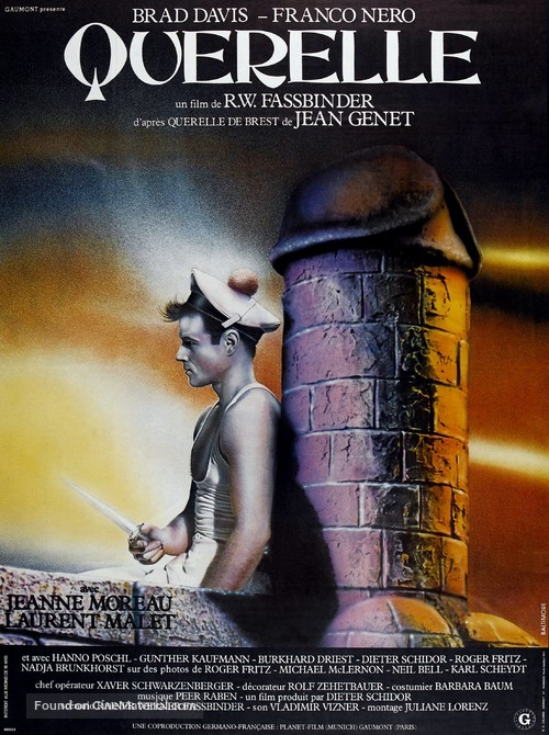
the first draft was even more “spicy” but we had to make it appropriate & approvable for mass production and re-sale in stores, trust me , if you’ve seen the film, I could have gone sooo crazy with it , lol

User avatar
zedz
Joined: Sun Nov 07, 2004 7:24 pm

Re: 1221 Querelle

#3393 Post by zedz » Sat Mar 16, 2024 2:35 am

Well, I learnt that “lol” is still a thing somewhere on the planet, I guess.

User avatar
colinr0380
Joined: Mon Nov 08, 2004 4:30 pm
Location: Chapel-en-le-Frith, Derbyshire, UK

Re: 1221 Querelle

#3394 Post by colinr0380 » Sat Mar 16, 2024 7:15 am

They should have got Jean-Paul Gaultier in really, since his fashion designs and perfume ads have been ripping off the Querelle aesthetic for decades.
zedz wrote:
Sat Mar 16, 2024 2:35 am
Well, I learnt that “lol” is still a thing somewhere on the planet, I guess.
Sounds like someone's not a fan of a certain mumblecore movie featuring Greta Gerwig's debut performance!

User avatar
Randall Maysin Again
Joined: Tue Dec 14, 2021 3:28 pm

Re: Criterion & Eclipse Cover Art & Packaging Babble-on Vol. 7

#3395 Post by Randall Maysin Again » Sat Mar 16, 2024 7:31 am

To me anyway, Criterion's covers are consistently proof that you can't "buy" talent or a sense of style. I mean, compare their covers consistently to those of Masters of Cinema, or at least to the early Masters of Cinema covers. (Yes, I know that Criterion use a whole bunch of different artists), but there's a consistent Criterion cover look, or perhaps several phases of Criterion looks over the years, and to me they all kinda stink. I mean, it takes a special kind of lack of design instincts to think that you need to, or should, "improve" upon the original Amarcord poster art, for instance, by hiring an artist to just essentially imitate the original but really accentuate lines and color so everyone looks like a sunburned, plastic-surgery-mishapped freak!

User avatar
Finch
Joined: Mon Jul 07, 2008 5:09 pm
Location: Edinburgh, UK

Re: Criterion & Eclipse Cover Art & Packaging Babble-on Vol. 7

#3396 Post by Finch » Sat Mar 16, 2024 9:53 am

Their new Lady Eve and Cluny Brown covers are still their all-time lows, to me anyway. I still can't bring myself to buy the former.

User avatar
therewillbeblus
Joined: Tue Dec 22, 2015 3:40 pm

Re: Criterion & Eclipse Cover Art & Packaging Babble-on Vol. 7

#3397 Post by therewillbeblus » Sat Mar 16, 2024 10:08 am

I'll never understand that logic, unless you store your discs in a way where the covers show instead of the spines

User avatar
Finch
Joined: Mon Jul 07, 2008 5:09 pm
Location: Edinburgh, UK

Re: Criterion & Eclipse Cover Art & Packaging Babble-on Vol. 7

#3398 Post by Finch » Sat Mar 16, 2024 12:54 pm

I'm not saying that it makes a lot of sense objectively and I get that it's really about the film than the cover but in Eve's case, I find the cover so cringe-inducing that I'd really rather wait longer still to see if one of the UK boutiques releases the film (Criterion UK have not done so far), possibly with better encoding too. I'll buy this Criterion BD as an absolute last resort if nothing else materialises but this is a very rare instance of the packaging putting me off completely. I don't have the time or talent for custom-making a new cover based on the theatrical poster which they did use for the DVD.

User avatar
cdnchris
Site Admin
Joined: Tue Nov 02, 2004 2:45 pm
Location: Washington
Contact:

Re: Criterion & Eclipse Cover Art & Packaging Babble-on Vol. 7

#3399 Post by cdnchris » Sat Mar 16, 2024 12:59 pm

I haven't seen the film and only know of its stylized look, but based on my understanding that the film has an artificial appearance, I actually like the cover. Maybe seeing it will change that, but the uproar around is absurd. It's a 3D model, which has been a thing for decades.

Like Matt, I feel bad for the artist as well, since they're getting bombarded and accused of laziness by people who don't know what they're talking about.

User avatar
Grand Wazoo
Joined: Thu Jun 21, 2007 2:23 pm

Re: Criterion & Eclipse Cover Art & Packaging Babble-on Vol. 7

#3400 Post by Grand Wazoo » Sat Mar 16, 2024 2:03 pm

I'm kind of baffled that people the internet over think this is actually AI art given it's a cover Criterion presumably commissioned vs., to reiterate what I posted earlier, it having the texture of AI art. That smooth skin effect just looks so similar to the images Dall-e and its ilk spit out which have proliferated across Twitter and such for a while now. While the artist shouldn't be terribly shocked at the comparisons due to the unfortunate new ubiquity of that style, I too would be pissed if people were accusing me of simply typing in a prompt and sending it to Criterion for a check.

Post Reply