The Menace II Society slipcase and Once Upon A Time In China boxset are the highlights for the month for me.
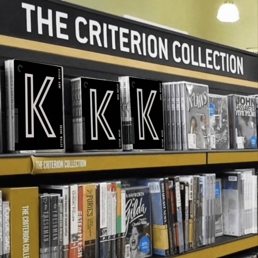
I'm still processing my thoughts on the Citizen Kane cover. I understand why they went in this direction, but I cannot say that I truly enjoy it. Hopefully it's more impressive in person (as usually tends to be the case).
Criterion & Eclipse Cover Art & Packaging Babble-on Vol. 7
-
Computer Raheem

- Joined: Wed Jun 16, 2021 7:45 pm
-
Lemdog

- The Man with no Title
- Joined: Wed Nov 03, 2004 4:43 pm
Re: Criterion & Eclipse Cover Art & Packaging Babble-on Vol. 7
Maybe I'm just cynical but I'm just waiting for some jerk to start putting three Citizen Kane boxes next to each other all over Barnes and Noble.
-
andyli

- Joined: Thu Sep 24, 2009 4:46 pm
Re: Criterion & Eclipse Cover Art & Packaging Babble-on Vol. 7
Strangely the first thought that came to me with that cover is also the Ku Klux Klan, and I'm not even American.Lemdog wrote:Maybe I'm just cynical but I'm just waiting for some jerk to start putting three Citizen Kane boxes next to each other all over Barnes and Noble.
-
therewillbeblus

- Joined: Tue Dec 22, 2015 3:40 pm
Re: Criterion & Eclipse Cover Art & Packaging Babble-on Vol. 7
I'm American and the "connection" never occurred to me until I read these last two comments
-
Brian C

- I hate to be That Pedantic Guy but...
- Joined: Wed Sep 16, 2009 11:58 am
- Location: Chicago, IL
Re: Criterion & Eclipse Cover Art & Packaging Babble-on Vol. 7
Seems perfectly normal to immediately think of the Klan anytime one sees a K.
-
flyonthewall2983

- Joined: Mon Jun 27, 2005 3:31 pm
- Location: Indiana
- Contact:
-
bugsy_pal

- Joined: Mon May 12, 2008 1:28 am
Re: Criterion & Eclipse Cover Art & Packaging Babble-on Vol. 7
I think the Kane cover is brilliant - simple, bold, and ties in with the visual style of the movie. Can't wait to see the full package.
-
Lemdog
- The Man with no Title
- Joined: Wed Nov 03, 2004 4:43 pm
-
Walter Kurtz

- Joined: Sat Jul 25, 2020 3:03 pm
Re: Criterion & Eclipse Cover Art & Packaging Babble-on Vol. 7
Let me tell you about Charlie----
The retro font on the right side of the Kane box/slip/whatever is a nice throwback to the old Criterion font because, um... flashbacks?
The retro font on the right side of the Kane box/slip/whatever is a nice throwback to the old Criterion font because, um... flashbacks?
-
DarkImbecile

- Ask me about my visible cat breasts
- Joined: Mon Dec 09, 2013 6:24 pm
- Location: Albuquerque, NM
-
FrauBlucher

- Joined: Mon Jul 15, 2013 8:28 pm
- Location: Greenwich Village
Re: Criterion & Eclipse Cover Art & Packaging Babble-on Vol. 7
I didn’t think it would create the PR it has
-
domino harvey

- Dot Com Dom
- Joined: Wed Jan 11, 2006 2:42 pm
Re: Criterion & Eclipse Cover Art & Packaging Babble-on Vol. 7
This top comment under Criterion’s original tweet of the cover is perfect
How long did it take you
-
swo17

- Bloodthirsty Butcher
- Joined: Tue Apr 15, 2008 10:25 am
- Location: SLC, UT
Re: Criterion & Eclipse Cover Art & Packaging Babble-on Vol. 7
DarkImbecile wrote: ↑Tue Aug 17, 2021 10:45 amHollywood Reporter: ‘Citizen Kane’ Criterion Cover Artist Explains Design Motivation Amid Criticism, Praise
Artist Mike McQuade told The Hollywood Reporter on Tuesday he was not surprised his work elicited such strong emotion.
“I put a K on the cover,” McQuade said of the 1941 Orson Welles epic considered by most film historians to be the greatest film ever made (although Welles did not think that was the case).
Kane being his first cover design for Criterion, McQuade was thrilled when he was approached by an art director at the distribution company requesting his expertise for the project.
“I’ve worked on key art for some television pilots and indie films,” McQuade told THR. “I’ve been a practicing graphic designer and illustrator with a focus on editorial illustration, branding, and collage for more than 15 years. I’ve done work for The New York Times, New Yorker, Nike, Penguin Books and Rolling Stone, to name a few. And I put a K on the cover.”
-
Brian C
- I hate to be That Pedantic Guy but...
- Joined: Wed Sep 16, 2009 11:58 am
- Location: Chicago, IL
Re: Criterion & Eclipse Cover Art & Packaging Babble-on Vol. 7
I don’t know what the big fuss is all about, to be honest. It’s not like it would have made sense to put an ‘L’ on the cover. He obviously picked the right letter, or what am I missing?
-
tenia

- Ask Me About My Bassoon
- Joined: Wed Apr 29, 2009 11:13 am
Re: Criterion & Eclipse Cover Art & Packaging Babble-on Vol. 7
As someone already wrote above, it looks like a cover that took 2 min to do for one of the most reverred movie of all time and one filled with (and praised for) technically wonderful shots. One would thus argue maybe there's something a tad less simplistic that could have been achieved.
I don't mind it myself, but I understand people looking at it and thinking it can't be the real artwork.
I don't mind it myself, but I understand people looking at it and thinking it can't be the real artwork.
Last edited by tenia on Tue Aug 17, 2021 12:51 pm, edited 1 time in total.
-
dwk

- Joined: Sat Jun 12, 2010 6:10 pm
Re: Criterion & Eclipse Cover Art & Packaging Babble-on Vol. 7
People are just ignoring that the designer does more than just the cover. They also do designs for the discs, the booklet, the case inside.
It would have been helpful if, like the Menace II Society and Once Upon a Time in China, Criterion included some sample of what the whole package will be like on the page.
It would have been helpful if, like the Menace II Society and Once Upon a Time in China, Criterion included some sample of what the whole package will be like on the page.
-
DimitriL
- Joined: Thu Jul 24, 2014 6:07 pm
Re: Criterion & Eclipse Cover Art & Packaging Babble-on Vol. 7
As I mentioned elsewhere, I can see Orson Welles getting the same crap for perhaps the most minimalistic title sequence in film history up to that point. No grand fanfare, no stylistic/thematic flourishes, no setting up the story, no cast or crew…text on black. That’s it. It’s funny that people forget this, when it’s really as iconic a choice as any of the various technical and story achievements in the film itself.tenia wrote: ↑Tue Aug 17, 2021 11:53 amAs someone already wrote above, it looks like a cover that took 2 min to do for one of the most reverred mo ie of all time and one filled with (and praised for) technically wonderful shots. One would thus argue maybe there's something a tad less simplistic that could have been achieved.
I don't mind it myself, but I understand people looking at it and thinking it can't be the real artwork.
-
tenia
- Ask Me About My Bassoon
- Joined: Wed Apr 29, 2009 11:13 am
Re: Criterion & Eclipse Cover Art & Packaging Babble-on Vol. 7
Especially since "special packaging" is in their Extra Features spec sheet !
As I wrote, I don't mind it myself as I do find this cover to offer something of an iconic stance on the movie and its aura : it doesn't need more, somehow. We see this, we know which movie it is. But I can also understand how something different, and maybe more nicely "artful" to look at could have been done. I remember for instance of what was done for The Magnificent Ambersons.
-
RIP Film
- Joined: Tue Oct 10, 2017 3:53 pm
Re: Criterion & Eclipse Cover Art & Packaging Babble-on Vol. 7
I can see both sides. Initially I hated it, but there is the question of what would you replace it with. An artfully done still? The dilemma is no shot can really encapsulate the film, perhaps in its themes but certainly not its legacy-- so there's a certain virtue to not even trying. The film inhabits a singular place in film history and the cover is equally singular.
On the downside I don't think the K is as universally recognized as they think it is, but maybe it will be after this. The cover would be easier to appraise if Criterion didn't already have so many spectacular misfires in their catalog, but I'm willing to let this one pass.
On the downside I don't think the K is as universally recognized as they think it is, but maybe it will be after this. The cover would be easier to appraise if Criterion didn't already have so many spectacular misfires in their catalog, but I'm willing to let this one pass.
-
FrauBlucher
- Joined: Mon Jul 15, 2013 8:28 pm
- Location: Greenwich Village
Re: Criterion & Eclipse Cover Art & Packaging Babble-on Vol. 7
I have a hunch that the overall packaging will change my initial reaction. As dwk mentioned if CC release packaging images it could’ve made a little bit of a difference. Knowing Criterion they will probably show us the packaging in some form sooner rather than later
-
Pavel

- Joined: Fri Aug 07, 2020 2:41 pm
Re: Criterion & Eclipse Cover Art & Packaging Babble-on Vol. 7
I have to give Criterion credit though, they managed to generate a lot more conversation with this (trending on Twitter, Hollywood Reporter article) than they would've with any other, "good" cover
-
Walter Kurtz
- Joined: Sat Jul 25, 2020 3:03 pm
Re: Criterion & Eclipse Cover Art & Packaging Babble-on Vol. 7
Citizen Kane is the most dissected film of all time. So the designer went to the theater and climbed a ladder when the titles came on... dissected a 'K'... and slapped it on a box.
The probably die-cut 'K'?
It's Terrific!
The probably die-cut 'K'?
It's Terrific!
-
_shadow_
- Joined: Tue Nov 22, 2011 1:48 am
Re: Criterion & Eclipse Cover Art & Packaging Babble-on Vol. 7
Will the "special packaging" include the rest of the letters?
-
therewillbeblus
- Joined: Tue Dec 22, 2015 3:40 pm
-
mteller
- Joined: Tue Nov 02, 2004 3:23 pm
Re: Criterion & Eclipse Cover Art & Packaging Babble-on Vol. 7
Never before has this forum so desperately needed the services of swimminghorses