Yeah it has.arsonfilms wrote:Before anybody blows out an artery, lets just take a moment to reflect on the fact that the official artwork has NOT yet been finalized or released.
Criterion & Eclipse Cover Art & Packaging Babble-on Vol.4
-
CSM126

- Joined: Thu Nov 04, 2004 8:22 am
- Location: The Room
- Contact:
-
Person

- Joined: Sat May 19, 2007 3:00 pm

-
Alonzo the Armless

- Joined: Wed Nov 03, 2004 8:57 pm
-
Cronenfly

- Joined: Thu Jul 19, 2007 12:04 pm
Yes, Breathless' design ultimately kept the spirit of the film; though I can appreciate Scharphedin2's points about where the design was coming from for Mishima vis-a-vis the way Mishima's novels were marketed in the West, representing Mishima's different personas, etc, I certainly hope that, even if the cover remains unchanged, the rest of the design incorporates more of the film and its many fine visual qualities (which no one can deny, I think, even if they dislike the film), or at least something less in the grips of psychedelia.Antoine Doinel wrote:Breathless, while surprising (and a design I think ultimately works), at least was true to the spirit of Godard in some sense. I have no idea what to make of Mishima. Looking at the cover, it's like I'm gearing up to watch [bTHE TRIPPED OUT ON TOTALLY AWESOME TABS EDITION[/b]

-
cgray

- Joined: Wed Aug 10, 2005 2:21 pm
- Location: Erie, CO
I don't think the cover is horrible or that it would deter potential buyers (though I agree its a far cry from the refinement of the Patriotism cover). I'm mainly annoyed because I think the cover looks so similar to WR: Mysteries of the Organism, a mere 40 numbers ago.
Why the kaleidoscopic overkill?
Why the kaleidoscopic overkill?
-
rwaits
- Joined: Tue Dec 21, 2004 12:24 pm
I think the complaint that the cover art could deter a viewer who has never seen the film is untrue. I have never seen Mishima (have only seen a few stills) but really like the cover. I'm not trying to be contentious for argument's sake (believe me I was one of the ones screaming about Viridiana, and a few others), but think it will look nice next to other 'cult' films like Symbiopsychotaxiplasm or Mysteries of the Organism, which it essentially is.
-
Antoine Doinel

- Joined: Sat Mar 04, 2006 1:22 pm
- Location: Montreal, Quebec
- Contact:
-
reno dakota

- Joined: Mon Mar 17, 2008 11:30 am
My earlier comment--which you seem to be referencing--was made partly in jest. I certainly do not believe the cover art will scare away every newcomer, but I do think it has the potential to scare away some.rwaits wrote:I think the complaint that the cover art could deter a viewer who has never seen the film is untrue.
-
rwaits
- Joined: Tue Dec 21, 2004 12:24 pm
-
Adam
- Joined: Sun Dec 09, 2007 8:29 pm
- Location: Los Angeles CA
- Contact:
I think it's more likely to attract potential buyers, with its colors and so forth. It just doesn't reflect the movie.reno dakota wrote:My earlier comment--which you seem to be referencing--was made partly in jest. I certainly do not believe the cover art will scare away every newcomer, but I do think it has the potential to scare away some.rwaits wrote:I think the complaint that the cover art could deter a viewer who has never seen the film is untrue.
-
domino harvey

- Dot Com Dom
- Joined: Wed Jan 11, 2006 2:42 pm

-
Svevan

- Joined: Mon Nov 22, 2004 7:49 pm
- Location: Portland, OR
you'll be disappointed if that's your only point of referenceAlonzo the Armless wrote:I like the cover a lot, have never seen the movie, but now want to.
uh, the Criterion section? where it will look terribly out of place.rwaits wrote:but really, what section will this dvd wind up in at, say, your local Borders?

-
domino harvey
- Dot Com Dom
- Joined: Wed Jan 11, 2006 2:42 pm
-
Jean-Luc Garbo

- Joined: Thu Dec 09, 2004 1:55 am
- Contact:
-
pianocrash

- Joined: Wed Nov 03, 2004 11:02 am
- Location: Over & Out
-
kinjitsu

- Joined: Sat Feb 12, 2005 1:39 pm
- Location: Uffa!
No one as far as I know has objected to the color pink. To my knowledge it was only used in reference to the first draft of the Viridiana cover.luridedith wrote:What is with you guys and the colour pink?
Some references to help everyone adjust
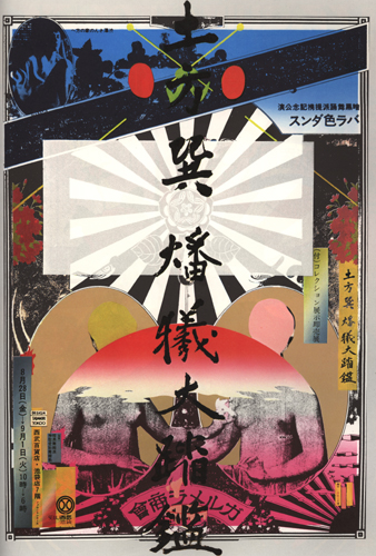
Yokoo Tadanori: The Great Mirror of the Dance as an Immolative Sacrifice
Calligraphy with the poster's title, was written by Mishima

Yokoo Tadanori: Barakei: Ordeal by Roses
* Tadanori briefly appears in Mishima during the Kyoko's House noodle stand sequence.
Last edited by kinjitsu on Sat Jul 05, 2008 1:33 pm, edited 5 times in total.
-
HerrSchreck

- Joined: Sun Sep 04, 2005 11:46 am
Not to mention King of Kings, probably designed by the original Viridiana designer, and itself just this side of Total Tackorama. "Come See The New, Pop, Commie, Homo Christ! Tonite at Bowery Ballroom!"kinjitsu wrote:No one as far as I know has objected to the color pink. To my knowledge it was only used in reference to the first draft of the Viridiana cover.

-
Steven H

- Joined: Tue Nov 02, 2004 3:30 pm
- Location: NC
None other than Birdey Hilltop from Oshima's Diary of a Shinjuku Thief, and if they had stuck with something more along the lines of what you posted, instead of throwing little heads everywhere and adding layer upon layer of photoshopped images, we wouldn't have a squabble.kinjitsu wrote:Yokoo Tadanori, "Yukio Mishima."