

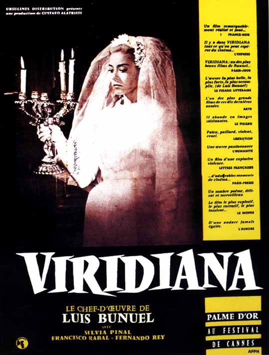
Oh, That Viridiana Cover!
-
Matt

- Joined: Tue Nov 02, 2004 4:58 pm


-
Cinéslob
- Joined: Sat Mar 12, 2005 9:31 pm
Criterion covers: Snatching defeat from the jaws of victory.
bunuelian: Is your avatar taken from the Alberto Isaac cartoon of Viridiana backfiring - literally - on Franco? Spooky coincidence if so; I saw that Isaac cartoon for the very first time yesterday!
-EDIT-
Of course, only now do I discover that your avatar was discussed at length in the Viridiana thread itself, making me look a bit dim. Arse.
Last edited by Cinéslob on Wed Nov 23, 2005 10:23 pm, edited 2 times in total.

-
zedz

- Joined: Sun Nov 07, 2004 11:24 pm
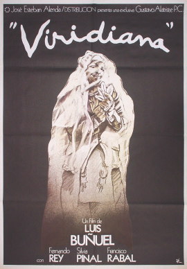
Wow. That Viridiana cover may occasion the first ever consensus in this thread. It looks like the runner-up in a cover design speed challenge. I say runner up, because the guy who didn't realise the race had started and ended up with a blank cover would have won against that.
I mean, really, it's hard to imagine how much worse it could be. Playing cards, skipping ropes, The Last Supper - anything!
I mean, really, it's hard to imagine how much worse it could be. Playing cards, skipping ropes, The Last Supper - anything!
-
Lino

- Joined: Wed Nov 03, 2004 10:18 am
- Location: Sitting End
- Contact:
-
toiletduck!

- Joined: Tue Nov 02, 2004 9:43 pm
- Location: The 'Go
- Contact:
-
backstreetsbackalright

- Joined: Fri Dec 17, 2004 10:49 pm
- Location: 313
-
ianungstad
- Joined: Thu Mar 17, 2005 1:20 am
-
godardslave

- Joined: Tue Nov 02, 2004 8:44 pm
- Location: Confusing and open ended = high art.
I have a paranoid/terrible feeling something bad has happened in the criterion art/cover design department. Someone got sacked? someone new who has no idea what the fuck they are doing moved in? Surely, the people who gave us ugestu cannot be the same as the people who have produced coronets/viridiana.
where will it end?
where will it end?
I'm with you, brother!bunuelian wrote:I mailed Mulvaney to complain.
-
FilmFanSea

- Joined: Wed Nov 03, 2004 5:37 pm
- Location: Portland, OR
-
Cinesimilitude
- Joined: Tue Jul 09, 2013 4:43 am
-
Jem

- Joined: Mon May 02, 2005 3:03 am
- Location: Potts Point
I have a paranoid/terrible feeling something bad has happened in the criterion art/cover design department. Someone got sacked? someone new who has no idea what the fuck they are doing moved in?
Surely, the people who gave us ugestu cannot be the same as the people who have produced coronets/viridiana. where will it end?
Relax. Have you forgotten the recent well designed covers already? I think the 'Coronets' cover is fine, infact in my opinion it is one of Criterions more unique and original covers, the script along the tree is particularly nice.
Re. Viridiana, I think the colour is what is putting everyone off, it is a bit insipid.
-
hammock

- Joined: Wed Nov 03, 2004 5:52 pm
- Location: www.criteriondungeon.com
- Contact:
-
colinr0380

- Joined: Mon Nov 08, 2004 8:30 pm
- Location: Chapel-en-le-Frith, Derbyshire, UK
I agree with both points here, I like the Kind Hearts and Coronets cover as well. Although I've never really had many problems with the covers before (except perhaps Heaven Can Wait), I feel as if I'm being dared to still buy Viridiana by the cover!Jem wrote:I think the 'Coronets' cover is fine, in fact in my opinion it is one of Criterions more unique and original covers, the script along the tree is particularly nice.
Re. Viridiana, I think the colour is what is putting everyone off, it is a bit insipid.
I think the pink is a little strange as is the picture and the slash of purple underneath with the title on it, but the thing that makes me really dislike it is the dirt over the cover. I'm not at all familiar with the film, but is the dirt meant to convey any meaning?
-
Lino
- Joined: Wed Nov 03, 2004 10:18 am
- Location: Sitting End
- Contact:


-
hammock
- Joined: Wed Nov 03, 2004 5:52 pm
- Location: www.criteriondungeon.com
- Contact:


-
jmj713
- Joined: Sun Apr 24, 2005 2:47 am
I'm a big fan of Bunuel, but became one with Criterion's DVD. So I've never seen any of his films prior to buying the discs. I have no idea what Viridiana is about or what sort of film it is, so maybe that's why I'm not bothered by the cover and actually like it. It's very blasphemous, and that's great. I'll be sure to preorder it! More Bunuel, Criterion!

-
justeleblanc

- Joined: Wed Nov 03, 2004 10:05 pm
- Location: Connecticut