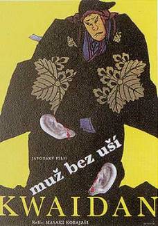
MoC Cover Art & Packaging Babble-on
- Lino
- Joined: Wed Nov 03, 2004 6:18 am
- Location: Sitting End
- Contact:
- Satyajit's Son
- Joined: Wed Sep 28, 2005 2:52 am
- Location: Hong Kong
Finally! Someone agres with me. Thanks Annie Mall =D>Annie Mall wrote:Nick has continually proved that he can do amazing jobs at designing DVD covers (the Shindos are a perfect example of that) so I do hope he reconsiders a second, alternative cover for The Expedition. It can't be that hard to better it, I'm sure. Sometimes the simplest of principles are also the most effective.
-
- not perpee
- Joined: Tue Nov 02, 2004 3:41 pm
Whichever way you look at it... the ABHIJAN sleeve is very faithfully based on the original poster art. That means a lot to us. If it's cluttered, it's because the original poster was cluttered. We don't know for sure that Ray designed, or approved of this poster, but he may have done and we'd rather have it than some text slapped over a still --- any day.
I believe the great Criterion covers (8OUDU, MON ONCLE, PICKPOCKET, etc) are all based on original poster art --- the lesser Criterion covers (IMO) are stills with text slapped on them (LE NOTTE BIANCHE, THE CHILDREN ARE WATCHING US) or overcooked, completely-new, Photoshop fantasms (BAD TIMING, GATE OF FLESH).
We're simply trying to use original poster art wherever possible. If anyone has any better ideas for adapting the original ABHIJAN poster, please let us know! (we're looking at changing the font to Ray's patented Roman font)
- Satyajit's Son
- Joined: Wed Sep 28, 2005 2:52 am
- Location: Hong Kong
- Jem
- Joined: Sun May 01, 2005 11:03 pm
- Location: Potts Point
Well said peerpee.
I think the ABHIJAN sleeve / poster is quite strong, the image of the man between the rocks is pretty curious.
It also has a nice hand made textural feel to it as well, probably because the original poster was silk screened. I also like the colour combinations, quite subtle and beautiful. I don't mind the font used as it holds together well as a block against the script (which is the best feature).
If I was to change anything it would be to remove the portraits.
I imagine they worked better on a large poster, but on a smaller DVD they are a bit lost and overly complex.
Though in saying that, if the purpose was to match or compliment the original poster, then MOC have done an excellent job.
- Lino
- Joined: Wed Nov 03, 2004 6:18 am
- Location: Sitting End
- Contact:
Yes, you are right - but in those cases, it worked. Just as it works on MoC's Sunrise, Faust or Prisoner of Shark Island. And like I said before, I'm all for it as I love vintage poster art.peerpee wrote:I believe the great Criterion covers (BOUDU, MON ONCLE, PICKPOCKET, etc) are all based on original poster art
There are great Satyajit Ray film posters out there (Devi is one such example) but this particular one doesn't strike me as especially effective. I'm sorry for being so blunt but I hope you can at least appreciate my sincerity. Heck, we bitch about Criterion covers all the time to no results - it's great to have some kind of feedback in this case!
However, Jem has made a very nice suggestion: to try and remove at least the portraits from the main picture - that would make it simpler and more to the point. They seem to be distracting us from what is really going on.
(Just a thought but just because it is the original poster art, that doesn't make it instantly "right" or "great" - God knows there have been some really terrible attempts at trying to promote a film by way of a poster advertisement. Here is such an example.
- godardslave
- Joined: Tue Nov 02, 2004 4:44 pm
- Location: Confusing and open ended = high art.
- Lino
- Joined: Wed Nov 03, 2004 6:18 am
- Location: Sitting End
- Contact:
Here's hoping that MoC will use this poster art for Kwaidan.
- Lino
- Joined: Wed Nov 03, 2004 6:18 am
- Location: Sitting End
- Contact:
- Lino
- Joined: Wed Nov 03, 2004 6:18 am
- Location: Sitting End
- Contact:
-
- Joined: Tue Dec 14, 2004 11:25 am
about those horrible bbfc classification logos that were discussed on the first page of this thread. i have a suggestion, or two...
what if you printed the image on both sides of the cover, without the logos on the flipside? i'd certainly love that...
or if that's not doable, you could include the untainted cover as a hi-res image in a dvd-rom folder, so it can be printed. i know, i know, i can scan, manipulate and print, but it will never be as good.
i don't really understand i know that they are required by law to have classification logos on the cover.
my suggestion is that on one side they print the cover WITH the horrible logos, but when you take it out and turn it over you have the cover WITHOUT the logos. i can't see how they are required by law to have the logos on both sides.
just my 2 cents.
- bunuelian
- Joined: Wed Nov 03, 2004 11:49 am
- Location: San Diego
- Lino
- Joined: Wed Nov 03, 2004 6:18 am
- Location: Sitting End
- Contact: